E-commerce
Wholesalr NG
Wholesalr NG is a multi-marketplace e-commerce platform that brings wholesale, retail, and secondhand buying and selling into one seamless experience. Built for businesses, resellers, and everyday shoppers, it simplifies how Nigerians discover, buy, and sell products across different markets.
Year :
2025
Industry :
E-Commerce
Client :
Wholesalr NG
Project Duration :
Ongoing

Problem :
The problem went beyond “shopping convenience.” Nigerian buyers constantly move between wholesale markets, retail platforms, and secondhand channels depending on their needs, yet these experiences remain disconnected.
Research revealed five major pain points:
Fragmented platforms - Users switch between different apps and physical markets with no seamless experience.
Low trust in secondhand commerce - Buyers struggle with uncertainty around product quality and seller reliability.
Poor support for wholesale buyers - Existing platforms are largely optimized for individual shoppers, not bulk purchasing.
Checkout flows ignore local realities - Delivery logistics, payment preferences, and pricing transparency are often overlooked.
Weak location awareness - Buyers rarely know what products are actually available near them or how quickly they can arrive.
These issues highlighted a larger gap: existing commerce platforms were not designed around how Nigerians actually buy and sell.

Solution Strategy:

The goal was not to create another generic e-commerce app, but to design a platform that reflects how Nigerians actually shop across wholesale, retail, and secondhand markets.
The solution focused on creating a flexible multi-marketplace experience built around user intent.
Key product decisions included:
Intent-first experience - Users choose whether they want to shop wholesale, retail, or secondhand, allowing the platform to adapt to their needs instantly.
Location-aware shopping - Product availability, delivery options, and recommendations are tailored to the user’s location.
Unified marketplace system - Despite serving different shopping contexts, core actions like cart, wishlist, and checkout remain consistent across the platform.
Trust-focused interactions - OTP verification, structured listings, and seller ratings help improve confidence in secondhand and wholesale transactions.
Simplified checkout flows - Reduced friction through faster add-to-cart actions and a more streamlined checkout experience.
These decisions directly addressed the key friction points uncovered during research and helped create a more seamless commerce experience for Nigerian users.
Design Decision Process

This was not a straight line from brief to solution. The process was iterative, shaped by real constraints, and required revisiting assumptions more than once.
Discovery
The design process was highly iterative and shaped by real user behavior rather than assumptions.
Early research revealed two major insights:
Shopping behavior changes by context - Wholesale buyers, retail shoppers, and secondhand users all define value differently, making a one-size-fits-all experience ineffective.
Trust varies across marketplaces - Users approach secondhand purchases with far more caution than standard retail transactions, requiring stronger trust signals within the experience.
These findings became foundational in shaping how the platform adapted to different shopping intents and user expectations.
Problem Definition
Instead of designing for “users,” I defined 3 behavioral modes:
Mode | Need | Risk |
|---|---|---|
Wholesale Buyer | Bulk efficiency | Pricing clarity |
Retail Buyer | Convenience | Speed |
Resale Buyer | Trust | Authenticity |
This directly influenced the information architecture
Ideation
A major design decision was whether the platform should function as one app or three separate marketplace experiences.
The final solution was a unified system with dedicated entry points for wholesale, retail, and secondhand shopping, allowing the experience to adapt based on user intent.
Validation
Validation focused on heuristic evaluation and UX best practices to reduce cognitive load and improve navigation clarity. Familiar UI patterns such as cards, tabs, and bottom navigation were used to create an experience that felt intuitive and easy to navigate, even for less frequent digital shoppers.
EMPATHY MAP
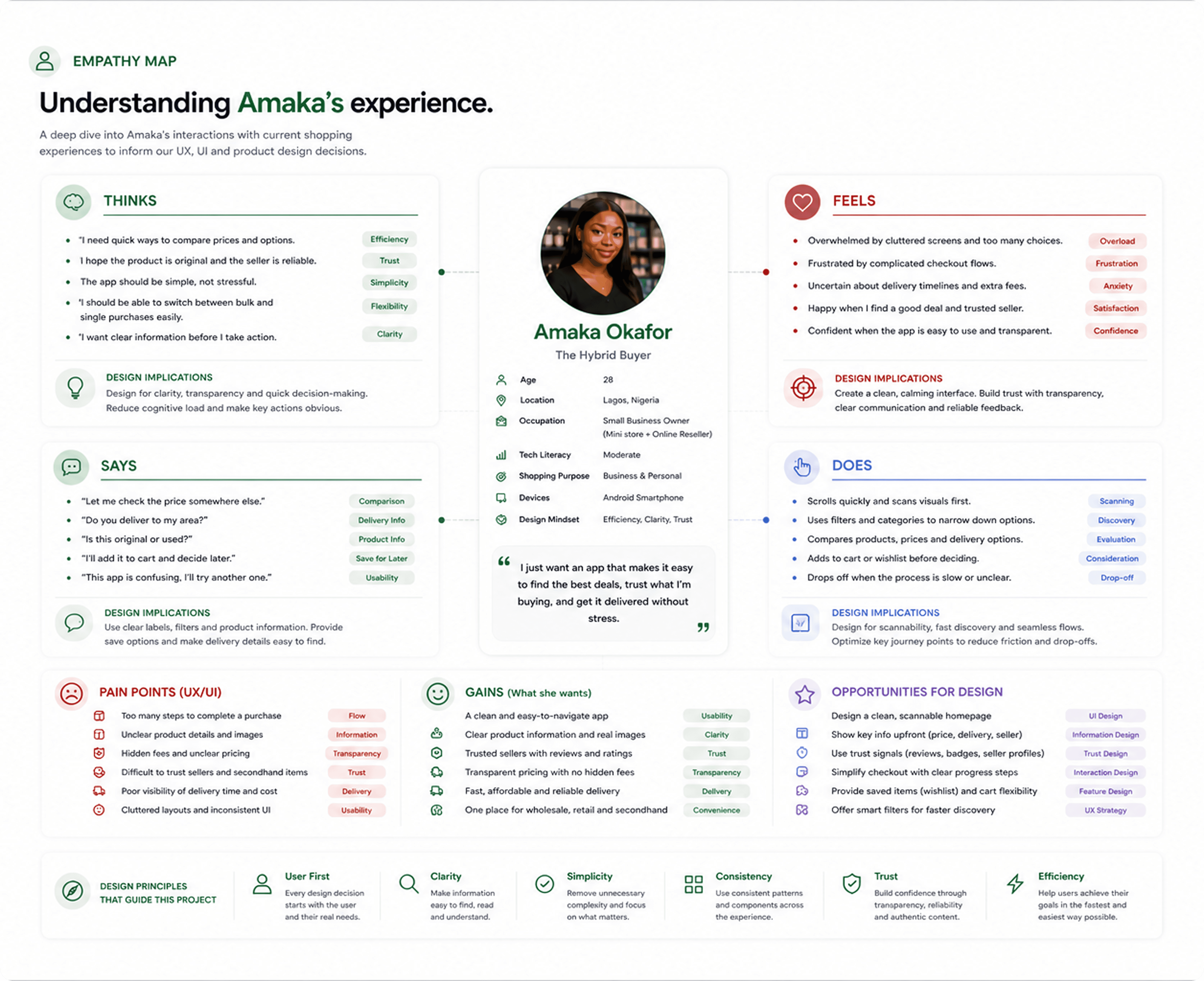
USER PERSONA

User Flow
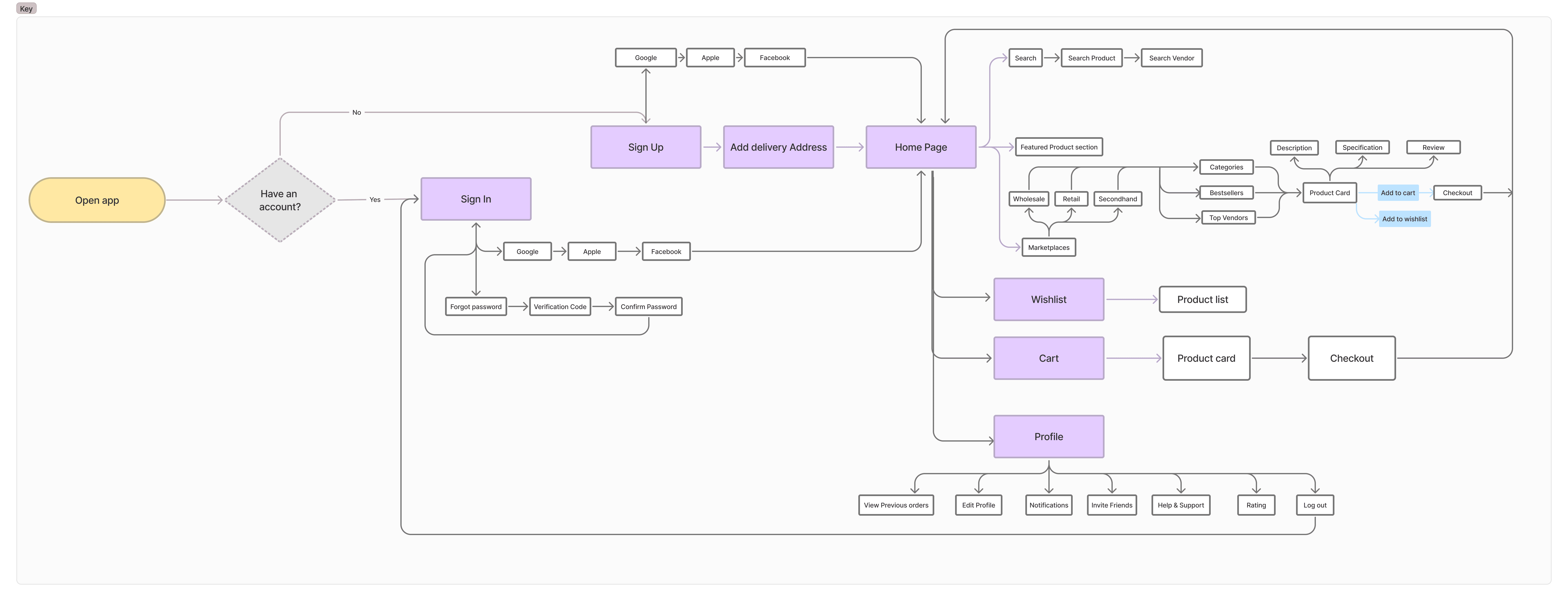
The user flow focused on key decision points rather than just screen transitions.
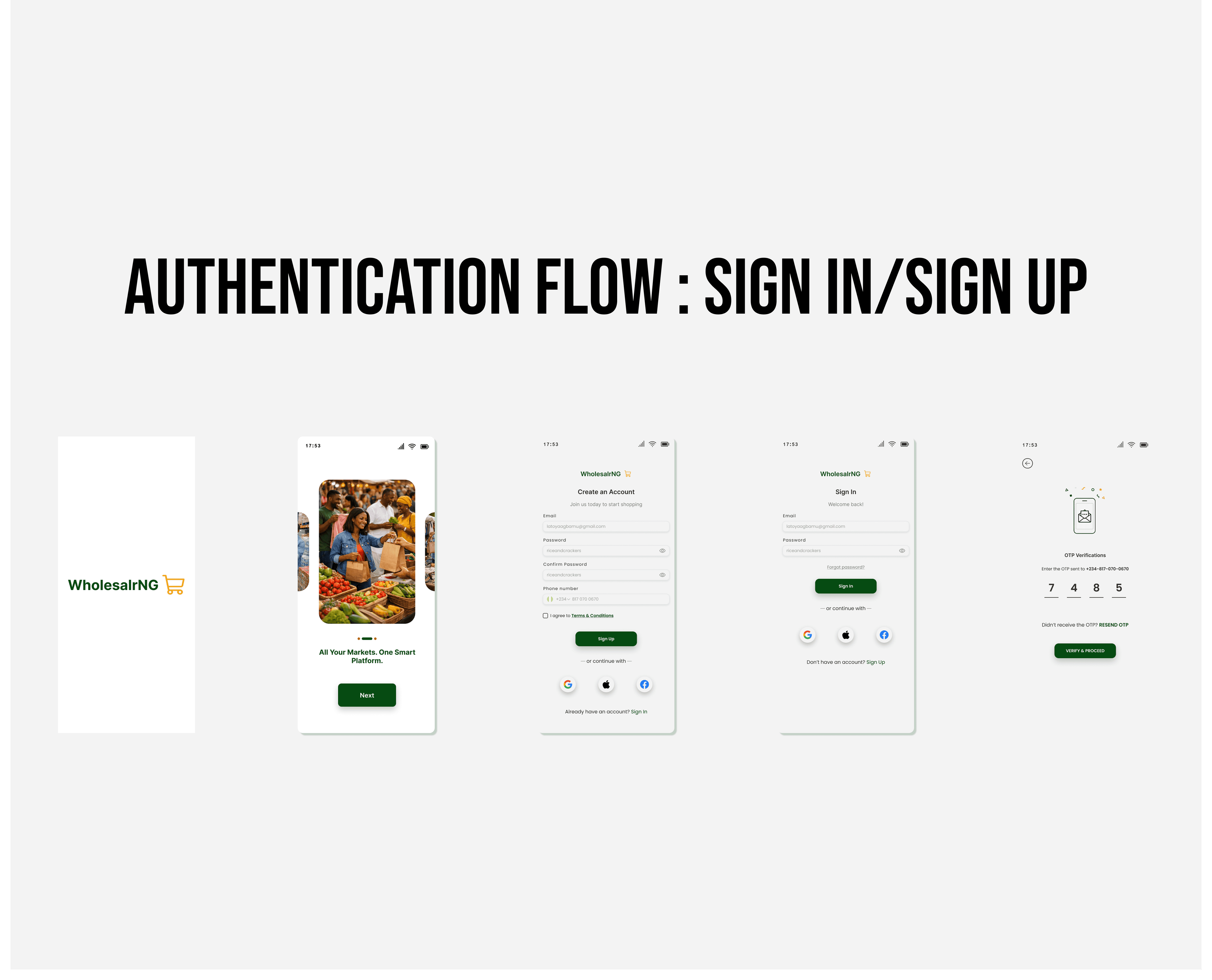
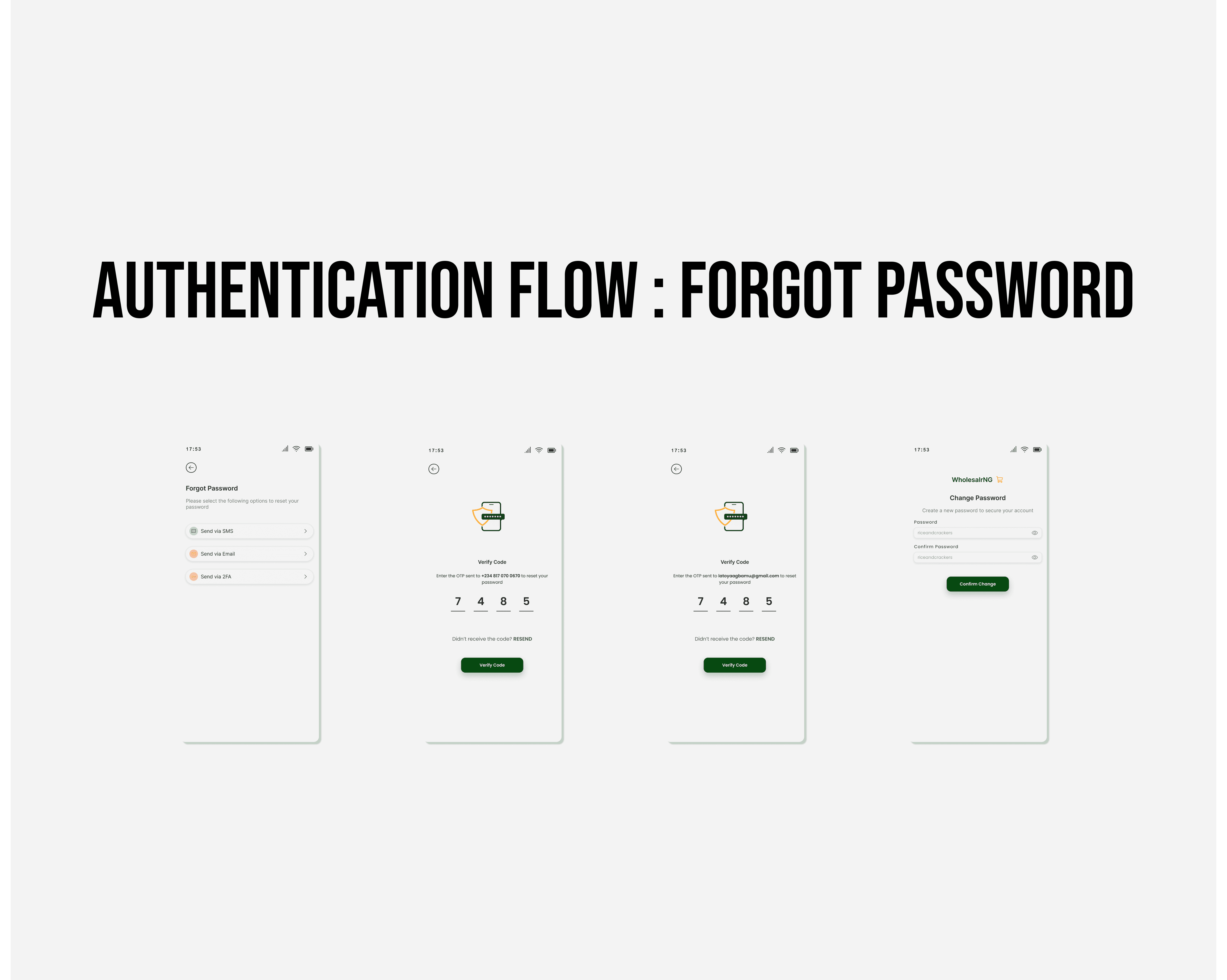
Authentication Flow
Users move through a simplified sign-up, sign-in, and OTP verification process, with separate recovery paths for forgotten passwords to reduce friction during onboarding.
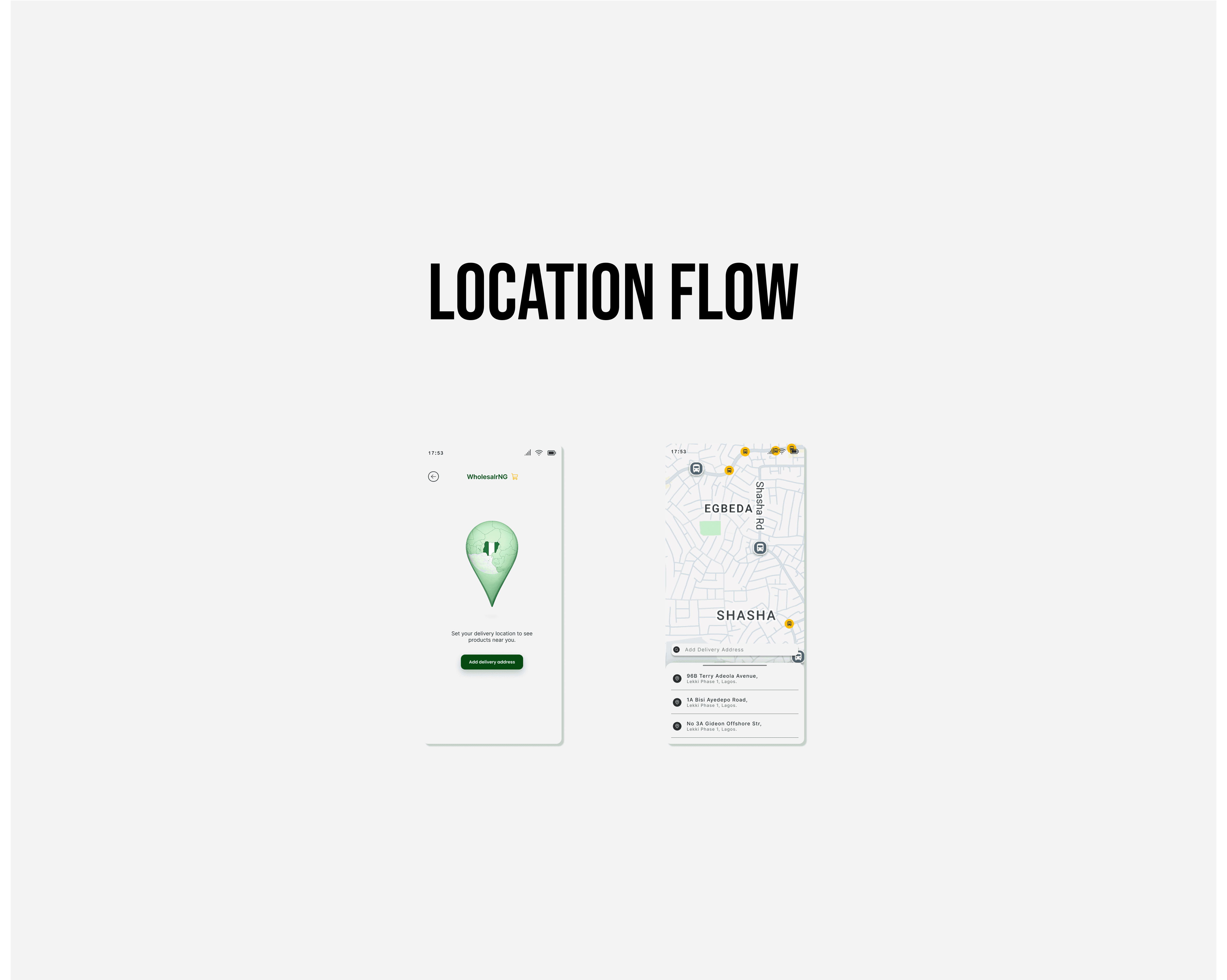
Location Flow
Users set a delivery location early in the experience, allowing product availability, delivery estimates, and pricing to adapt based on their location.
Discovery Flow
Users choose between wholesale, retail, or secondhand marketplaces, then browse categories, explore products, and save or purchase items through a streamlined discovery experience.

WHOLESALRNG USER FLOW Diagram
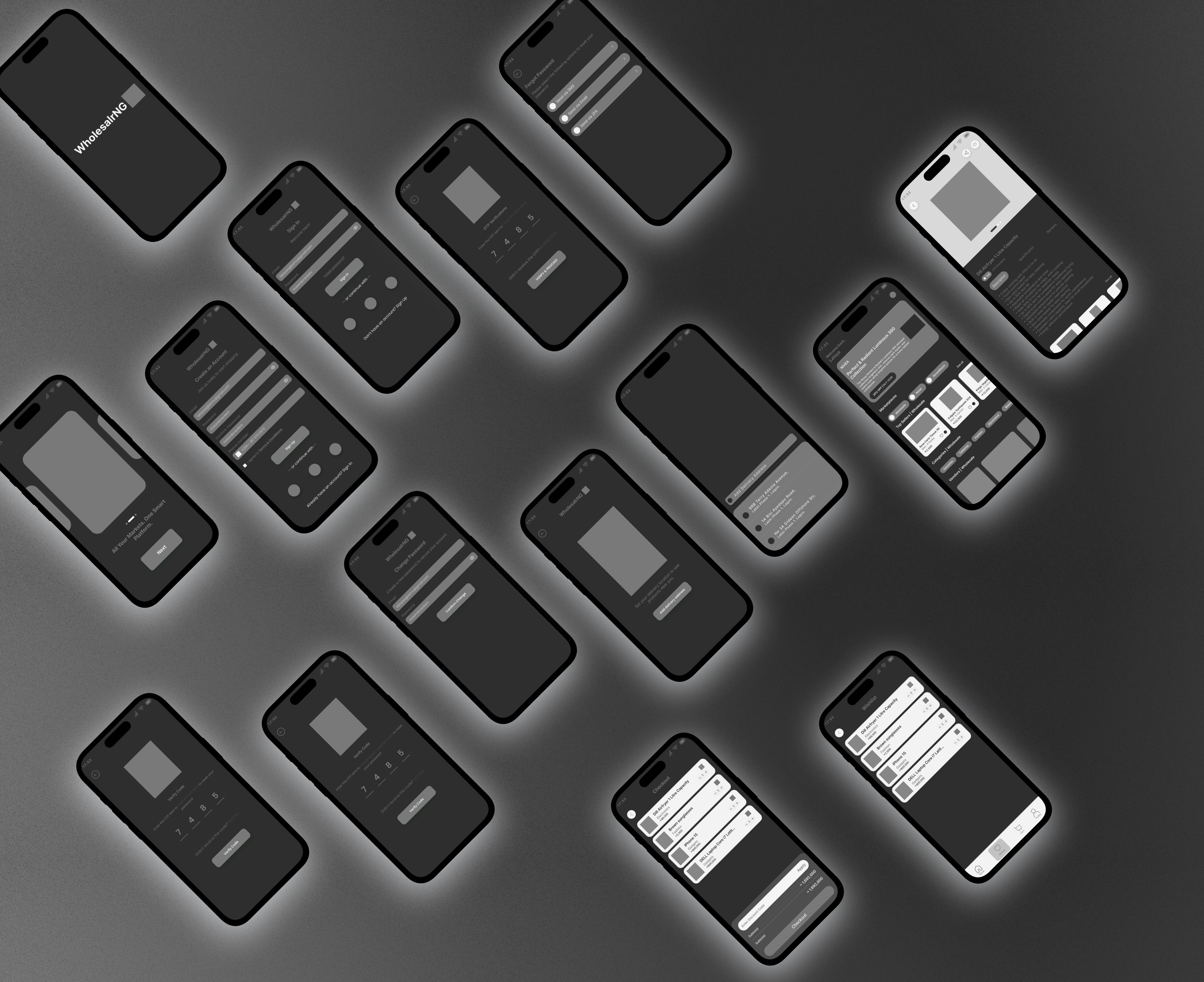
MID-FIDELITY Wireframes (Intent Before Aesthetics)
The wireframes focused on usability before aesthetics, ensuring users could quickly understand each screen and its available actions.
Three core principles guided the layouts:
Clear information hierarchy
Obvious interaction patterns
Consistent structure across all marketplace modes
Key design decisions included:
Persistent bottom navigation for easier orientation
Card-based layouts for scalable product browsing
Marketplace chips for quick switching between shopping modes
Thumb-friendly CTA placement to improve mobile usability
Design System (System Thinking)
The design system was built with scalability and consistency in mind, ensuring the product could grow without constantly redesigning components or user flows.
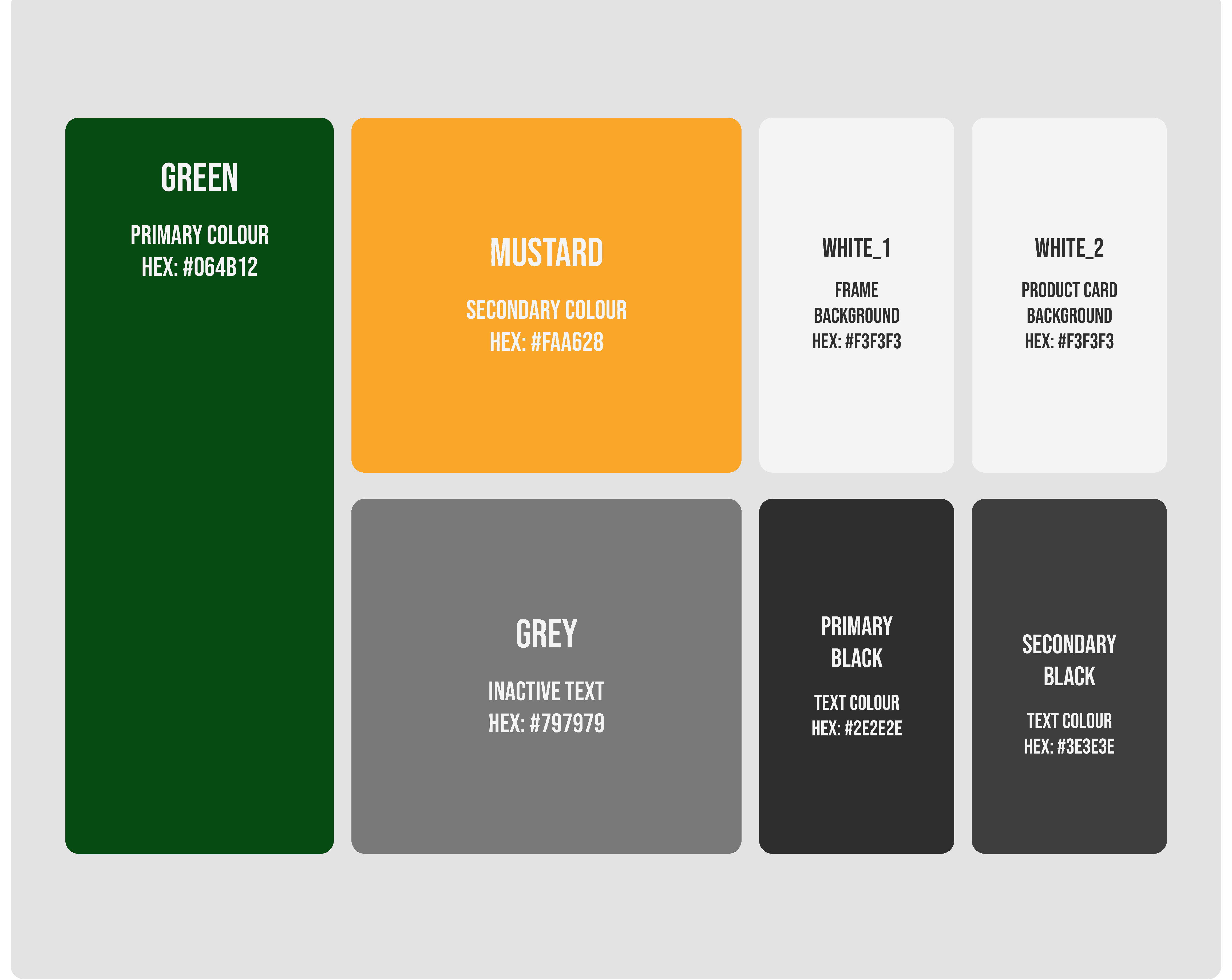
Color Strategy
Green was used as the primary brand color to reinforce trust, growth, and commerce, while mustard highlighted key actions and important touchpoints across the experience.
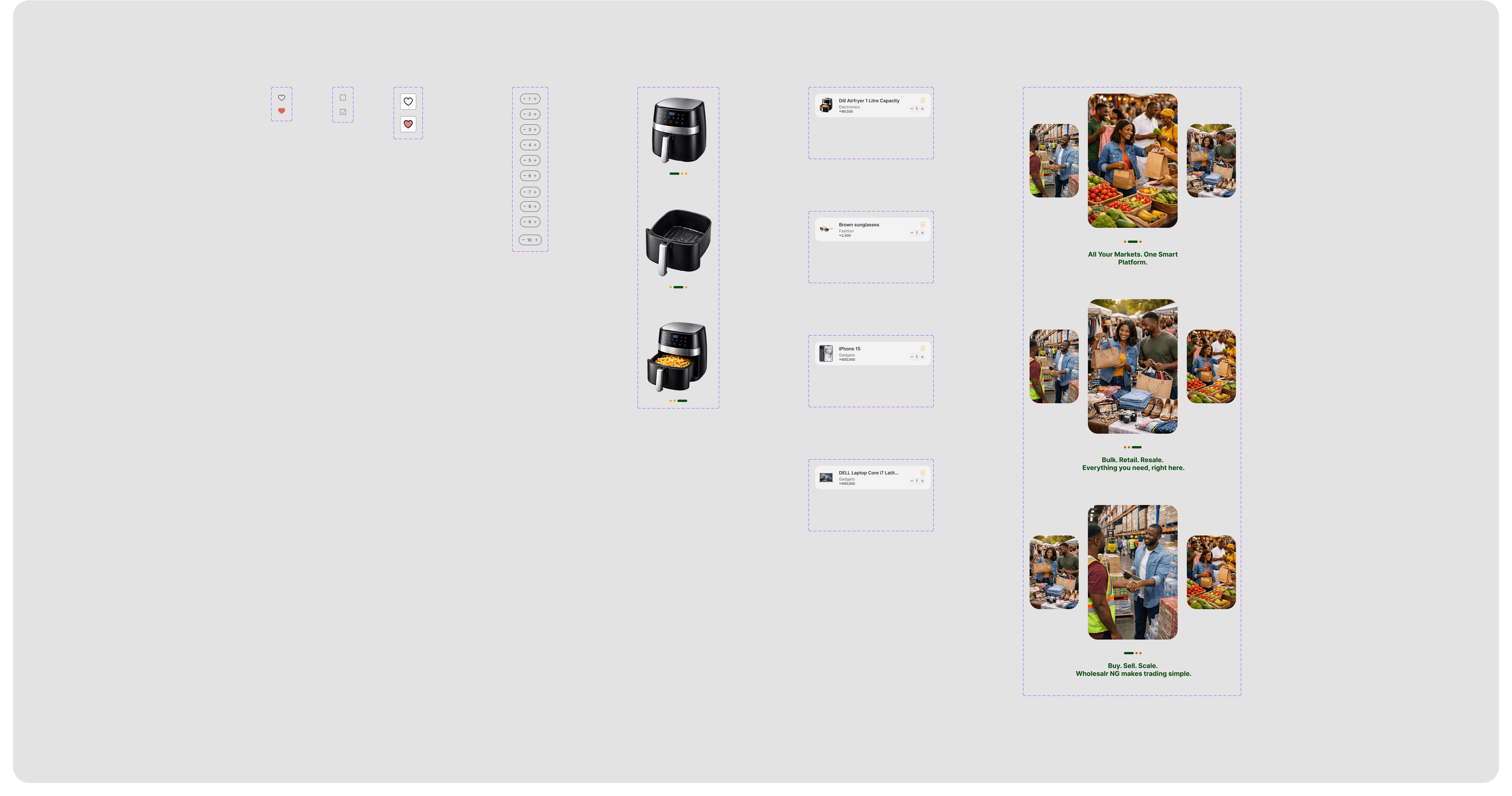
Component Thinking
The interface was built using reusable and scalable components, including standardized inputs, flexible category pills, consistent button styles, and adaptable product cards.
This ensured the platform could scale across new products, vendors, and features without redesigning the core experience.
STYLE GUIDE
Colours
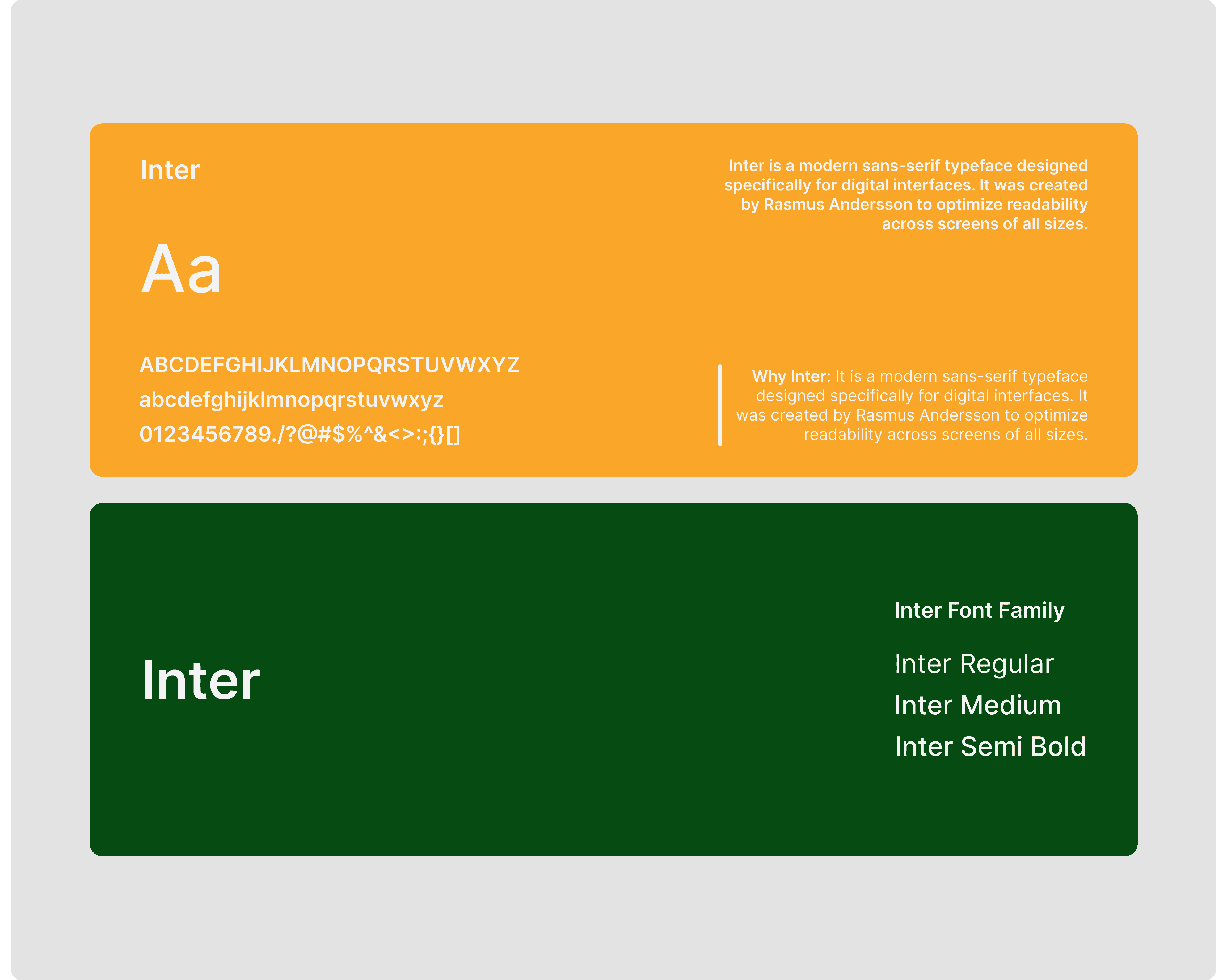
Typography
COMPONENTS
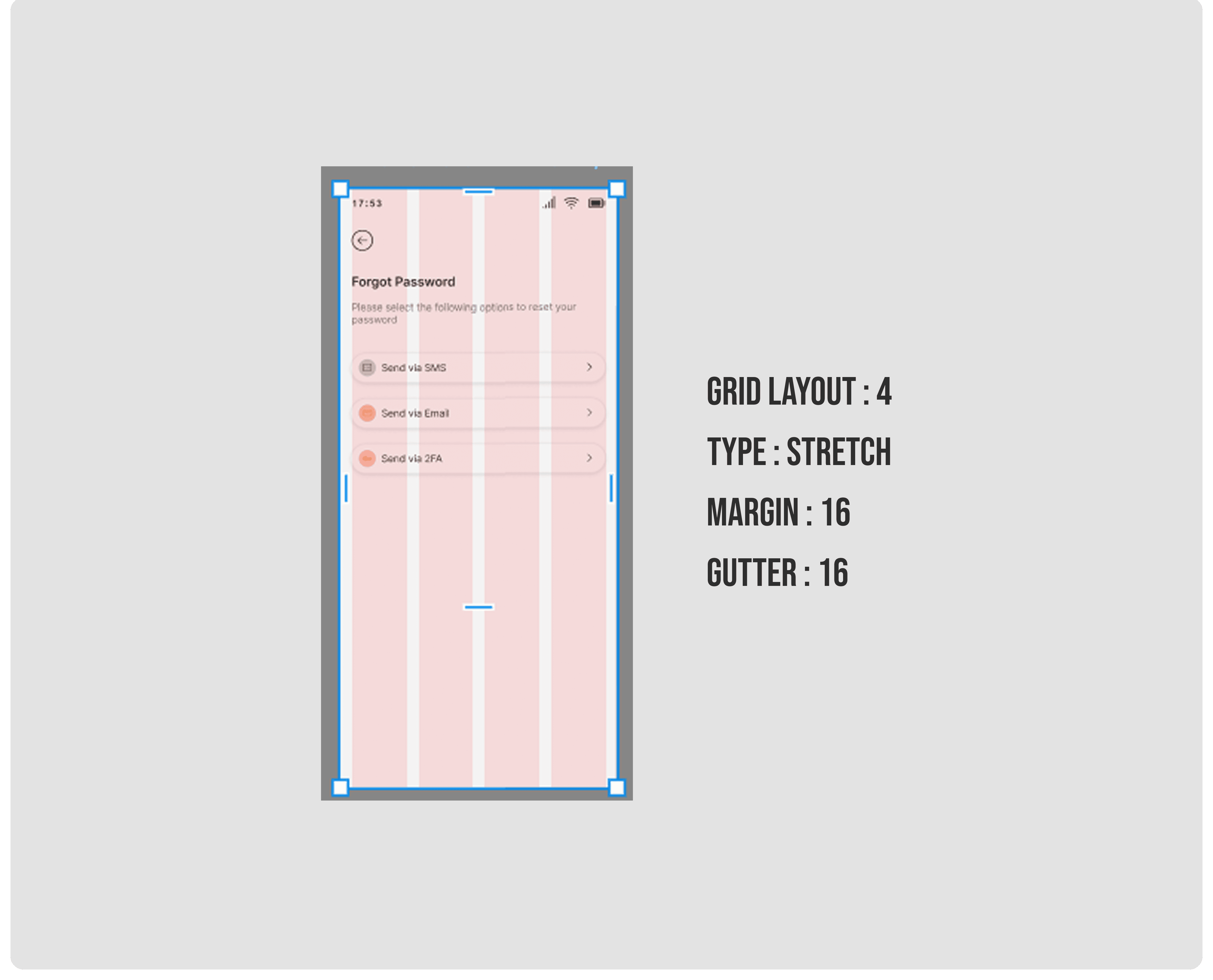
SPACING AND LAYOUT
High-Fidelity Mockups
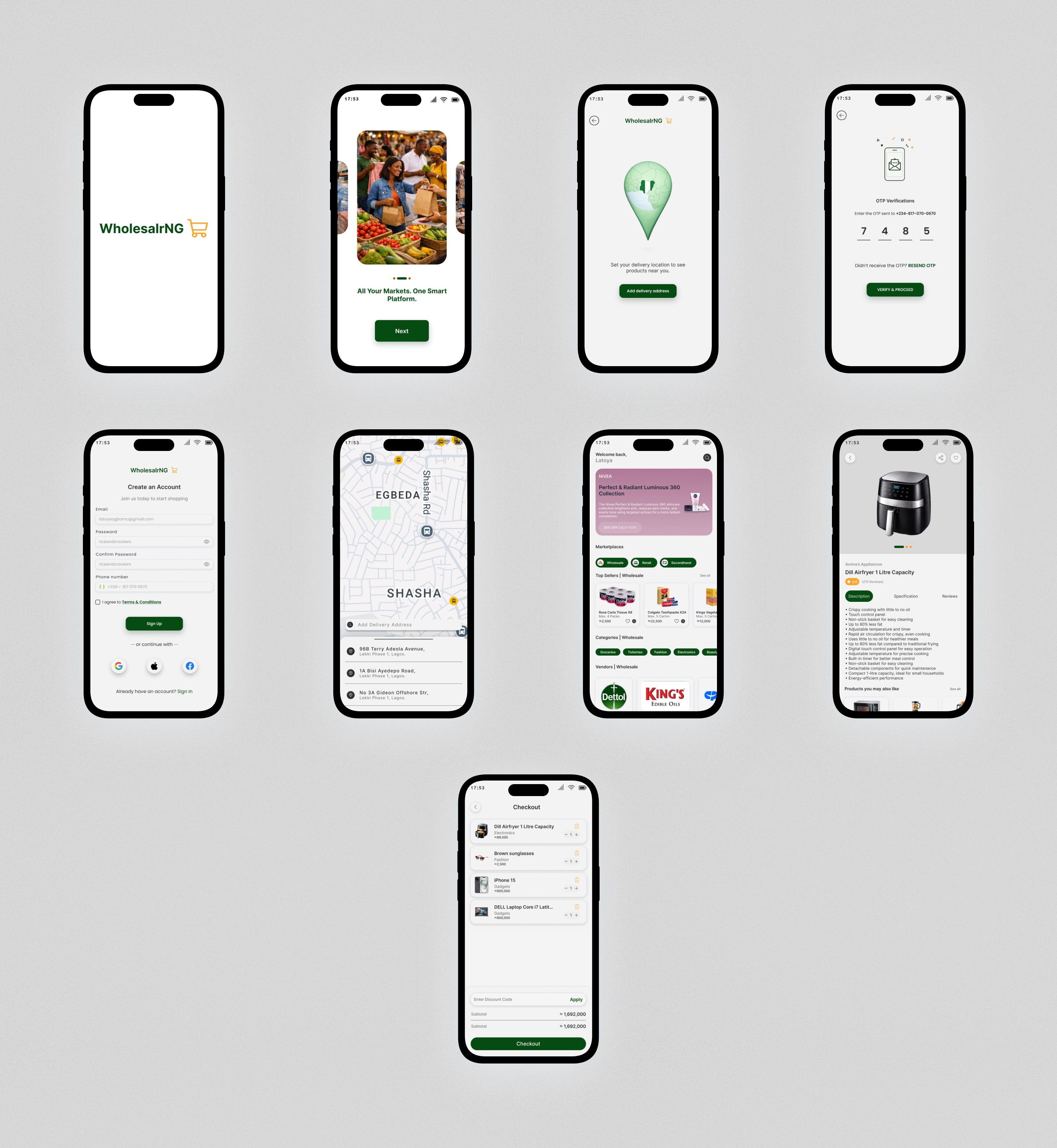
The high-fidelity designs translated earlier UX decisions into a polished and intuitive commerce experience.
Homepage - Designed to help users quickly choose between wholesale, retail, and secondhand marketplaces through clear product grouping and marketplace segmentation.
Wishlist & Checkout - Simplified layouts, flexible quantity controls, and clear pricing structures were used to reduce checkout friction and cart abandonment.
Authentication - OTP verification and multiple recovery options improved accessibility, trust, and account security.
Location System - Location-based flows tailored product availability and delivery experiences to the user’s area.
Product Detail Screens - Product information was organized into clear sections with strong visual emphasis and accessible CTAs to support faster purchase decisions.
Result & Impact
The design consolidated three separate commerce experiences into one coherent product. Usability testing showed that users could navigate between market types without confusion, and the trust signals built into the vendor and checkout flows significantly reduced hesitation during purchase decisions.
Product-Level Impact
The redesign focused on intent-driven navigation, a frictionless checkout, and trust signals built into every key touchpoint, all within a single product that comfortably serves three very different types of buyers.
Key Product Design Learnings
Designing for Nigeria meant unlearning global UX defaults and letting context lead. Trust has to be designed in, not assumed, and in a product this layered, simplicity is never free. It has to be earned through decisions about what not to build.
Designing WholesalrNG meant learning to hold three very different user mindsets at once. The bulk buyer, the bargain hunter, and the casual shopper all needed to feel at home on the same screen. That tension is what made this project interesting, and the solution was clarity: give everyone a clear path and get out of the way.
More Projects


New release
Preview
E-commerce
Wholesalr NG
Wholesalr NG is a multi-marketplace e-commerce platform that brings wholesale, retail, and secondhand buying and selling into one seamless experience. Built for businesses, resellers, and everyday shoppers, it simplifies how Nigerians discover, buy, and sell products across different markets.
Year :
2025
Industry :
E-Commerce
Client :
Wholesalr NG
Project Duration :
Ongoing
Problem :
The problem went beyond “shopping convenience.” Nigerian buyers constantly move between wholesale markets, retail platforms, and secondhand channels depending on their needs, yet these experiences remain disconnected.
Research revealed five major pain points:
Fragmented platforms - Users switch between different apps and physical markets with no seamless experience.
Low trust in secondhand commerce - Buyers struggle with uncertainty around product quality and seller reliability.
Poor support for wholesale buyers - Existing platforms are largely optimized for individual shoppers, not bulk purchasing.
Checkout flows ignore local realities - Delivery logistics, payment preferences, and pricing transparency are often overlooked.
Weak location awareness - Buyers rarely know what products are actually available near them or how quickly they can arrive.
These issues highlighted a larger gap: existing commerce platforms were not designed around how Nigerians actually buy and sell.
Solution Strategy:
The goal was not to create another generic e-commerce app, but to design a platform that reflects how Nigerians actually shop across wholesale, retail, and secondhand markets.
The solution focused on creating a flexible multi-marketplace experience built around user intent.
Key product decisions included:
Intent-first experience - Users choose whether they want to shop wholesale, retail, or secondhand, allowing the platform to adapt to their needs instantly.
Location-aware shopping - Product availability, delivery options, and recommendations are tailored to the user’s location.
Unified marketplace system - Despite serving different shopping contexts, core actions like cart, wishlist, and checkout remain consistent across the platform.
Trust-focused interactions - OTP verification, structured listings, and seller ratings help improve confidence in secondhand and wholesale transactions.
Simplified checkout flows - Reduced friction through faster add-to-cart actions and a more streamlined checkout experience.
These decisions directly addressed the key friction points uncovered during research and helped create a more seamless commerce experience for Nigerian users.
Design Decision Process
This was not a straight line from brief to solution. The process was iterative, shaped by real constraints, and required revisiting assumptions more than once.
Discovery
The design process was highly iterative and shaped by real user behavior rather than assumptions.
Early research revealed two major insights:
Shopping behavior changes by context - Wholesale buyers, retail shoppers, and secondhand users all define value differently, making a one-size-fits-all experience ineffective.
Trust varies across marketplaces - Users approach secondhand purchases with far more caution than standard retail transactions, requiring stronger trust signals within the experience.
These findings became foundational in shaping how the platform adapted to different shopping intents and user expectations.
Problem Definition
Instead of designing for “users,” I defined 3 behavioral modes:
Mode | Need | Risk |
|---|---|---|
Wholesale Buyer | Bulk efficiency | Pricing clarity |
Retail Buyer | Convenience | Speed |
Resale Buyer | Trust | Authenticity |
This directly influenced the information architecture
Ideation
A major design decision was whether the platform should function as one app or three separate marketplace experiences.
The final solution was a unified system with dedicated entry points for wholesale, retail, and secondhand shopping, allowing the experience to adapt based on user intent.
Validation
Validation focused on heuristic evaluation and UX best practices to reduce cognitive load and improve navigation clarity. Familiar UI patterns such as cards, tabs, and bottom navigation were used to create an experience that felt intuitive and easy to navigate, even for less frequent digital shoppers.
EMPATHY MAP
USER PERSONA
User Flow
The user flow focused on key decision points rather than just screen transitions.
Authentication Flow
Users move through a simplified sign-up, sign-in, and OTP verification process, with separate recovery paths for forgotten passwords to reduce friction during onboarding.
Location Flow
Users set a delivery location early in the experience, allowing product availability, delivery estimates, and pricing to adapt based on their location.
Discovery Flow
Users choose between wholesale, retail, or secondhand marketplaces, then browse categories, explore products, and save or purchase items through a streamlined discovery experience.
WHOLESALRNG USER FLOW Diagram
MID-FIDELITY Wireframes (Intent Before Aesthetics)
The wireframes focused on usability before aesthetics, ensuring users could quickly understand each screen and its available actions.
Three core principles guided the layouts:
Clear information hierarchy
Obvious interaction patterns
Consistent structure across all marketplace modes
Key design decisions included:
Persistent bottom navigation for easier orientation
Card-based layouts for scalable product browsing
Marketplace chips for quick switching between shopping modes
Thumb-friendly CTA placement to improve mobile usability
Design System (System Thinking)
The design system was built with scalability and consistency in mind, ensuring the product could grow without constantly redesigning components or user flows.
Color Strategy
Green was used as the primary brand color to reinforce trust, growth, and commerce, while mustard highlighted key actions and important touchpoints across the experience.
Component Thinking
The interface was built using reusable and scalable components, including standardized inputs, flexible category pills, consistent button styles, and adaptable product cards.
This ensured the platform could scale across new products, vendors, and features without redesigning the core experience.
STYLE GUIDE
Colours
Typography
COMPONENTS
SPACING AND LAYOUT
High-Fidelity Mockups
The high-fidelity designs translated earlier UX decisions into a polished and intuitive commerce experience.
Homepage - Designed to help users quickly choose between wholesale, retail, and secondhand marketplaces through clear product grouping and marketplace segmentation.
Wishlist & Checkout - Simplified layouts, flexible quantity controls, and clear pricing structures were used to reduce checkout friction and cart abandonment.
Authentication - OTP verification and multiple recovery options improved accessibility, trust, and account security.
Location System - Location-based flows tailored product availability and delivery experiences to the user’s area.
Product Detail Screens - Product information was organized into clear sections with strong visual emphasis and accessible CTAs to support faster purchase decisions.
Result & Impact
The design consolidated three separate commerce experiences into one coherent product. Usability testing showed that users could navigate between market types without confusion, and the trust signals built into the vendor and checkout flows significantly reduced hesitation during purchase decisions.
Product-Level Impact
The redesign focused on intent-driven navigation, a frictionless checkout, and trust signals built into every key touchpoint, all within a single product that comfortably serves three very different types of buyers.
Key Product Design Learnings
Designing for Nigeria meant unlearning global UX defaults and letting context lead. Trust has to be designed in, not assumed, and in a product this layered, simplicity is never free. It has to be earned through decisions about what not to build.
Designing WholesalrNG meant learning to hold three very different user mindsets at once. The bulk buyer, the bargain hunter, and the casual shopper all needed to feel at home on the same screen. That tension is what made this project interesting, and the solution was clarity: give everyone a clear path and get out of the way.
More Projects
New release
Preview
E-commerce
Wholesalr NG
Wholesalr NG is a multi-marketplace e-commerce platform that brings wholesale, retail, and secondhand buying and selling into one seamless experience. Built for businesses, resellers, and everyday shoppers, it simplifies how Nigerians discover, buy, and sell products across different markets.
Year :
2025
Industry :
E-Commerce
Client :
Wholesalr NG
Project Duration :
Ongoing
Problem :
The problem went beyond “shopping convenience.” Nigerian buyers constantly move between wholesale markets, retail platforms, and secondhand channels depending on their needs, yet these experiences remain disconnected.
Research revealed five major pain points:
Fragmented platforms - Users switch between different apps and physical markets with no seamless experience.
Low trust in secondhand commerce - Buyers struggle with uncertainty around product quality and seller reliability.
Poor support for wholesale buyers - Existing platforms are largely optimized for individual shoppers, not bulk purchasing.
Checkout flows ignore local realities - Delivery logistics, payment preferences, and pricing transparency are often overlooked.
Weak location awareness - Buyers rarely know what products are actually available near them or how quickly they can arrive.
These issues highlighted a larger gap: existing commerce platforms were not designed around how Nigerians actually buy and sell.
Solution Strategy:
The goal was not to create another generic e-commerce app, but to design a platform that reflects how Nigerians actually shop across wholesale, retail, and secondhand markets.
The solution focused on creating a flexible multi-marketplace experience built around user intent.
Key product decisions included:
Intent-first experience - Users choose whether they want to shop wholesale, retail, or secondhand, allowing the platform to adapt to their needs instantly.
Location-aware shopping - Product availability, delivery options, and recommendations are tailored to the user’s location.
Unified marketplace system - Despite serving different shopping contexts, core actions like cart, wishlist, and checkout remain consistent across the platform.
Trust-focused interactions - OTP verification, structured listings, and seller ratings help improve confidence in secondhand and wholesale transactions.
Simplified checkout flows - Reduced friction through faster add-to-cart actions and a more streamlined checkout experience.
These decisions directly addressed the key friction points uncovered during research and helped create a more seamless commerce experience for Nigerian users.
Design Decision Process
This was not a straight line from brief to solution. The process was iterative, shaped by real constraints, and required revisiting assumptions more than once.
Discovery
The design process was highly iterative and shaped by real user behavior rather than assumptions.
Early research revealed two major insights:
Shopping behavior changes by context - Wholesale buyers, retail shoppers, and secondhand users all define value differently, making a one-size-fits-all experience ineffective.
Trust varies across marketplaces - Users approach secondhand purchases with far more caution than standard retail transactions, requiring stronger trust signals within the experience.
These findings became foundational in shaping how the platform adapted to different shopping intents and user expectations.
Problem Definition
Instead of designing for “users,” I defined 3 behavioral modes:
Mode | Need | Risk |
|---|---|---|
Wholesale Buyer | Bulk efficiency | Pricing clarity |
Retail Buyer | Convenience | Speed |
Resale Buyer | Trust | Authenticity |
This directly influenced the information architecture
Ideation
A major design decision was whether the platform should function as one app or three separate marketplace experiences.
The final solution was a unified system with dedicated entry points for wholesale, retail, and secondhand shopping, allowing the experience to adapt based on user intent.
Validation
Validation focused on heuristic evaluation and UX best practices to reduce cognitive load and improve navigation clarity. Familiar UI patterns such as cards, tabs, and bottom navigation were used to create an experience that felt intuitive and easy to navigate, even for less frequent digital shoppers.
EMPATHY MAP
USER PERSONA
User Flow
The user flow focused on key decision points rather than just screen transitions.
Authentication Flow
Users move through a simplified sign-up, sign-in, and OTP verification process, with separate recovery paths for forgotten passwords to reduce friction during onboarding.
Location Flow
Users set a delivery location early in the experience, allowing product availability, delivery estimates, and pricing to adapt based on their location.
Discovery Flow
Users choose between wholesale, retail, or secondhand marketplaces, then browse categories, explore products, and save or purchase items through a streamlined discovery experience.
WHOLESALRNG USER FLOW Diagram
MID-FIDELITY Wireframes (Intent Before Aesthetics)
The wireframes focused on usability before aesthetics, ensuring users could quickly understand each screen and its available actions.
Three core principles guided the layouts:
Clear information hierarchy
Obvious interaction patterns
Consistent structure across all marketplace modes
Key design decisions included:
Persistent bottom navigation for easier orientation
Card-based layouts for scalable product browsing
Marketplace chips for quick switching between shopping modes
Thumb-friendly CTA placement to improve mobile usability
Design System (System Thinking)
The design system was built with scalability and consistency in mind, ensuring the product could grow without constantly redesigning components or user flows.
Color Strategy
Green was used as the primary brand color to reinforce trust, growth, and commerce, while mustard highlighted key actions and important touchpoints across the experience.
Component Thinking
The interface was built using reusable and scalable components, including standardized inputs, flexible category pills, consistent button styles, and adaptable product cards.
This ensured the platform could scale across new products, vendors, and features without redesigning the core experience.
STYLE GUIDE
Colours
Typography
COMPONENTS
SPACING AND LAYOUT
High-Fidelity Mockups
The high-fidelity designs translated earlier UX decisions into a polished and intuitive commerce experience.
Homepage - Designed to help users quickly choose between wholesale, retail, and secondhand marketplaces through clear product grouping and marketplace segmentation.
Wishlist & Checkout - Simplified layouts, flexible quantity controls, and clear pricing structures were used to reduce checkout friction and cart abandonment.
Authentication - OTP verification and multiple recovery options improved accessibility, trust, and account security.
Location System - Location-based flows tailored product availability and delivery experiences to the user’s area.
Product Detail Screens - Product information was organized into clear sections with strong visual emphasis and accessible CTAs to support faster purchase decisions.
Result & Impact
The design consolidated three separate commerce experiences into one coherent product. Usability testing showed that users could navigate between market types without confusion, and the trust signals built into the vendor and checkout flows significantly reduced hesitation during purchase decisions.
Product-Level Impact
The redesign focused on intent-driven navigation, a frictionless checkout, and trust signals built into every key touchpoint, all within a single product that comfortably serves three very different types of buyers.
Key Product Design Learnings
Designing for Nigeria meant unlearning global UX defaults and letting context lead. Trust has to be designed in, not assumed, and in a product this layered, simplicity is never free. It has to be earned through decisions about what not to build.
Designing WholesalrNG meant learning to hold three very different user mindsets at once. The bulk buyer, the bargain hunter, and the casual shopper all needed to feel at home on the same screen. That tension is what made this project interesting, and the solution was clarity: give everyone a clear path and get out of the way.
More Projects
New release
Preview