Artisan Acquisition
GIGNATION
Gignation is a mobile platform that helps users find and book trusted local artisans like electricians, plumbers, barbers, and cleaners. This redesign focused on improving key MVP user flows to create a clearer and more intuitive experience. My role involved identifying usability issues and redesigning critical screens to improve navigation and overall usability.
Year :
2026
Industry :
Gig Economy
Client :
Gignation
Project Duration :
Pending

PROBLEM :
From a product design perspective, the MVP had several usability and experience gaps:
Information hierarchy was weak, making it hard to scan content quickly
Booking states such as upcoming, ongoing, completed, and cancelled lacked clear distinction
Payment flow felt cluttered and slightly confusing for users adding cards
CTA buttons were inconsistent and sometimes unclear in intent
The home screen did not fully guide users toward quick action
These issues created friction in core user journeys such as booking, tracking, and managing services.
Solution :
The redesign focused on clarity, accessibility, and usability:
Improved hierarchy using spacing, typography, and card-based layouts
Clearly separated booking states with better labels and visual cues
Simplified the payment experience with structured input fields and card previews
Standardized CTAs for consistency and predictability
Made the home screen more action-driven with clearer categories and service highlights
The result is a more intuitive experience that helps users complete tasks faster with less confusion.

DESIGN PROCESS :

I approached this redesign with a user-first mindset, focusing on how real people interact with service-based platforms in Nigeria.
Steps Taken
Reviewed the MVP screens and identified friction points
Analyzed user behavior patterns for service booking apps
Defined key user goals and expectations
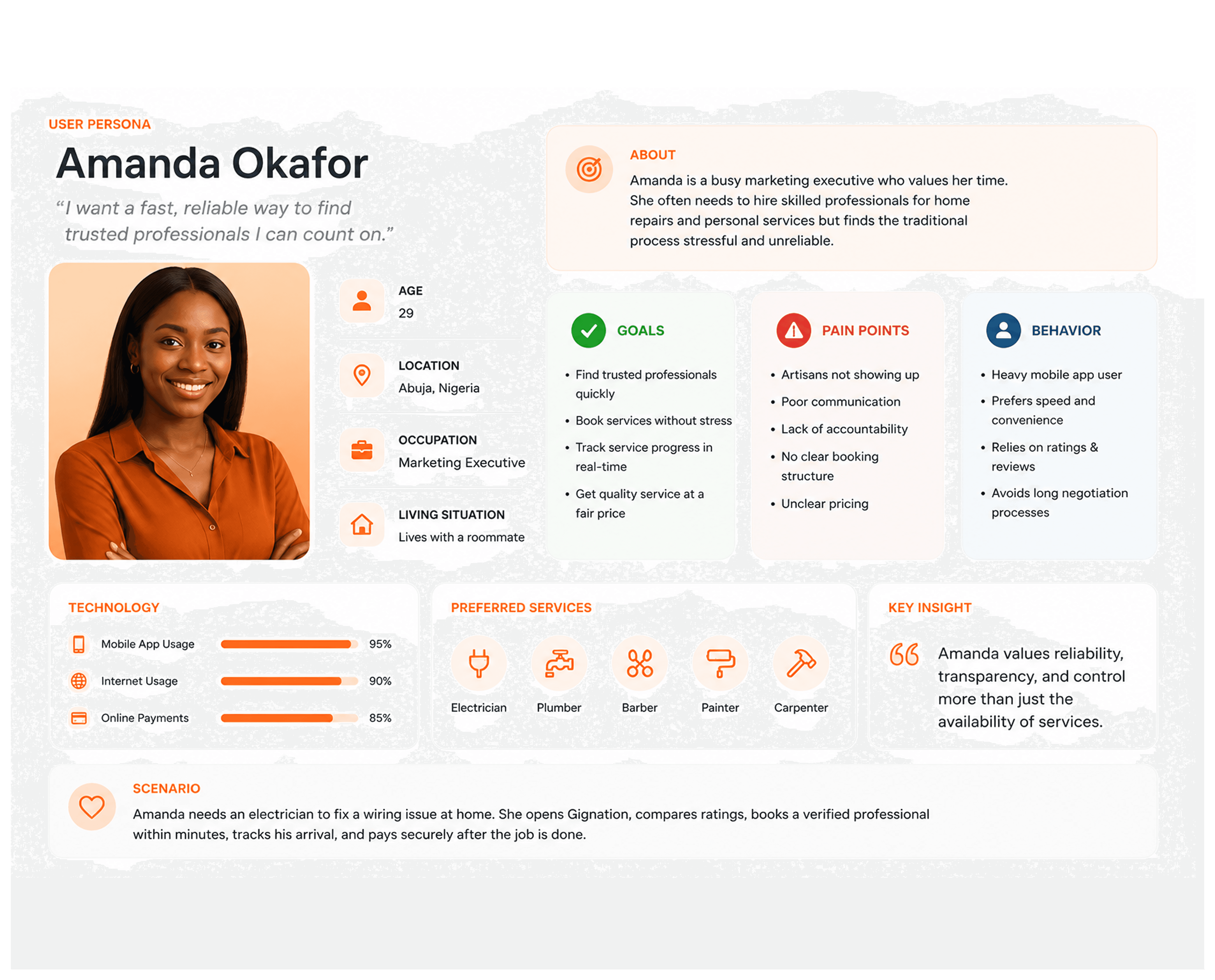
Created a user persona to guide decisions
Designed improved flows and layouts
Built wireframes before moving to high-fidelity screens
USER PERSONA :
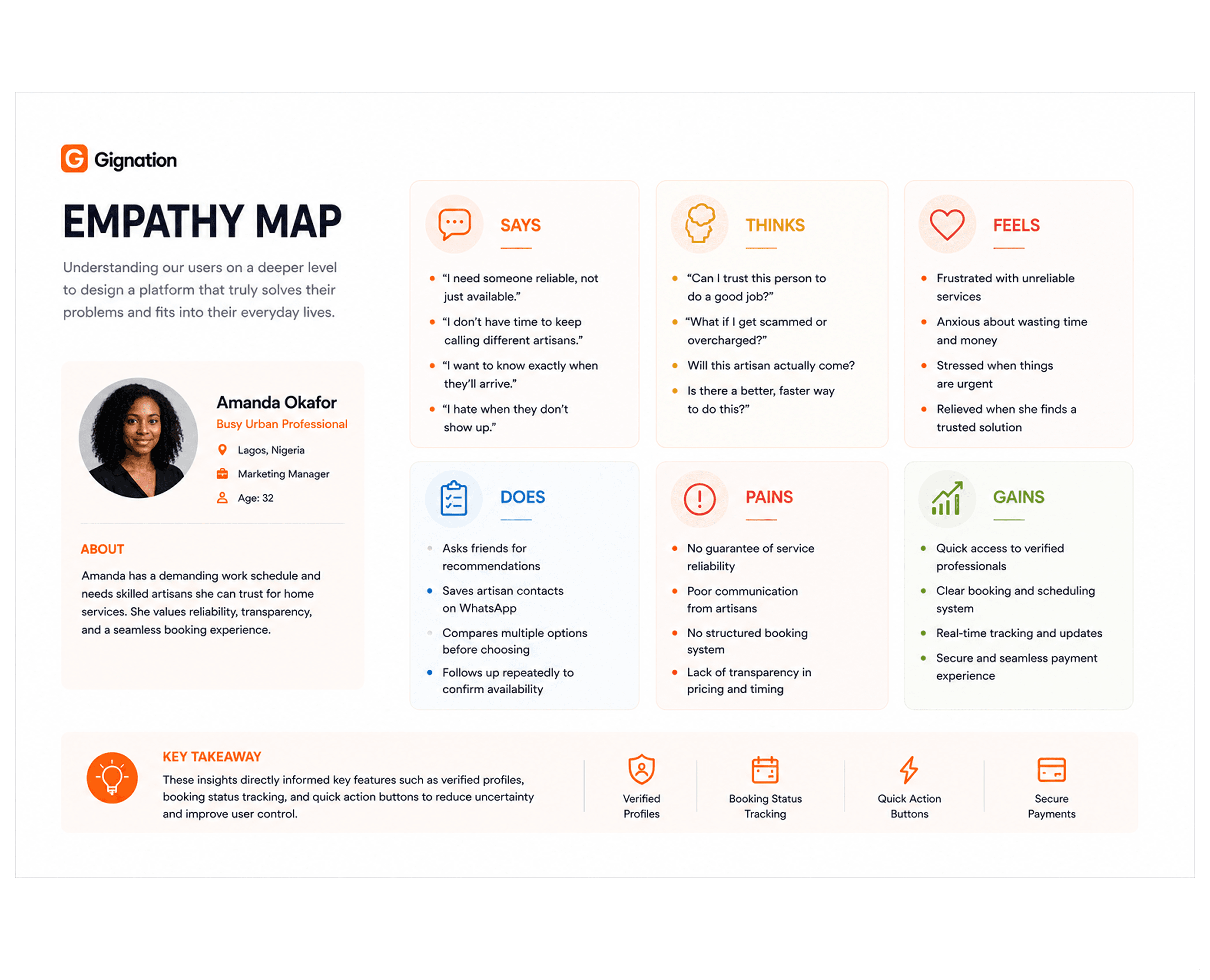
EMPATHY MAP:
USER-FLOW DIAGRAM:

The user flow diagram maps out the key paths users take to complete core tasks within the app. It was designed to ensure a smooth and logical progression from entry points to final actions, reducing friction and improving overall usability.
ITERATIONS :
This section highlights how the design evolved from the MVP to the final solution. Each change was driven by usability issues, clarity, and user experience improvements.
Home Screen
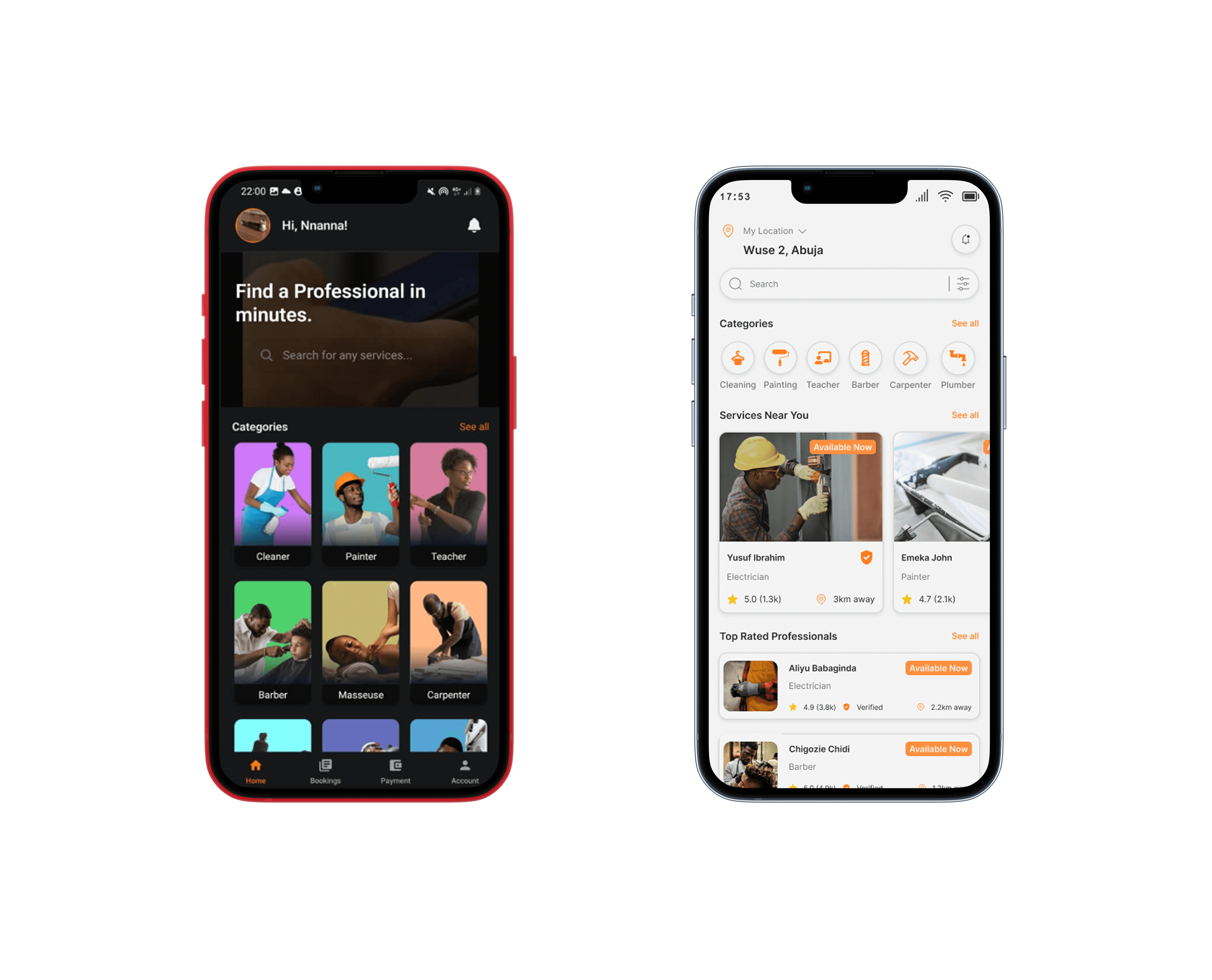
Before:
Categories were visually engaging but lacked structure
Search was not immediately prominent
Content felt more aesthetic than functional
After:
Introduced clearer hierarchy with sections like “Services Near You” and “Top Rated Professionals”
Search bar is now more visible and accessible
Cards redesigned to prioritize key information like rating, distance, and availability
Users typically come to this screen with intent. The redesign makes it easier to scan, decide, and act quickly.
Bookings (Upcoming, Ongoing, Completed, Cancelled)
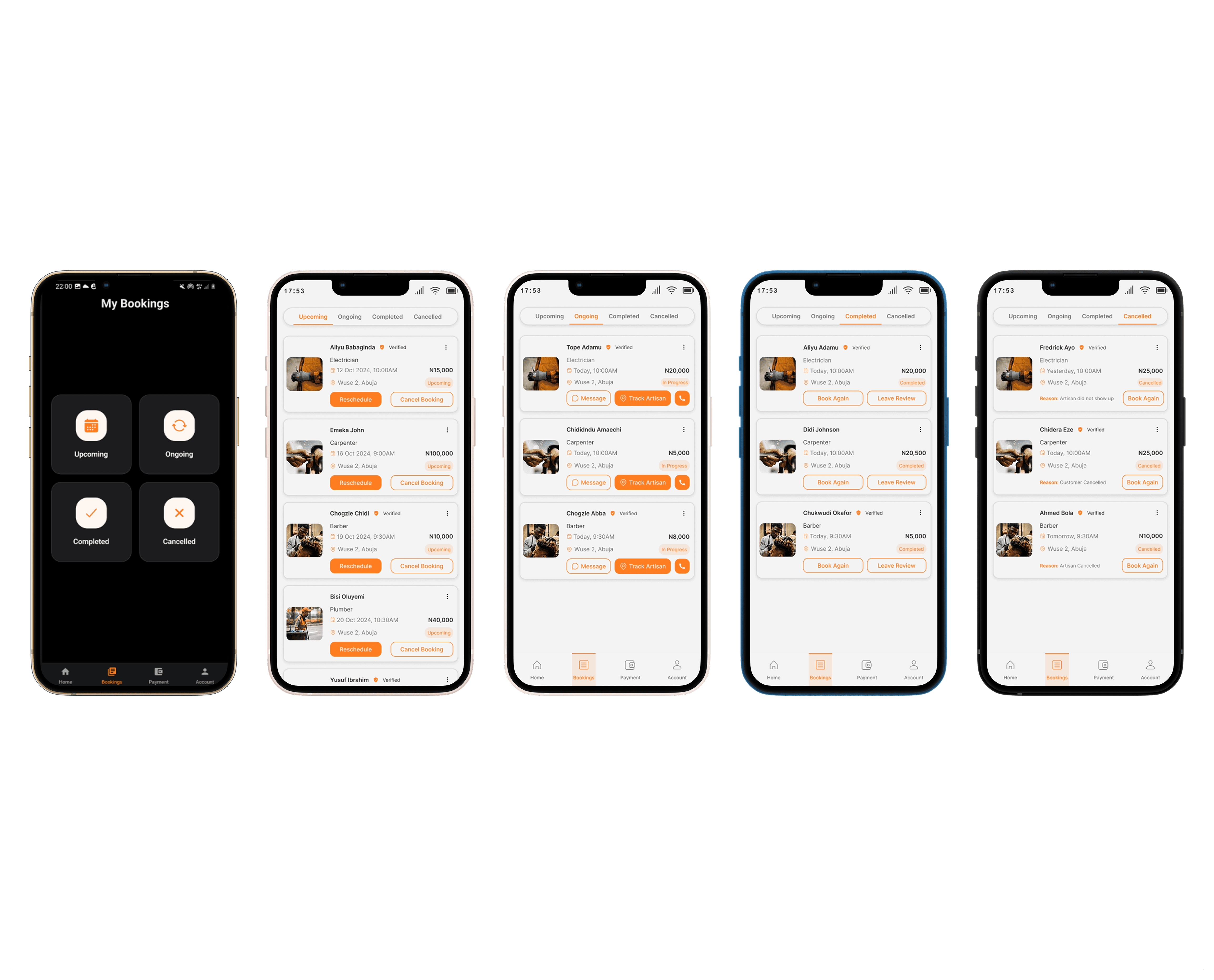
Before:
Booking states were not clearly differentiated
Actions were not always obvious
Information felt compressed and harder to scan
After:
Clear tabs for each booking state
Status tags like “Upcoming”, “In Progress”, “Completed”, “Cancelled” are more visible
Action buttons such as “Track Artisan”, “Book Again”, and “Leave Review” are clearly defined
Improved spacing and card layout
Users need quick clarity on what’s happening with their bookings. The redesign removes confusion and improves decision-making.
Payment Experience

Before:
Card management felt slightly cluttered
Input fields lacked strong visual guidance
Payment flow did not feel fully intuitive
After:
Cleaner card layout with better spacing
Live card preview improves user confidence
Structured form inputs for card details
Clear “Add Card” CTA and simplified interaction
Payments are sensitive. A clearer and more structured interface increases trust and reduces user hesitation.
Account / Profile
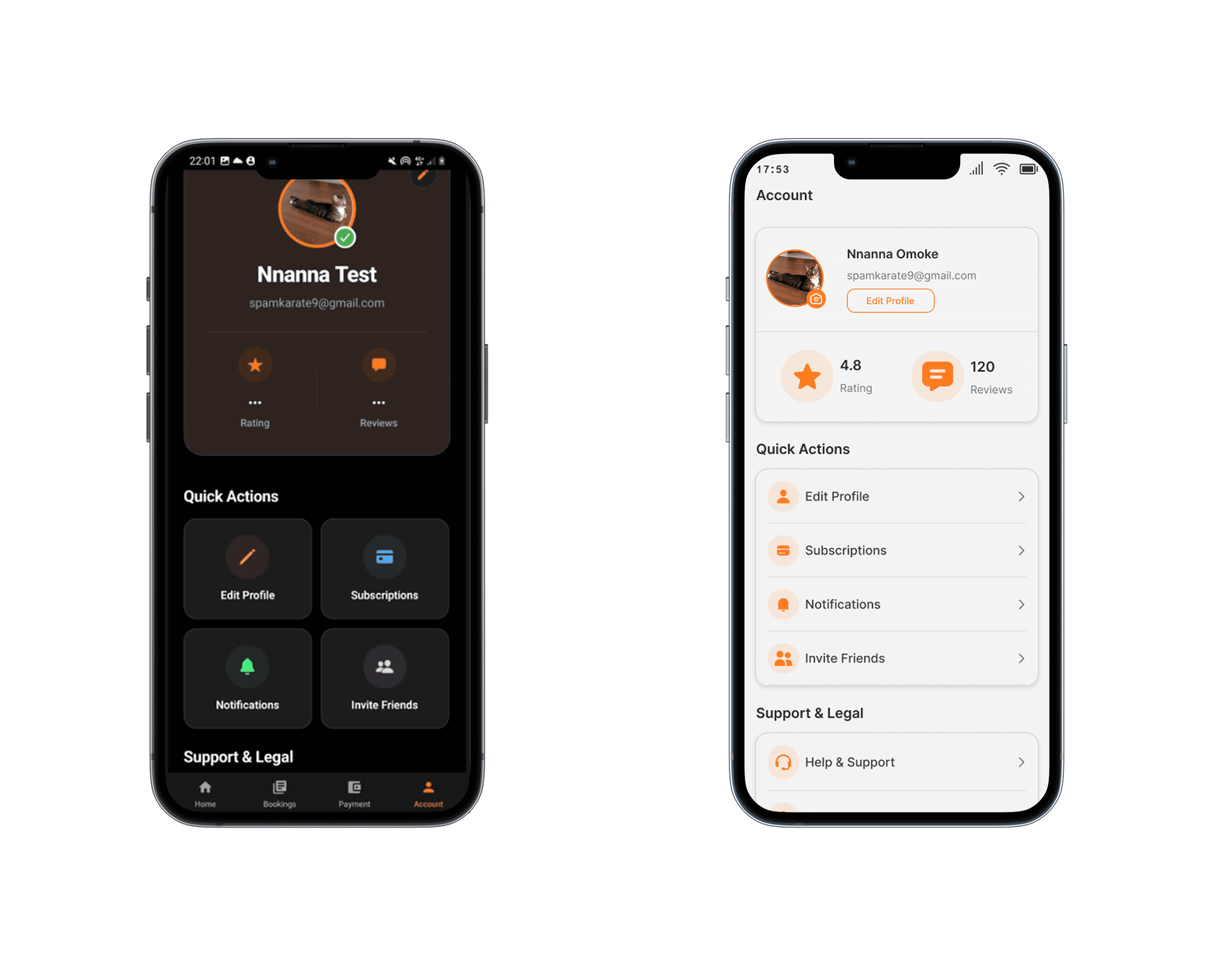
Before
Weak information hierarchy
Unstructured quick actions
Less intuitive navigation
After
Clear grouping for quick actions and support sections
Improved spacing and card organization
More prominent profile information
The redesign focused on making account management feel clearer, faster, and easier to navigate through better structure and reduced friction.
WIREFRAME
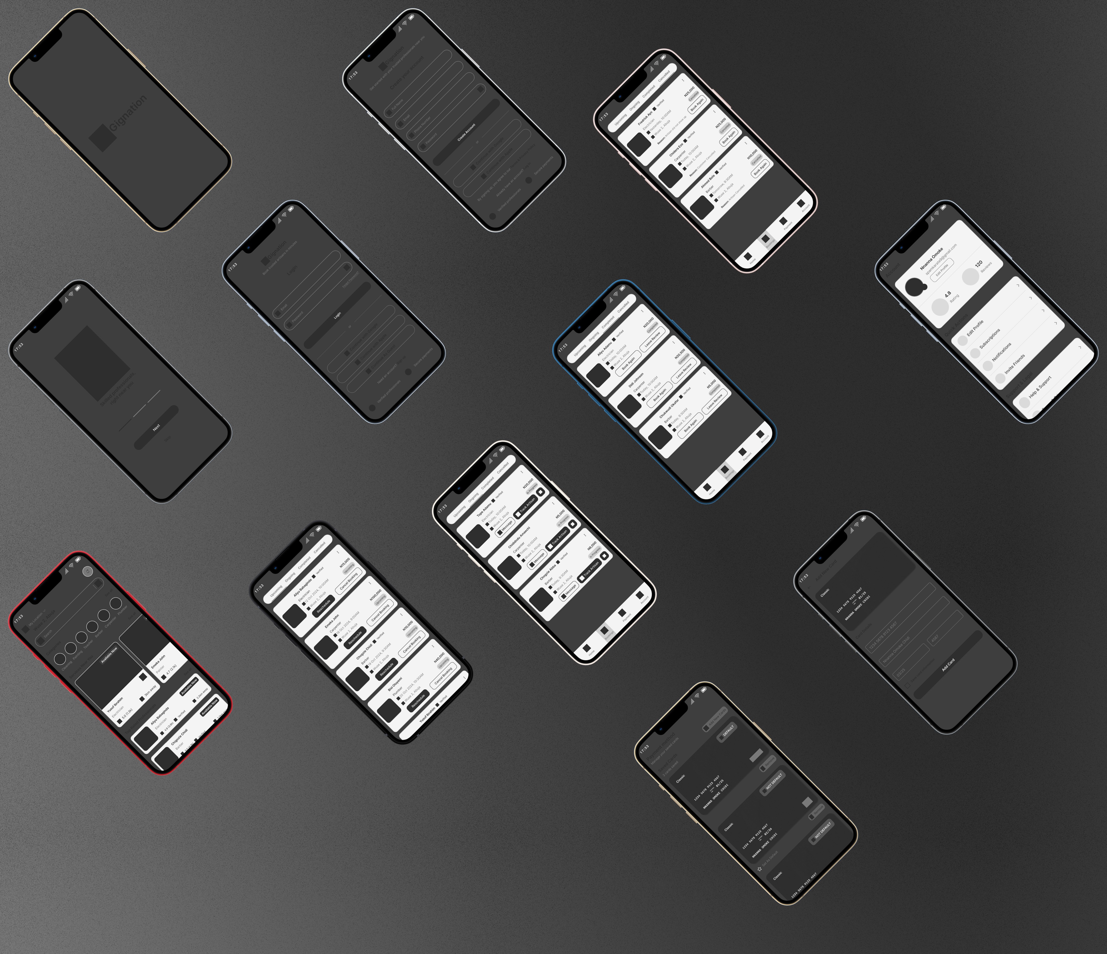
Mid-fidelity wireframes were created in Figma to validate information architecture and layout decisions before committing to visual design. The focus at this stage was structure, not aesthetics: where does the key content live on each screen, and how does the user move between states?
Design System (Style Guide)
Color Strategy
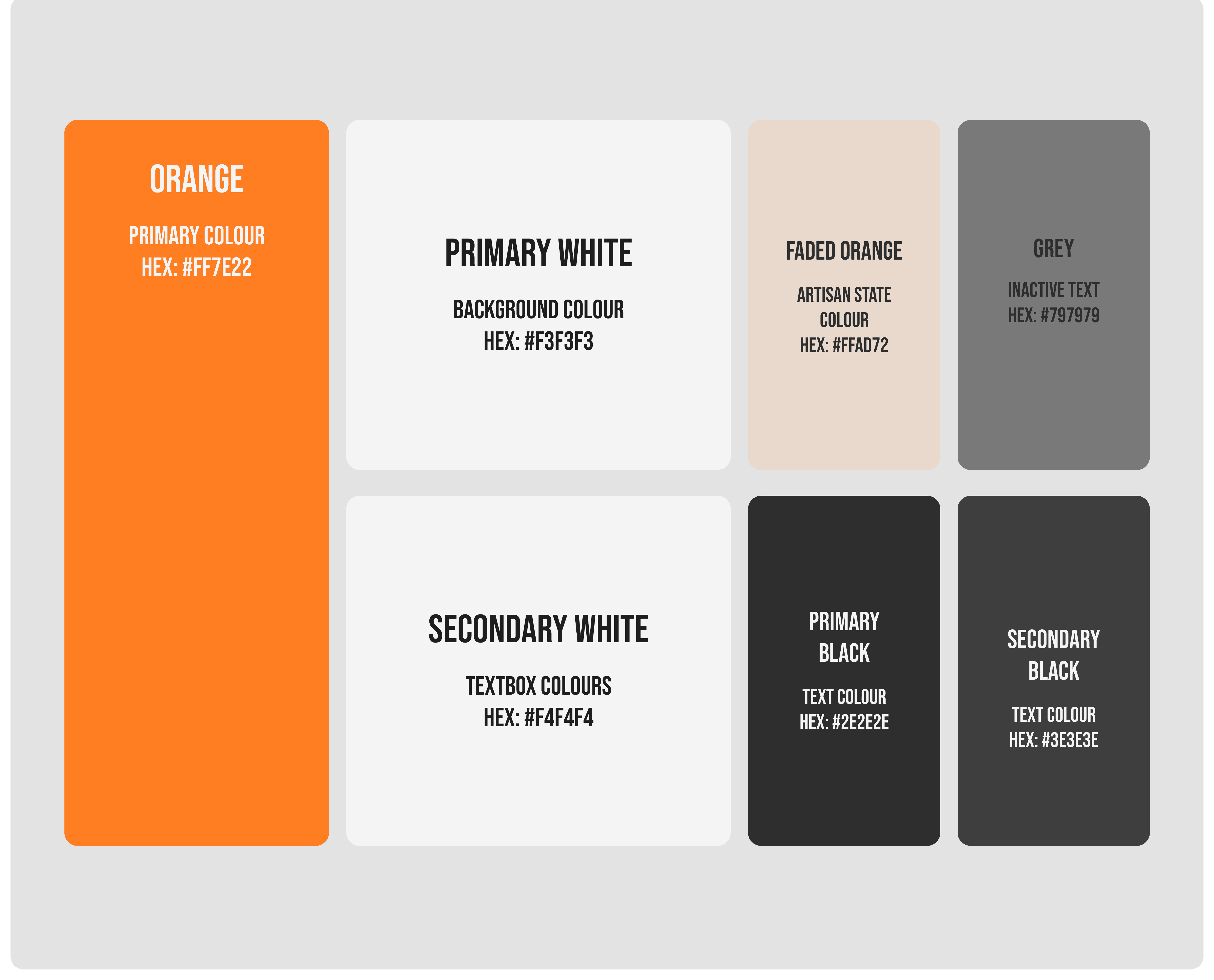
The redesign used color intentionally to create a more trustworthy and user-friendly experience, helping users focus on key actions while keeping the interface clean and easy to navigate.
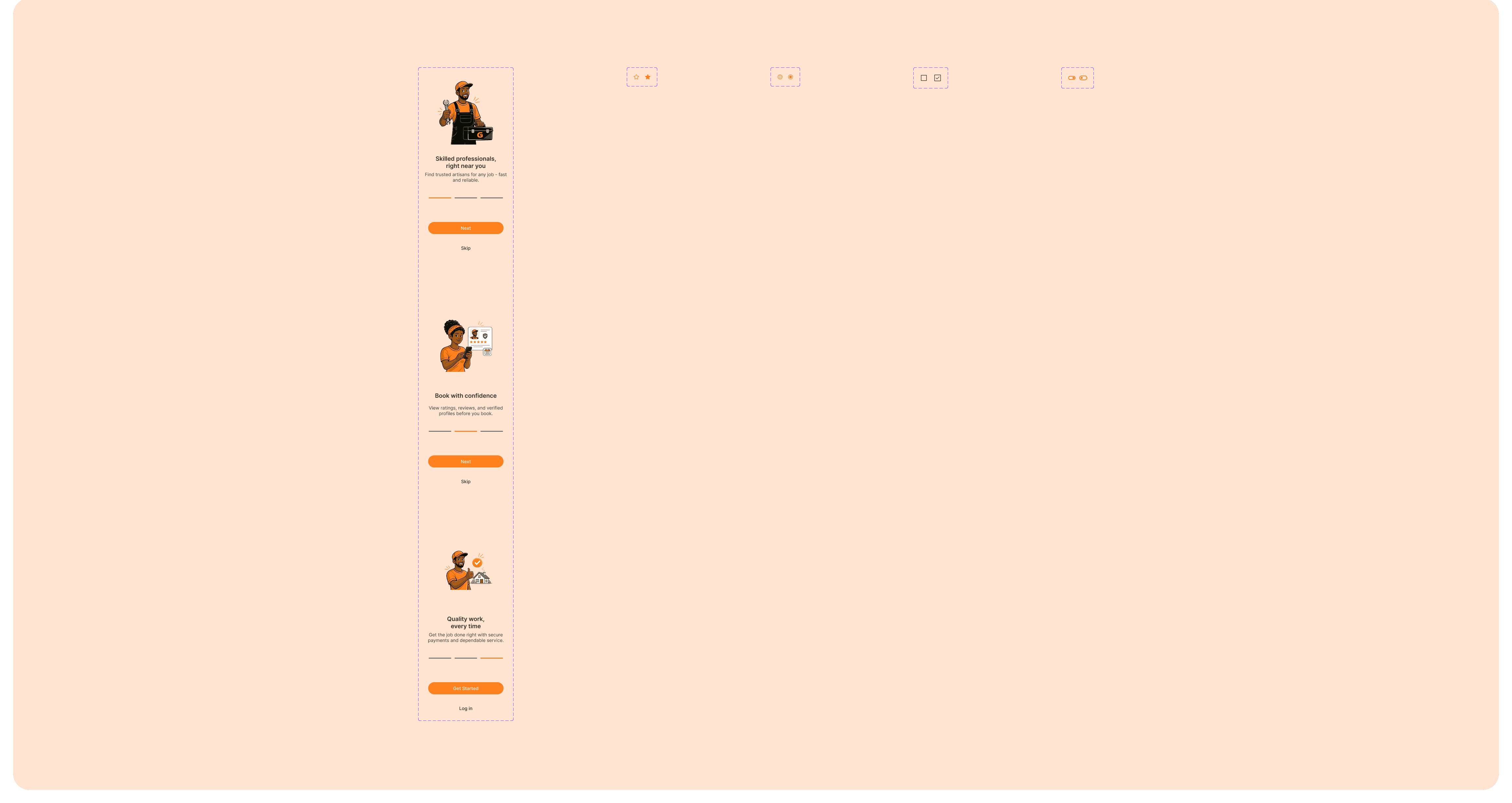
Component Thinking
A consistent component system was introduced using reusable cards, clear button hierarchies, defined booking statuses, and familiar icon patterns to improve usability and scalability.
The result is a more intuitive and predictable experience.
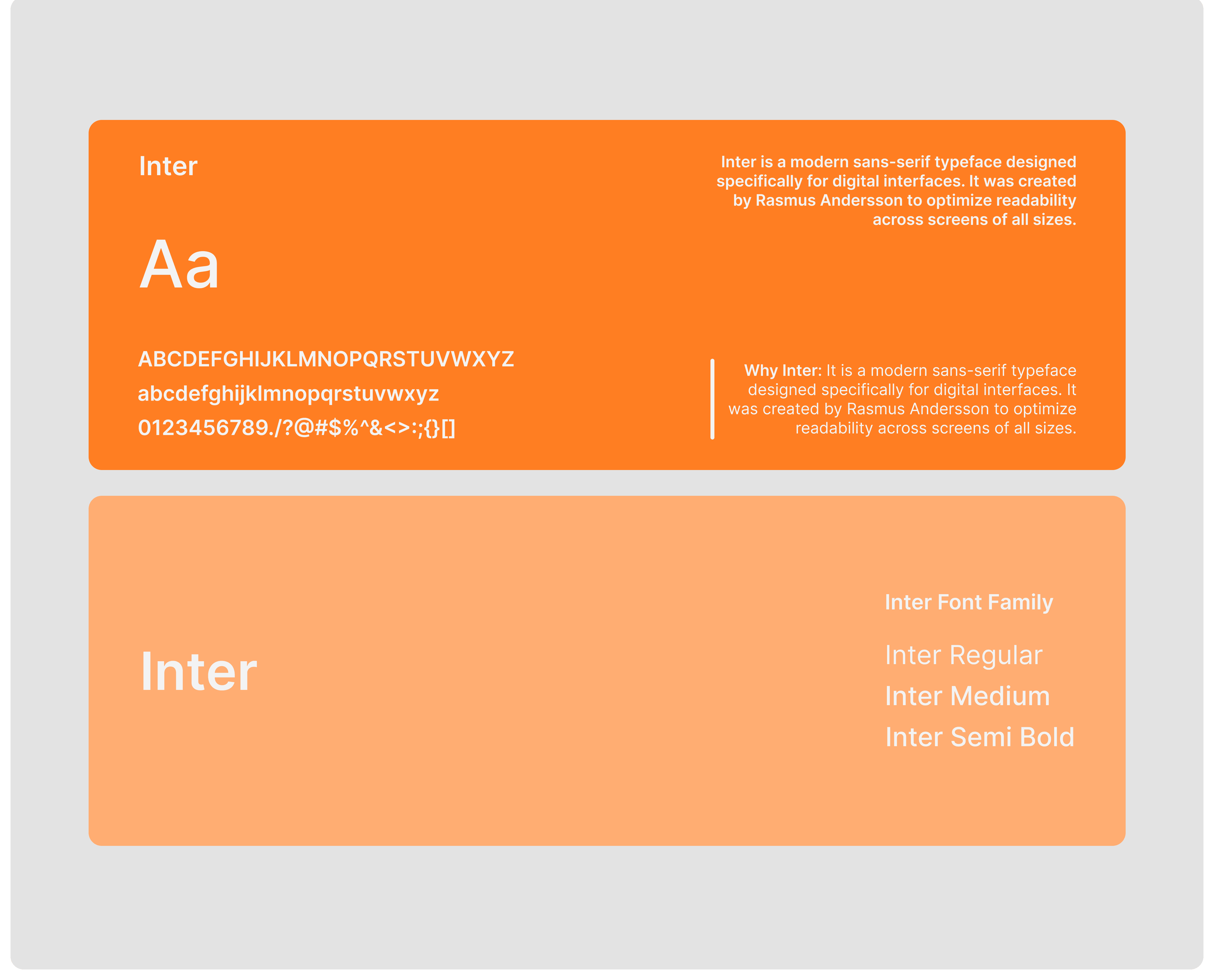
TYPOGRAPHY
COMPONENTS
SPACING & LAYOUT
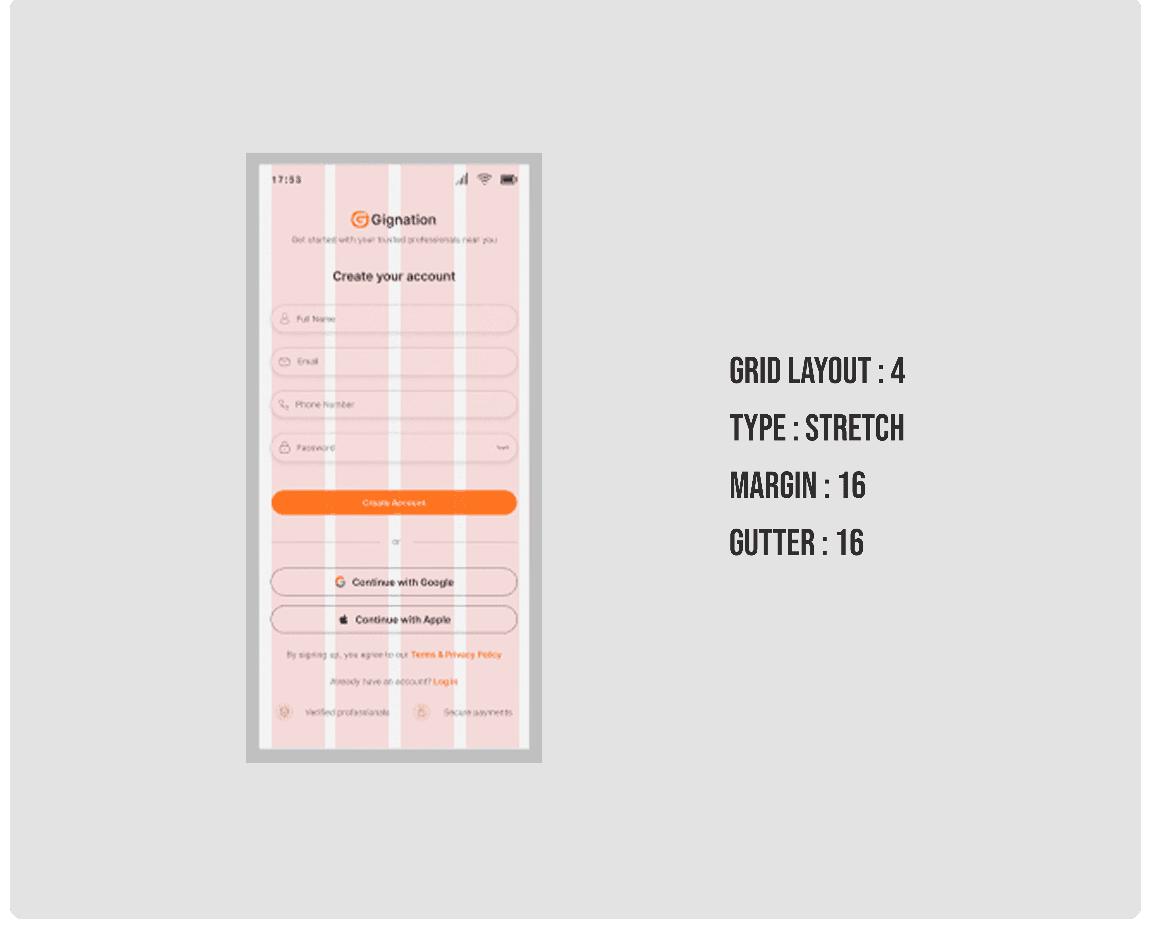
The redesign used generous spacing and a consistent grid system to reduce cognitive load and improve readability.
Clear separation between sections helped users scan content more easily, while predictable alignment created a cleaner and more trustworthy interface.
HIGH-FIDELITY MOCKUPS
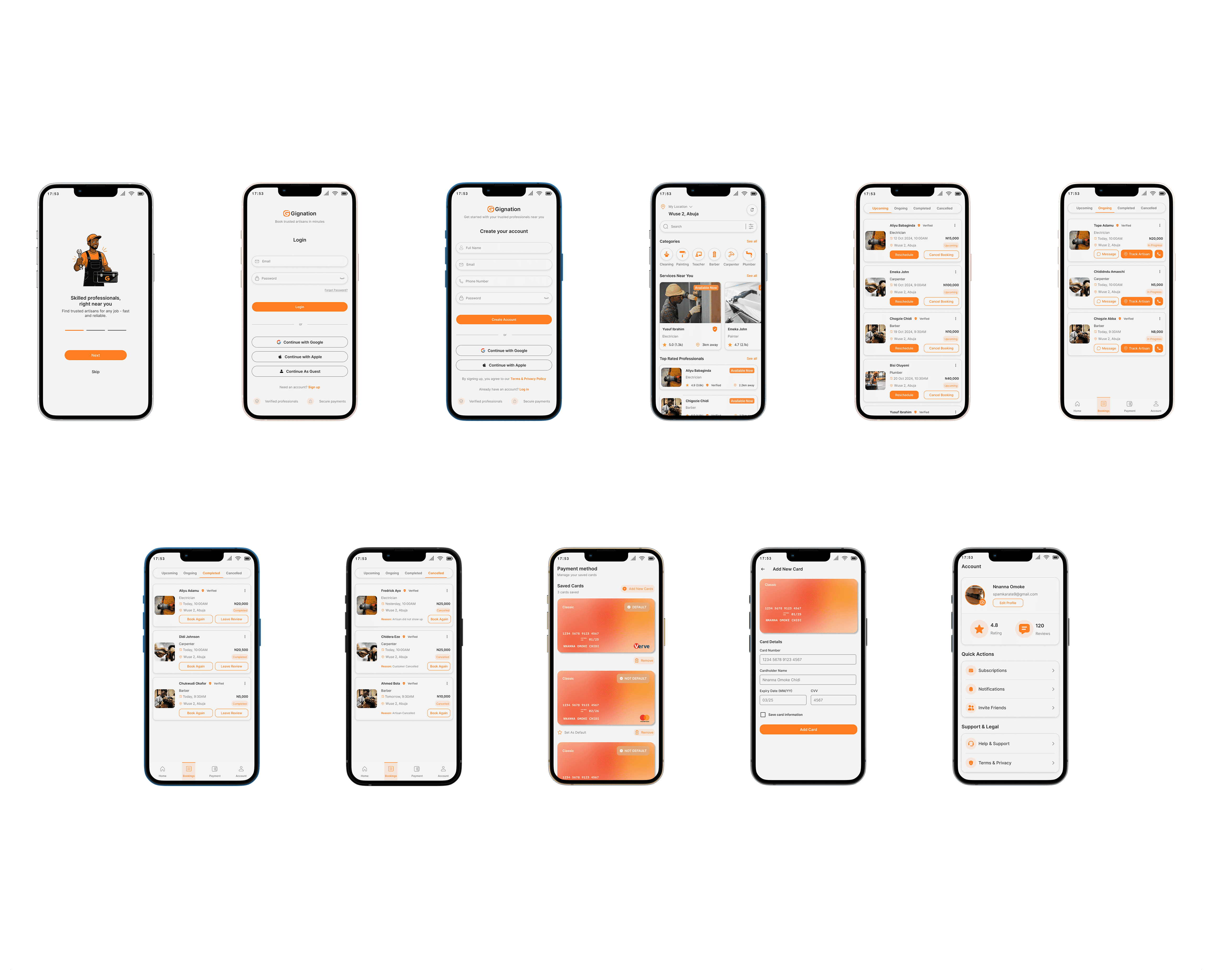
The high-fidelity stage focused on refining usability, clarity, and overall user confidence across the experience.
Home Screen - Categories support quick access for intentional users, while nearby services improve discovery for users still exploring.
Booking Cards - Key details and next actions such as rescheduling, tracking, or reviewing were consolidated into a single, easy-to-scan layout.
Payment Screens - Payment management flows were redesigned to feel simpler, more structured, and more trustworthy.
Across the app, the goal was to create an experience that felt intuitive for new users and efficient for returning users.
Result & Impact
The redesign transformed Gignation into a more intuitive, trustworthy, and consistent service marketplace experience.
Key improvements included:
A clearer tab-based booking system that made service status easier to track
A more unified payment experience that felt integrated into the product
Consistent UI patterns that reduced friction across screens
Verified badges and rating systems that improved trust and accountability
Faster and more streamlined booking flows for users
Overall, the redesign reduced cognitive load, improved navigation clarity, and made it easier for users to confidently find and book trusted professionals.
What I Learned
Trust must be built into the experience from the beginning through elements like verification, ratings, and clear artisan identity.
Designing with local context in mind makes products feel more familiar, relevant, and trustworthy to users.
Investing early in a scalable design system improves consistency and speeds up future design decisions.
Cancellation and recovery flows are just as important as booking flows in maintaining a positive user experience.
More Projects


New release
Preview
Artisan Acquisition
GIGNATION
Gignation is a mobile platform that helps users find and book trusted local artisans like electricians, plumbers, barbers, and cleaners. This redesign focused on improving key MVP user flows to create a clearer and more intuitive experience. My role involved identifying usability issues and redesigning critical screens to improve navigation and overall usability.
Year :
2026
Industry :
Gig Economy
Client :
Gignation
Project Duration :
Pending
PROBLEM :
From a product design perspective, the MVP had several usability and experience gaps:
Information hierarchy was weak, making it hard to scan content quickly
Booking states such as upcoming, ongoing, completed, and cancelled lacked clear distinction
Payment flow felt cluttered and slightly confusing for users adding cards
CTA buttons were inconsistent and sometimes unclear in intent
The home screen did not fully guide users toward quick action
These issues created friction in core user journeys such as booking, tracking, and managing services.
Solution :
The redesign focused on clarity, accessibility, and usability:
Improved hierarchy using spacing, typography, and card-based layouts
Clearly separated booking states with better labels and visual cues
Simplified the payment experience with structured input fields and card previews
Standardized CTAs for consistency and predictability
Made the home screen more action-driven with clearer categories and service highlights
The result is a more intuitive experience that helps users complete tasks faster with less confusion.
DESIGN PROCESS :
I approached this redesign with a user-first mindset, focusing on how real people interact with service-based platforms in Nigeria.
Steps Taken
Reviewed the MVP screens and identified friction points
Analyzed user behavior patterns for service booking apps
Defined key user goals and expectations
Created a user persona to guide decisions
Designed improved flows and layouts
Built wireframes before moving to high-fidelity screens
USER PERSONA :
EMPATHY MAP:
USER-FLOW DIAGRAM:
The user flow diagram maps out the key paths users take to complete core tasks within the app. It was designed to ensure a smooth and logical progression from entry points to final actions, reducing friction and improving overall usability.
ITERATIONS :
This section highlights how the design evolved from the MVP to the final solution. Each change was driven by usability issues, clarity, and user experience improvements.
Home Screen
Before:
Categories were visually engaging but lacked structure
Search was not immediately prominent
Content felt more aesthetic than functional
After:
Introduced clearer hierarchy with sections like “Services Near You” and “Top Rated Professionals”
Search bar is now more visible and accessible
Cards redesigned to prioritize key information like rating, distance, and availability
Users typically come to this screen with intent. The redesign makes it easier to scan, decide, and act quickly.
Bookings (Upcoming, Ongoing, Completed, Cancelled)
Before:
Booking states were not clearly differentiated
Actions were not always obvious
Information felt compressed and harder to scan
After:
Clear tabs for each booking state
Status tags like “Upcoming”, “In Progress”, “Completed”, “Cancelled” are more visible
Action buttons such as “Track Artisan”, “Book Again”, and “Leave Review” are clearly defined
Improved spacing and card layout
Users need quick clarity on what’s happening with their bookings. The redesign removes confusion and improves decision-making.
Payment Experience
Before:
Card management felt slightly cluttered
Input fields lacked strong visual guidance
Payment flow did not feel fully intuitive
After:
Cleaner card layout with better spacing
Live card preview improves user confidence
Structured form inputs for card details
Clear “Add Card” CTA and simplified interaction
Payments are sensitive. A clearer and more structured interface increases trust and reduces user hesitation.
Account / Profile
Before
Weak information hierarchy
Unstructured quick actions
Less intuitive navigation
After
Clear grouping for quick actions and support sections
Improved spacing and card organization
More prominent profile information
The redesign focused on making account management feel clearer, faster, and easier to navigate through better structure and reduced friction.
WIREFRAME
Mid-fidelity wireframes were created in Figma to validate information architecture and layout decisions before committing to visual design. The focus at this stage was structure, not aesthetics: where does the key content live on each screen, and how does the user move between states?
Design System (Style Guide)
Color Strategy
The redesign used color intentionally to create a more trustworthy and user-friendly experience, helping users focus on key actions while keeping the interface clean and easy to navigate.
Component Thinking
A consistent component system was introduced using reusable cards, clear button hierarchies, defined booking statuses, and familiar icon patterns to improve usability and scalability.
The result is a more intuitive and predictable experience.
TYPOGRAPHY
COMPONENTS
SPACING & LAYOUT
The redesign used generous spacing and a consistent grid system to reduce cognitive load and improve readability.
Clear separation between sections helped users scan content more easily, while predictable alignment created a cleaner and more trustworthy interface.
HIGH-FIDELITY MOCKUPS
The high-fidelity stage focused on refining usability, clarity, and overall user confidence across the experience.
Home Screen - Categories support quick access for intentional users, while nearby services improve discovery for users still exploring.
Booking Cards - Key details and next actions such as rescheduling, tracking, or reviewing were consolidated into a single, easy-to-scan layout.
Payment Screens - Payment management flows were redesigned to feel simpler, more structured, and more trustworthy.
Across the app, the goal was to create an experience that felt intuitive for new users and efficient for returning users.
Result & Impact
The redesign transformed Gignation into a more intuitive, trustworthy, and consistent service marketplace experience.
Key improvements included:
A clearer tab-based booking system that made service status easier to track
A more unified payment experience that felt integrated into the product
Consistent UI patterns that reduced friction across screens
Verified badges and rating systems that improved trust and accountability
Faster and more streamlined booking flows for users
Overall, the redesign reduced cognitive load, improved navigation clarity, and made it easier for users to confidently find and book trusted professionals.
What I Learned
Trust must be built into the experience from the beginning through elements like verification, ratings, and clear artisan identity.
Designing with local context in mind makes products feel more familiar, relevant, and trustworthy to users.
Investing early in a scalable design system improves consistency and speeds up future design decisions.
Cancellation and recovery flows are just as important as booking flows in maintaining a positive user experience.
More Projects
New release
Preview
Artisan Acquisition
GIGNATION
Gignation is a mobile platform that helps users find and book trusted local artisans like electricians, plumbers, barbers, and cleaners. This redesign focused on improving key MVP user flows to create a clearer and more intuitive experience. My role involved identifying usability issues and redesigning critical screens to improve navigation and overall usability.
Year :
2026
Industry :
Gig Economy
Client :
Gignation
Project Duration :
Pending
PROBLEM :
From a product design perspective, the MVP had several usability and experience gaps:
Information hierarchy was weak, making it hard to scan content quickly
Booking states such as upcoming, ongoing, completed, and cancelled lacked clear distinction
Payment flow felt cluttered and slightly confusing for users adding cards
CTA buttons were inconsistent and sometimes unclear in intent
The home screen did not fully guide users toward quick action
These issues created friction in core user journeys such as booking, tracking, and managing services.
Solution :
The redesign focused on clarity, accessibility, and usability:
Improved hierarchy using spacing, typography, and card-based layouts
Clearly separated booking states with better labels and visual cues
Simplified the payment experience with structured input fields and card previews
Standardized CTAs for consistency and predictability
Made the home screen more action-driven with clearer categories and service highlights
The result is a more intuitive experience that helps users complete tasks faster with less confusion.
DESIGN PROCESS :
I approached this redesign with a user-first mindset, focusing on how real people interact with service-based platforms in Nigeria.
Steps Taken
Reviewed the MVP screens and identified friction points
Analyzed user behavior patterns for service booking apps
Defined key user goals and expectations
Created a user persona to guide decisions
Designed improved flows and layouts
Built wireframes before moving to high-fidelity screens
USER PERSONA :
EMPATHY MAP:
USER-FLOW DIAGRAM:
The user flow diagram maps out the key paths users take to complete core tasks within the app. It was designed to ensure a smooth and logical progression from entry points to final actions, reducing friction and improving overall usability.
ITERATIONS :
This section highlights how the design evolved from the MVP to the final solution. Each change was driven by usability issues, clarity, and user experience improvements.
Home Screen
Before:
Categories were visually engaging but lacked structure
Search was not immediately prominent
Content felt more aesthetic than functional
After:
Introduced clearer hierarchy with sections like “Services Near You” and “Top Rated Professionals”
Search bar is now more visible and accessible
Cards redesigned to prioritize key information like rating, distance, and availability
Users typically come to this screen with intent. The redesign makes it easier to scan, decide, and act quickly.
Bookings (Upcoming, Ongoing, Completed, Cancelled)
Before:
Booking states were not clearly differentiated
Actions were not always obvious
Information felt compressed and harder to scan
After:
Clear tabs for each booking state
Status tags like “Upcoming”, “In Progress”, “Completed”, “Cancelled” are more visible
Action buttons such as “Track Artisan”, “Book Again”, and “Leave Review” are clearly defined
Improved spacing and card layout
Users need quick clarity on what’s happening with their bookings. The redesign removes confusion and improves decision-making.
Payment Experience
Before:
Card management felt slightly cluttered
Input fields lacked strong visual guidance
Payment flow did not feel fully intuitive
After:
Cleaner card layout with better spacing
Live card preview improves user confidence
Structured form inputs for card details
Clear “Add Card” CTA and simplified interaction
Payments are sensitive. A clearer and more structured interface increases trust and reduces user hesitation.
Account / Profile
Before
Weak information hierarchy
Unstructured quick actions
Less intuitive navigation
After
Clear grouping for quick actions and support sections
Improved spacing and card organization
More prominent profile information
The redesign focused on making account management feel clearer, faster, and easier to navigate through better structure and reduced friction.
WIREFRAME
Mid-fidelity wireframes were created in Figma to validate information architecture and layout decisions before committing to visual design. The focus at this stage was structure, not aesthetics: where does the key content live on each screen, and how does the user move between states?
Design System (Style Guide)
Color Strategy
The redesign used color intentionally to create a more trustworthy and user-friendly experience, helping users focus on key actions while keeping the interface clean and easy to navigate.
Component Thinking
A consistent component system was introduced using reusable cards, clear button hierarchies, defined booking statuses, and familiar icon patterns to improve usability and scalability.
The result is a more intuitive and predictable experience.
TYPOGRAPHY
COMPONENTS
SPACING & LAYOUT
The redesign used generous spacing and a consistent grid system to reduce cognitive load and improve readability.
Clear separation between sections helped users scan content more easily, while predictable alignment created a cleaner and more trustworthy interface.
HIGH-FIDELITY MOCKUPS
The high-fidelity stage focused on refining usability, clarity, and overall user confidence across the experience.
Home Screen - Categories support quick access for intentional users, while nearby services improve discovery for users still exploring.
Booking Cards - Key details and next actions such as rescheduling, tracking, or reviewing were consolidated into a single, easy-to-scan layout.
Payment Screens - Payment management flows were redesigned to feel simpler, more structured, and more trustworthy.
Across the app, the goal was to create an experience that felt intuitive for new users and efficient for returning users.
Result & Impact
The redesign transformed Gignation into a more intuitive, trustworthy, and consistent service marketplace experience.
Key improvements included:
A clearer tab-based booking system that made service status easier to track
A more unified payment experience that felt integrated into the product
Consistent UI patterns that reduced friction across screens
Verified badges and rating systems that improved trust and accountability
Faster and more streamlined booking flows for users
Overall, the redesign reduced cognitive load, improved navigation clarity, and made it easier for users to confidently find and book trusted professionals.
What I Learned
Trust must be built into the experience from the beginning through elements like verification, ratings, and clear artisan identity.
Designing with local context in mind makes products feel more familiar, relevant, and trustworthy to users.
Investing early in a scalable design system improves consistency and speeds up future design decisions.
Cancellation and recovery flows are just as important as booking flows in maintaining a positive user experience.
More Projects
New release
Preview