Fintech Landing Page
COINFLIP - CRYPTO LANDING PAGE CONCEPT
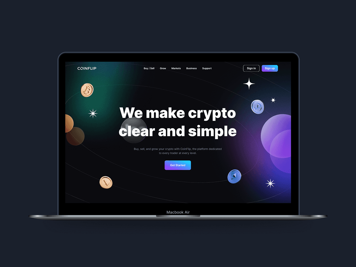
CoinFlip is a conceptual crypto investment landing page designed to make cryptocurrency platforms feel more approachable, trustworthy, and beginner-friendly. The project combined dark UI aesthetics, strong visual hierarchy, and modern design elements to create a premium yet easy-to-navigate user experience.
Year :
2026
Industry :
Fintech
Client :
CoinFlip
Project Duration :
3 weeks
Problem :
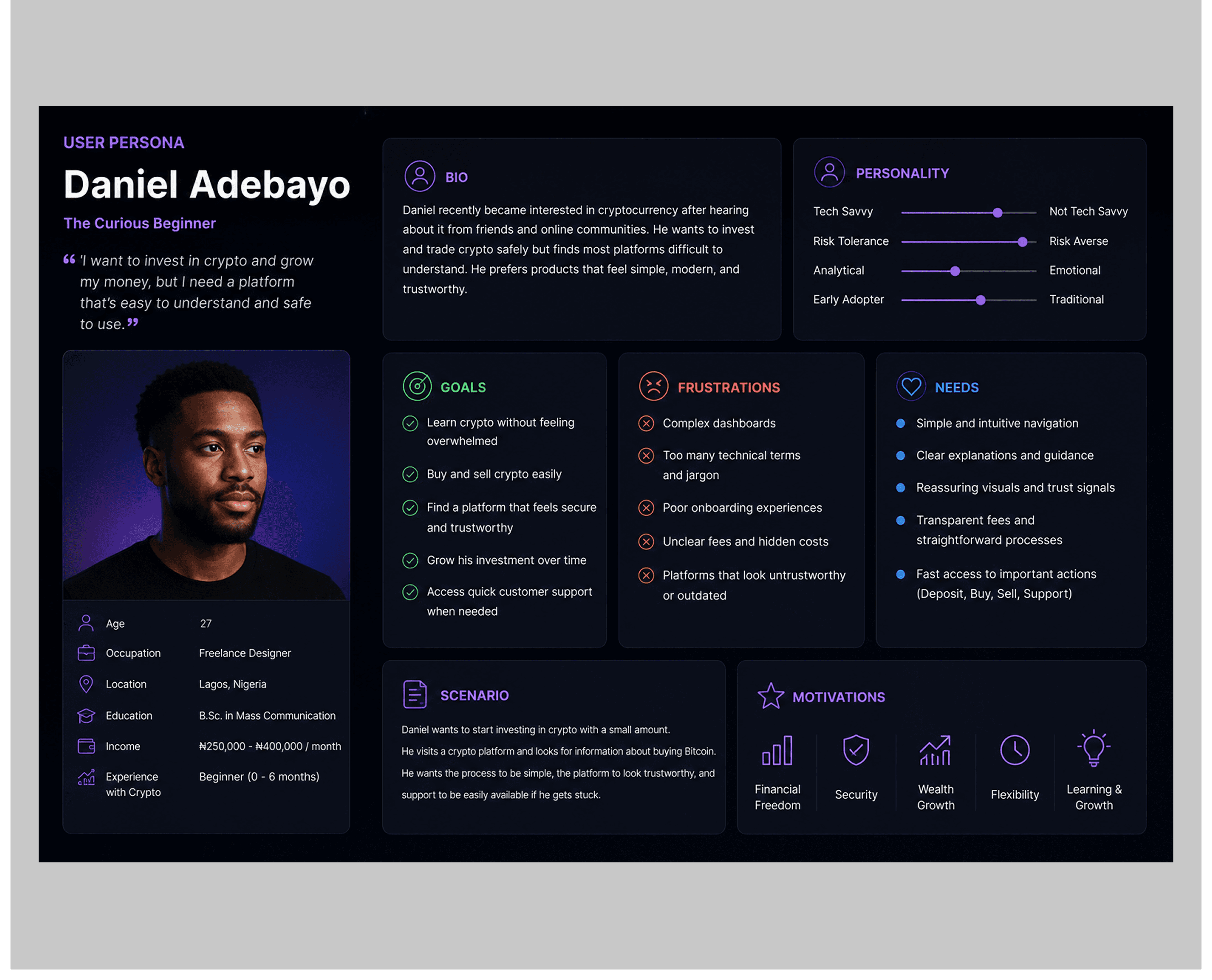
Research revealed that many crypto platforms overwhelm users with complex terminology, cluttered interfaces, and weak trust messaging, making the experience intimidating for beginners.
The project focused on creating a clearer and more approachable experience that helps users quickly understand the platform and feel confident using it.

SOLUTION :

The solution focused on creating a crypto landing page that felt clear, trustworthy, and beginner-friendly.
Key decisions included:
Strong visual hierarchy and concise copywriting
Simple navigation and structured content sections
Modern visuals and 3D elements to make crypto feel more approachable
Clear emphasis on security, support, and low fees to build user trust
The experience was designed to feel accessible for both new and experienced users.
DESIGN PROCESS :

Research & Discovery
Research into existing crypto platforms revealed that users respond better to experiences that feel clear, approachable, and trustworthy rather than overly technical.
This insight shaped the overall design direction, including the use of bold typography, strong visual hierarchy, and concise copy to improve readability and reduce cognitive load.
USER PERSONA :
User Experience Decisions
Ideation
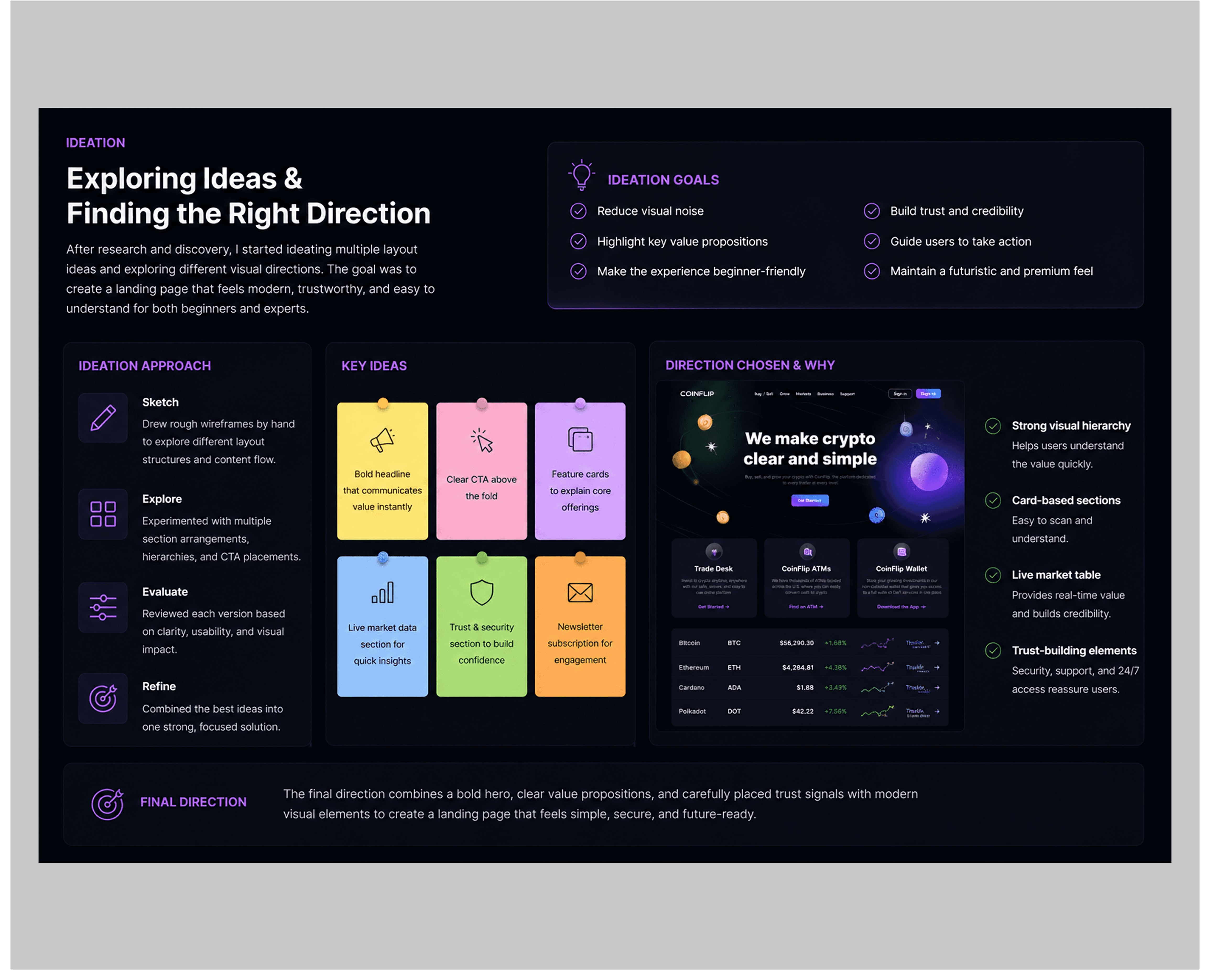
After identifying the key pain points, I started sketching different layout structures and experimenting with section hierarchy. My main focus was reducing visual noise while still maintaining the futuristic aesthetic commonly associated with crypto products.
I explored:
Hero section variations
CTA positioning
Card layouts
Data presentation styles
Trust-building sections
Visual balance between information and decorative elements
WIREFRAME :
The wireframing stage focused on structure and content placement before visual styling was introduced.
Key considerations included:
Clear content hierarchy
Strong CTA visibility
Balanced spacing
Section readability
Smooth visual progression throughout the page
The early wireframes helped establish:
Hero section positioning
Card-based feature layouts
Market table structure
Footer organization
Newsletter subscription placement
The low-fidelity approach allowed quick iteration before moving into high-fidelity exploration.


Style Guide
Typography
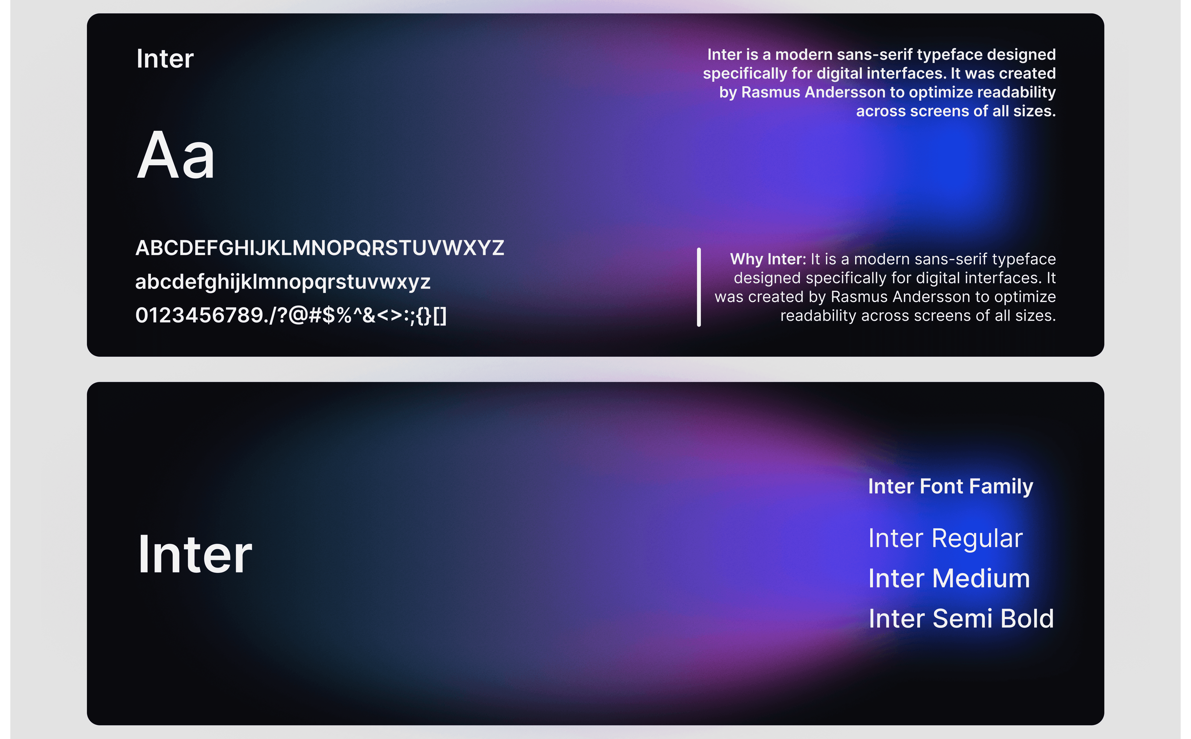
The design uses a bold and modern sans-serif typeface to create strong readability and visual impact. Large headline sizes were used to immediately capture attention, while softer body text created balance and improved readability against the dark background.
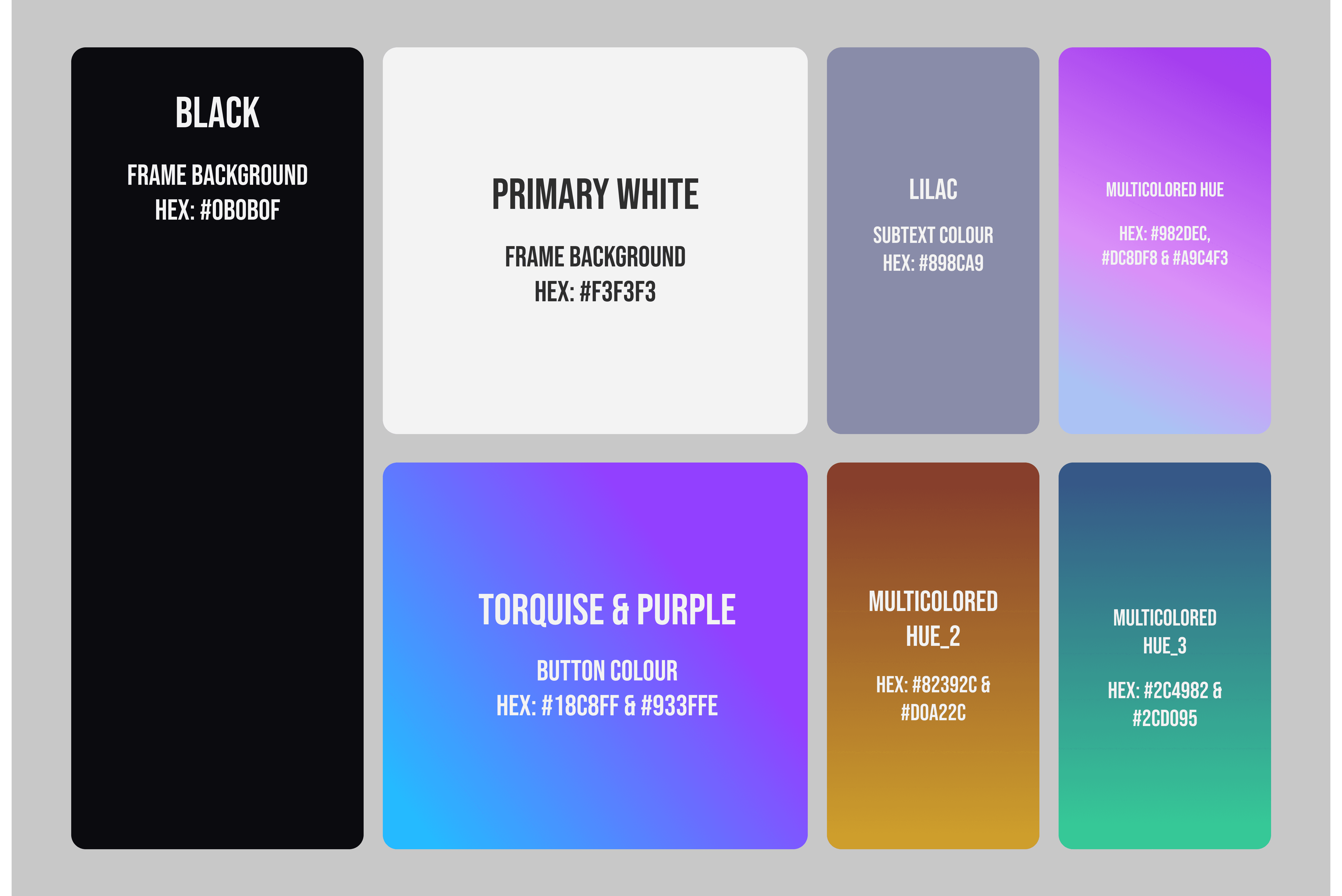
Color Palette
The visual direction combines dark surfaces with vibrant gradient accents.
Primary Colors
Deep Black
Midnight Blue
Neon Purple
Electric Cyan
Accent Colors
Soft Orange
Gradient Violet
Glow Blue
The color choices were intentional. Dark backgrounds helped the interface feel premium and immersive, while bright gradients added energy and visual focus.
SPACING :
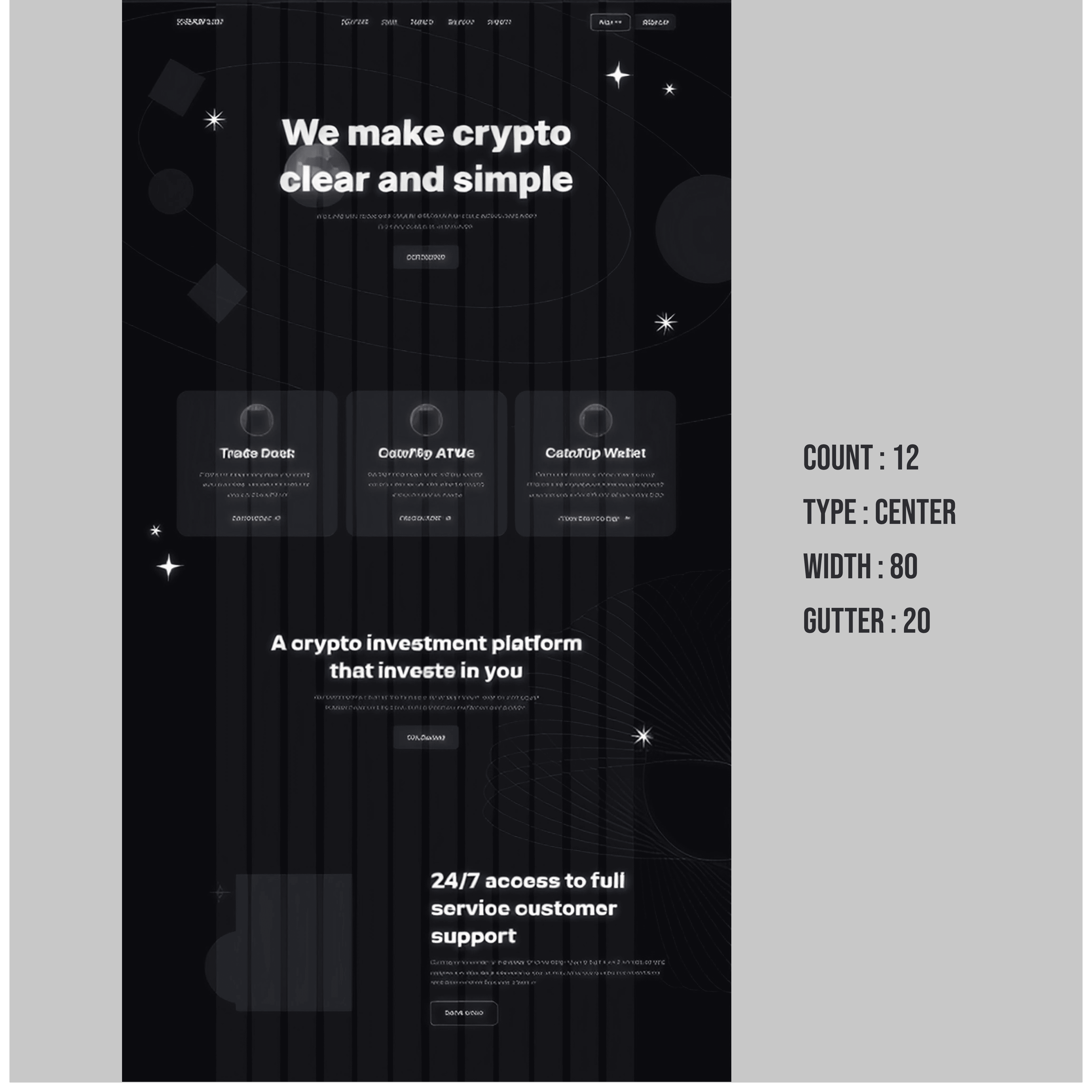
Spacing & Layout
A structured grid and consistent spacing system were used to create a clean, balanced, and easy-to-scan interface.
Whitespace and predictable alignment improved readability and helped reduce visual overload.
High-Fidelity Mockups
The final interface combined bold typography, modern gradients, and strong visual hierarchy to create a more approachable and trustworthy crypto experience.
Interface Highlights
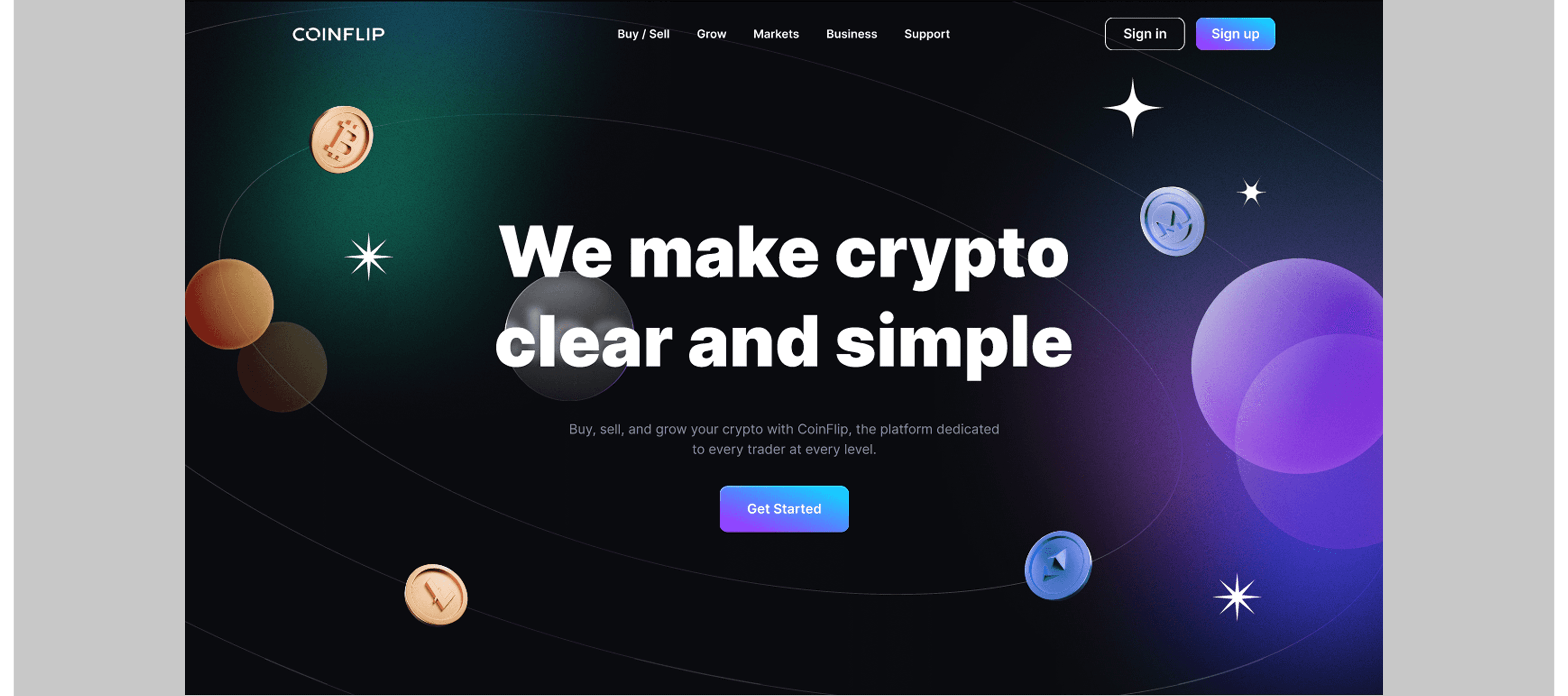
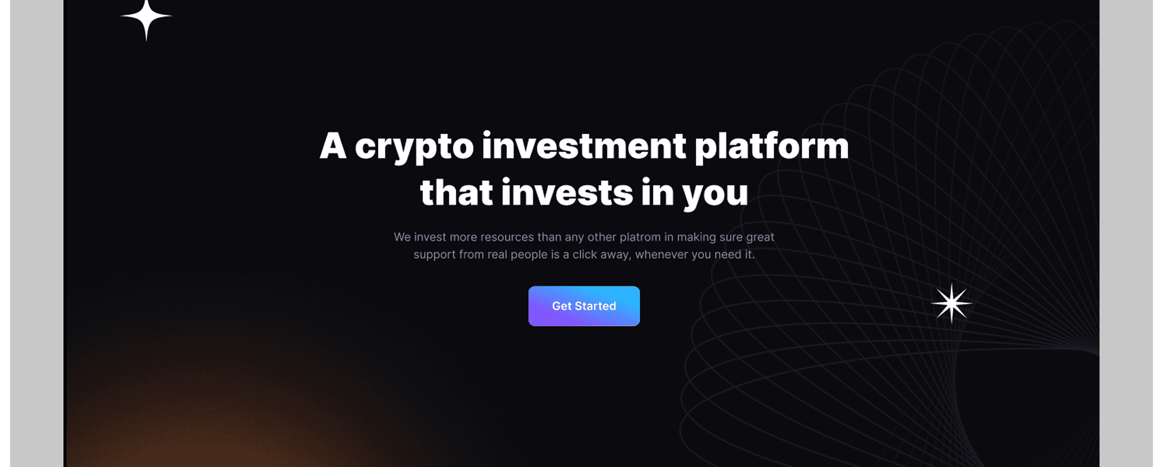
Hero Section
The hero section used bold typography, 3D visuals, and soft gradients to create a modern and attention-grabbing first impression while keeping the experience approachable.
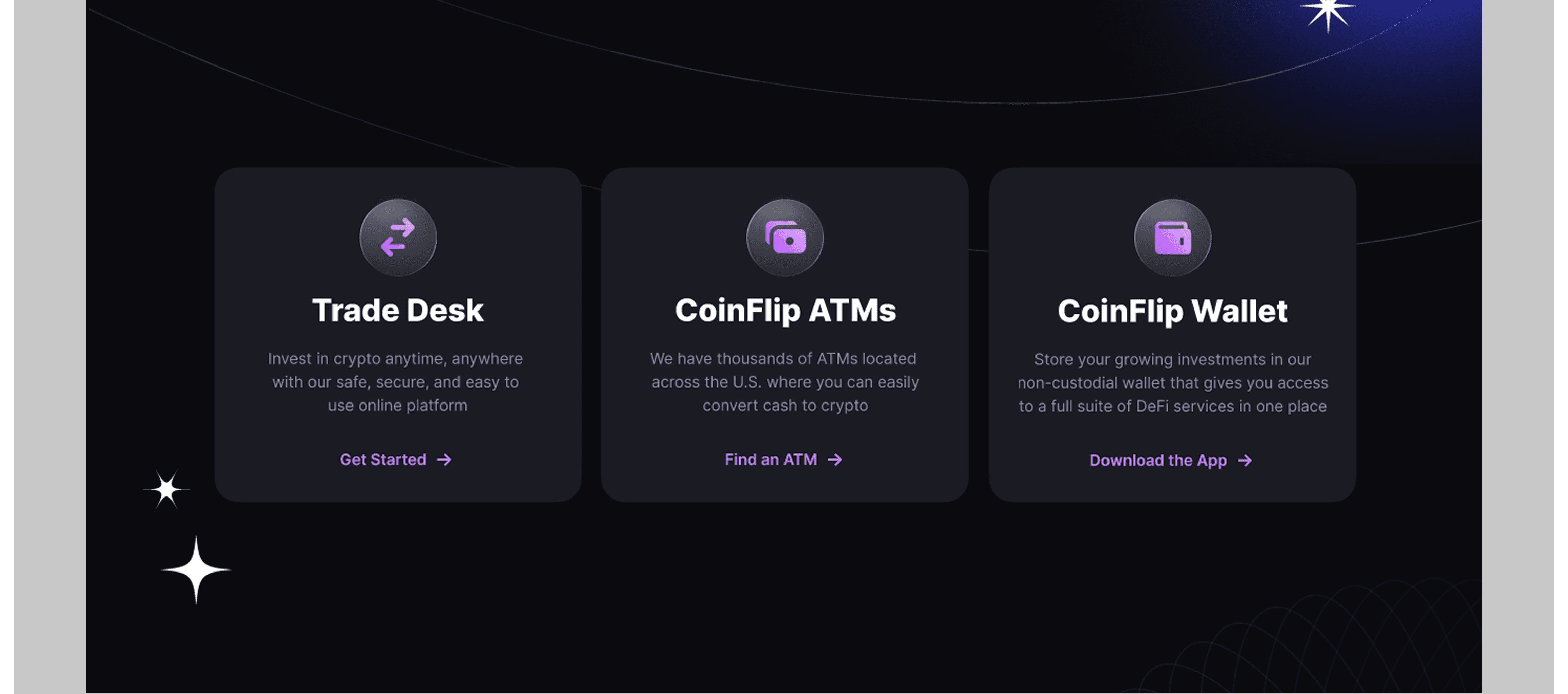
Feature Cards
The feature cards break down the platform’s core services into smaller, easy-to-understand sections. Clear spacing and minimal layouts help users quickly scan information without feeling overloaded.
Informative Section
This section reinforces the platform’s value proposition through a clean centred layout and strong typography. The minimal structure allows the message to stand out clearly.
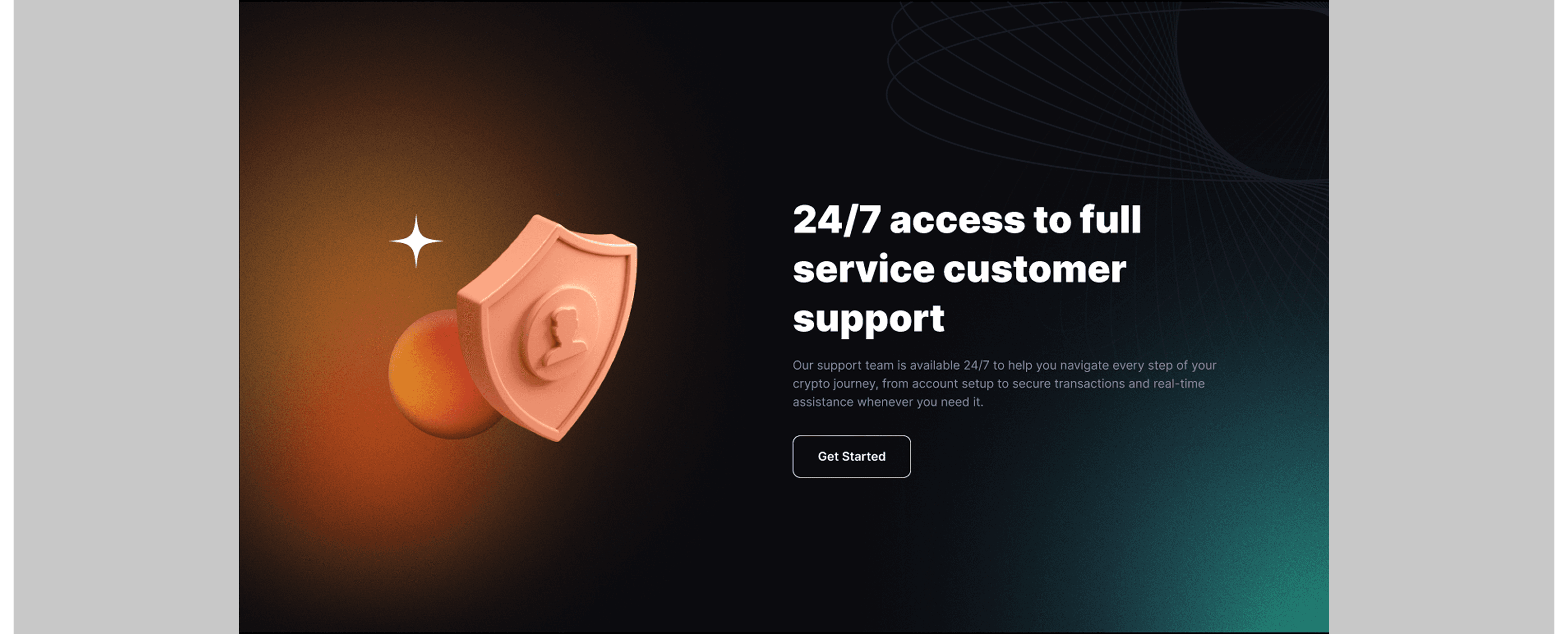
Customer Support Section
The customer support section focuses on building trust and reassurance. The shield illustration and spacious layout help communicate security, reliability, and accessibility.
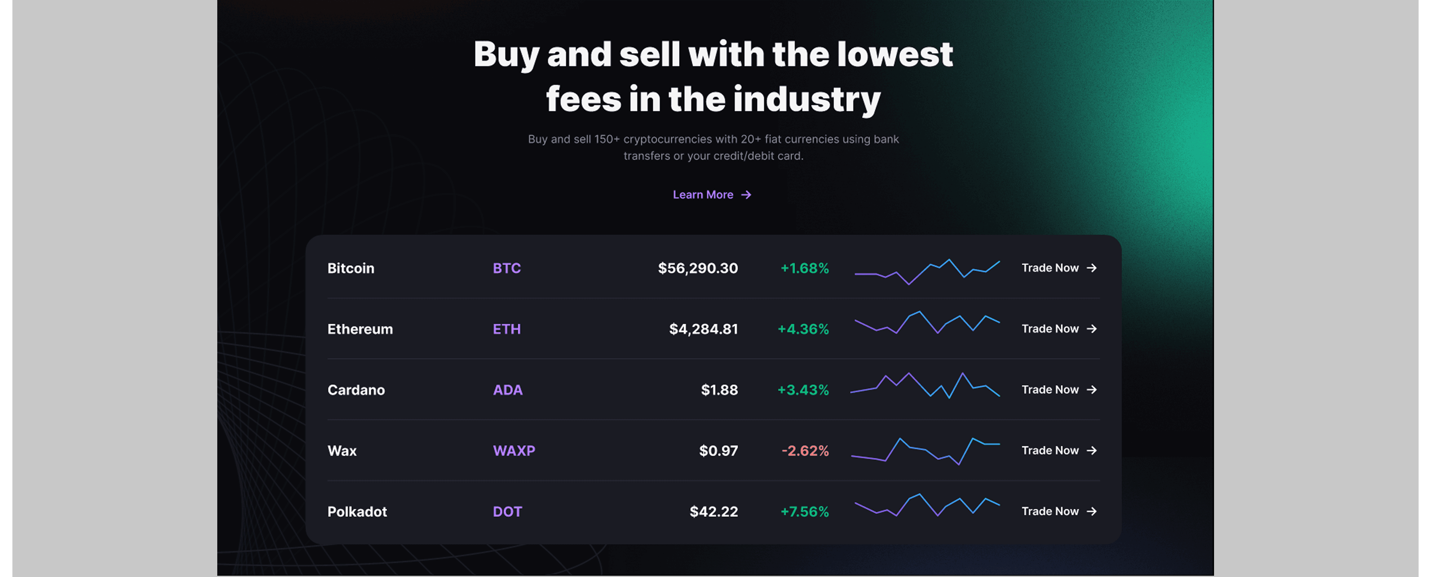
Market Overview Section
The market table presents trading information in a clean and simplified format. Strong typography and minimal charts make the data easier to understand at a glance.
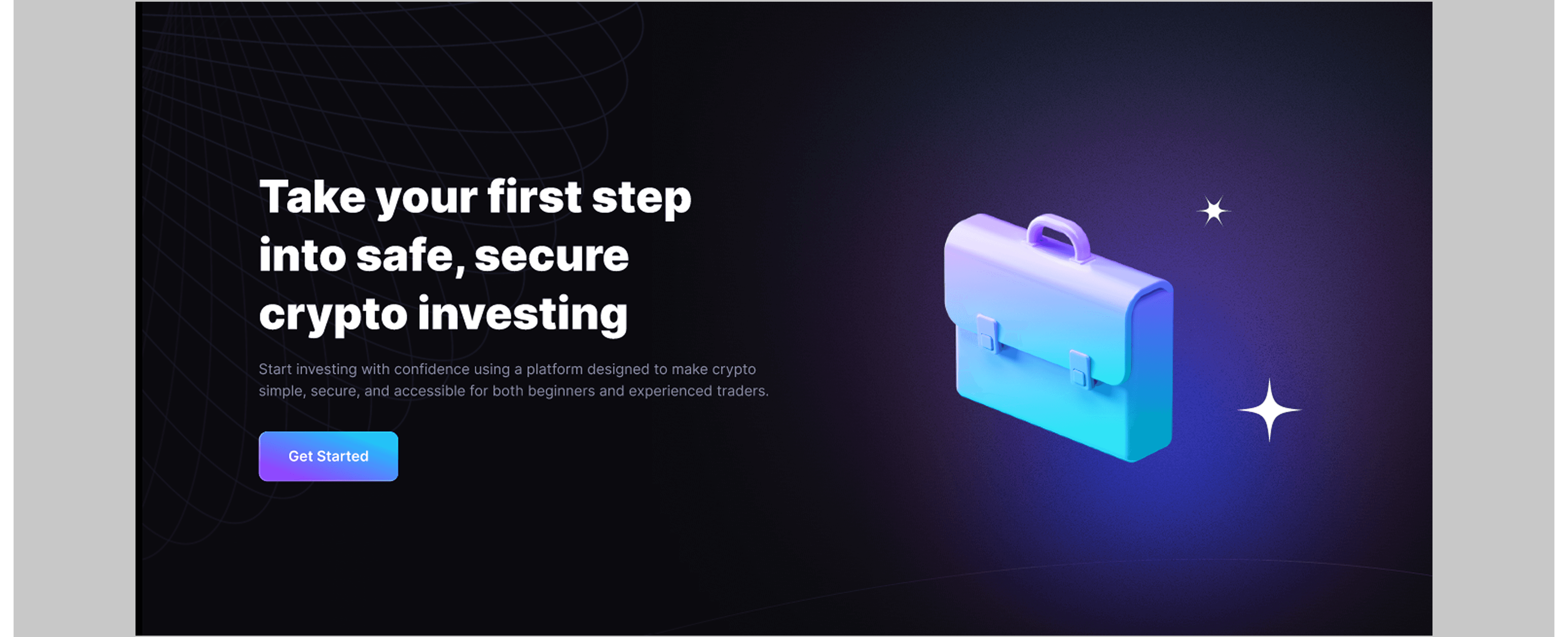
Investment Call-to-Action Section
This section was designed to encourage action through bold messaging and balanced visuals. The combination of typography and 3D elements creates a modern and engaging feel.
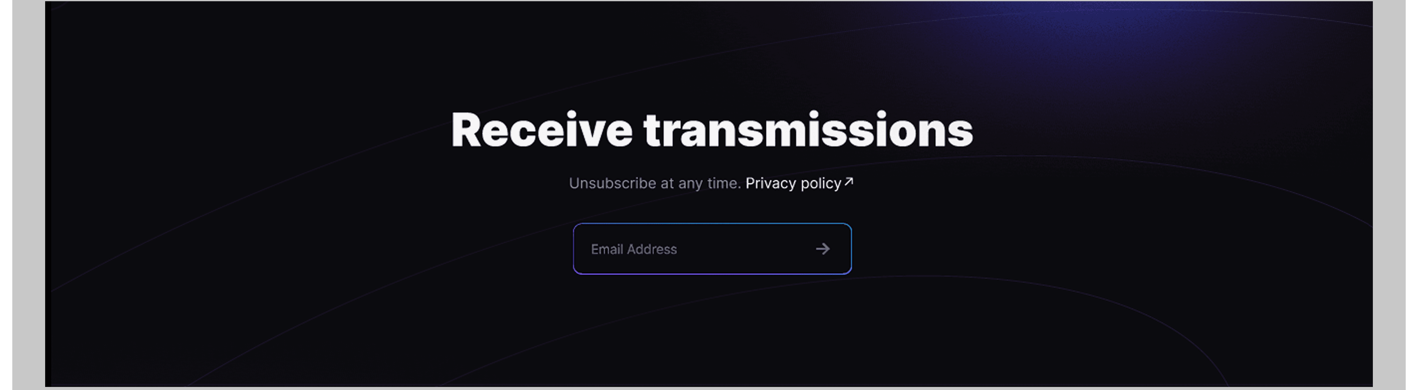
Newsletter Section
The newsletter section keeps the experience simple by focusing on a single action. Minimal inputs and subtle background elements help maintain clarity and consistency.
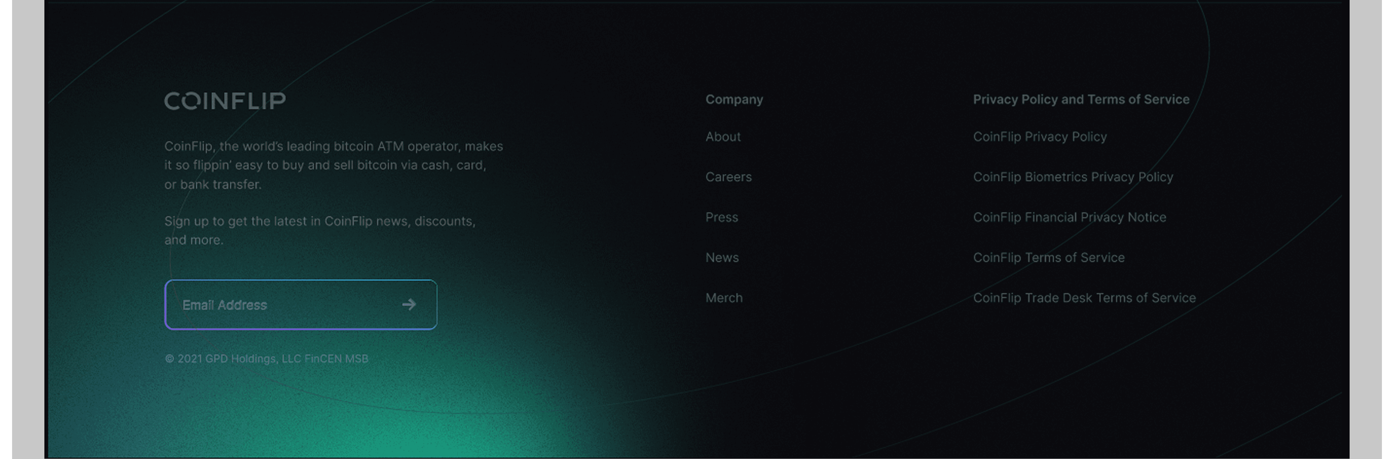
Footer
The footer provides a clean and organised way to access additional information, policies, and navigation links while maintaining the overall visual style of the landing page.
Result & Impact
The final design successfully transformed a potentially intimidating crypto experience into something visually engaging and easy to understand.
Outcomes
Improved content hierarchy and readability
More approachable experience for beginner users
Stronger balance between aesthetics and usability
Increased trust through security-focused design
Consistent visual language across the interface
This project strengthened my ability to create visually engaging experiences while maintaining clarity, usability, and user trust..
More Projects


New release
Preview
Fintech Landing Page
COINFLIP - CRYPTO LANDING PAGE CONCEPT
CoinFlip is a conceptual crypto investment landing page designed to make cryptocurrency platforms feel more approachable, trustworthy, and beginner-friendly. The project combined dark UI aesthetics, strong visual hierarchy, and modern design elements to create a premium yet easy-to-navigate user experience.
Year :
2026
Industry :
Fintech
Client :
CoinFlip
Project Duration :
3 weeks
Problem :
Research revealed that many crypto platforms overwhelm users with complex terminology, cluttered interfaces, and weak trust messaging, making the experience intimidating for beginners.
The project focused on creating a clearer and more approachable experience that helps users quickly understand the platform and feel confident using it.
SOLUTION :
The solution focused on creating a crypto landing page that felt clear, trustworthy, and beginner-friendly.
Key decisions included:
Strong visual hierarchy and concise copywriting
Simple navigation and structured content sections
Modern visuals and 3D elements to make crypto feel more approachable
Clear emphasis on security, support, and low fees to build user trust
The experience was designed to feel accessible for both new and experienced users.
DESIGN PROCESS :
Research & Discovery
Research into existing crypto platforms revealed that users respond better to experiences that feel clear, approachable, and trustworthy rather than overly technical.
This insight shaped the overall design direction, including the use of bold typography, strong visual hierarchy, and concise copy to improve readability and reduce cognitive load.
USER PERSONA :
User Experience Decisions
Ideation
After identifying the key pain points, I started sketching different layout structures and experimenting with section hierarchy. My main focus was reducing visual noise while still maintaining the futuristic aesthetic commonly associated with crypto products.
I explored:
Hero section variations
CTA positioning
Card layouts
Data presentation styles
Trust-building sections
Visual balance between information and decorative elements
WIREFRAME :
The wireframing stage focused on structure and content placement before visual styling was introduced.
Key considerations included:
Clear content hierarchy
Strong CTA visibility
Balanced spacing
Section readability
Smooth visual progression throughout the page
The early wireframes helped establish:
Hero section positioning
Card-based feature layouts
Market table structure
Footer organization
Newsletter subscription placement
The low-fidelity approach allowed quick iteration before moving into high-fidelity exploration.
Style Guide
Typography
The design uses a bold and modern sans-serif typeface to create strong readability and visual impact. Large headline sizes were used to immediately capture attention, while softer body text created balance and improved readability against the dark background.
Color Palette
The visual direction combines dark surfaces with vibrant gradient accents.
Primary Colors
Deep Black
Midnight Blue
Neon Purple
Electric Cyan
Accent Colors
Soft Orange
Gradient Violet
Glow Blue
The color choices were intentional. Dark backgrounds helped the interface feel premium and immersive, while bright gradients added energy and visual focus.
SPACING :
Spacing & Layout
A structured grid and consistent spacing system were used to create a clean, balanced, and easy-to-scan interface.
Whitespace and predictable alignment improved readability and helped reduce visual overload.
High-Fidelity Mockups
The final interface combined bold typography, modern gradients, and strong visual hierarchy to create a more approachable and trustworthy crypto experience.
Interface Highlights
Hero Section
The hero section used bold typography, 3D visuals, and soft gradients to create a modern and attention-grabbing first impression while keeping the experience approachable.
Feature Cards
The feature cards break down the platform’s core services into smaller, easy-to-understand sections. Clear spacing and minimal layouts help users quickly scan information without feeling overloaded.
Informative Section
This section reinforces the platform’s value proposition through a clean centred layout and strong typography. The minimal structure allows the message to stand out clearly.
Customer Support Section
The customer support section focuses on building trust and reassurance. The shield illustration and spacious layout help communicate security, reliability, and accessibility.
Market Overview Section
The market table presents trading information in a clean and simplified format. Strong typography and minimal charts make the data easier to understand at a glance.
Investment Call-to-Action Section
This section was designed to encourage action through bold messaging and balanced visuals. The combination of typography and 3D elements creates a modern and engaging feel.
Newsletter Section
The newsletter section keeps the experience simple by focusing on a single action. Minimal inputs and subtle background elements help maintain clarity and consistency.
Footer
The footer provides a clean and organised way to access additional information, policies, and navigation links while maintaining the overall visual style of the landing page.
Result & Impact
The final design successfully transformed a potentially intimidating crypto experience into something visually engaging and easy to understand.
Outcomes
Improved content hierarchy and readability
More approachable experience for beginner users
Stronger balance between aesthetics and usability
Increased trust through security-focused design
Consistent visual language across the interface
This project strengthened my ability to create visually engaging experiences while maintaining clarity, usability, and user trust..
More Projects
New release
Preview
Fintech Landing Page
COINFLIP - CRYPTO LANDING PAGE CONCEPT
CoinFlip is a conceptual crypto investment landing page designed to make cryptocurrency platforms feel more approachable, trustworthy, and beginner-friendly. The project combined dark UI aesthetics, strong visual hierarchy, and modern design elements to create a premium yet easy-to-navigate user experience.
Year :
2026
Industry :
Fintech
Client :
CoinFlip
Project Duration :
3 weeks
Problem :
Research revealed that many crypto platforms overwhelm users with complex terminology, cluttered interfaces, and weak trust messaging, making the experience intimidating for beginners.
The project focused on creating a clearer and more approachable experience that helps users quickly understand the platform and feel confident using it.
SOLUTION :
The solution focused on creating a crypto landing page that felt clear, trustworthy, and beginner-friendly.
Key decisions included:
Strong visual hierarchy and concise copywriting
Simple navigation and structured content sections
Modern visuals and 3D elements to make crypto feel more approachable
Clear emphasis on security, support, and low fees to build user trust
The experience was designed to feel accessible for both new and experienced users.
DESIGN PROCESS :
Research & Discovery
Research into existing crypto platforms revealed that users respond better to experiences that feel clear, approachable, and trustworthy rather than overly technical.
This insight shaped the overall design direction, including the use of bold typography, strong visual hierarchy, and concise copy to improve readability and reduce cognitive load.
USER PERSONA :
User Experience Decisions
Ideation
After identifying the key pain points, I started sketching different layout structures and experimenting with section hierarchy. My main focus was reducing visual noise while still maintaining the futuristic aesthetic commonly associated with crypto products.
I explored:
Hero section variations
CTA positioning
Card layouts
Data presentation styles
Trust-building sections
Visual balance between information and decorative elements
WIREFRAME :
The wireframing stage focused on structure and content placement before visual styling was introduced.
Key considerations included:
Clear content hierarchy
Strong CTA visibility
Balanced spacing
Section readability
Smooth visual progression throughout the page
The early wireframes helped establish:
Hero section positioning
Card-based feature layouts
Market table structure
Footer organization
Newsletter subscription placement
The low-fidelity approach allowed quick iteration before moving into high-fidelity exploration.
Style Guide
Typography
The design uses a bold and modern sans-serif typeface to create strong readability and visual impact. Large headline sizes were used to immediately capture attention, while softer body text created balance and improved readability against the dark background.
Color Palette
The visual direction combines dark surfaces with vibrant gradient accents.
Primary Colors
Deep Black
Midnight Blue
Neon Purple
Electric Cyan
Accent Colors
Soft Orange
Gradient Violet
Glow Blue
The color choices were intentional. Dark backgrounds helped the interface feel premium and immersive, while bright gradients added energy and visual focus.
SPACING :
Spacing & Layout
A structured grid and consistent spacing system were used to create a clean, balanced, and easy-to-scan interface.
Whitespace and predictable alignment improved readability and helped reduce visual overload.
High-Fidelity Mockups
The final interface combined bold typography, modern gradients, and strong visual hierarchy to create a more approachable and trustworthy crypto experience.
Interface Highlights
Hero Section
The hero section used bold typography, 3D visuals, and soft gradients to create a modern and attention-grabbing first impression while keeping the experience approachable.
Feature Cards
The feature cards break down the platform’s core services into smaller, easy-to-understand sections. Clear spacing and minimal layouts help users quickly scan information without feeling overloaded.
Informative Section
This section reinforces the platform’s value proposition through a clean centred layout and strong typography. The minimal structure allows the message to stand out clearly.
Customer Support Section
The customer support section focuses on building trust and reassurance. The shield illustration and spacious layout help communicate security, reliability, and accessibility.
Market Overview Section
The market table presents trading information in a clean and simplified format. Strong typography and minimal charts make the data easier to understand at a glance.
Investment Call-to-Action Section
This section was designed to encourage action through bold messaging and balanced visuals. The combination of typography and 3D elements creates a modern and engaging feel.
Newsletter Section
The newsletter section keeps the experience simple by focusing on a single action. Minimal inputs and subtle background elements help maintain clarity and consistency.
Footer
The footer provides a clean and organised way to access additional information, policies, and navigation links while maintaining the overall visual style of the landing page.
Result & Impact
The final design successfully transformed a potentially intimidating crypto experience into something visually engaging and easy to understand.
Outcomes
Improved content hierarchy and readability
More approachable experience for beginner users
Stronger balance between aesthetics and usability
Increased trust through security-focused design
Consistent visual language across the interface
This project strengthened my ability to create visually engaging experiences while maintaining clarity, usability, and user trust..
More Projects
New release
Preview