Job Hunting
JOB FINDER
JobFinder is a mobile job search app that helps users discover relevant opportunities faster through personalized recommendations, location-based listings, and smart filters. This case study explores the redesign process focused on creating a simpler and more intuitive job search experience.
Year :
2026
Industry :
Tech
Client :
Job finder
Project Duration :
2 months

Problem & Solution:
Research revealed that many job platforms overwhelm users with endless listings and little personalization, turning job searching into a frustrating experience.
This project explored how a more personalized and guided approach could help users discover relevant opportunities faster and with less friction.
The Problem
Job apps feel generic and impersonal
Users waste time filtering through irrelevant listings
Onboarding is either skipped or so long it's abandoned
Applying for jobs feels tedious and repetitive
No sense of location-based relevance on mobile
Poor visual hierarchy makes scanning difficult
The Solution
Personalised onboarding that sets context early
Location-aware job feed from session one
Smart category filters to narrow down by field
Clean card-based layout for fast scanning
Simple one-screen application with CV upload
Saved jobs and notification system built in

Design Process :

I followed a structured but flexible process that kept the user at the centre of every decision. Each phase informed the next: research shaped the persona, the persona shaped the flows, and the flows shaped every pixel in the final design.
Discovery & Research
I conducted informal interviews with 12 job seekers aged 22–35 across Lagos, Abuja, and Port Harcourt. I wanted to understand how people actually search for jobs, not how they say they do. Themes around frustration, wasted time, and lack of confidence came up repeatedly.
User Persona Development
From the research I synthesised a primary persona, a realistic representation of the core user group. This persona sat on my screen throughout the entire design process and acted as a sanity check every time I had to make a design decision.
User Flow Mapping
I mapped the critical paths a user would take from downloading the app to successfully applying for a job. This revealed several unnecessary friction points that I was able to eliminate before a single screen was designed.
Wireframing
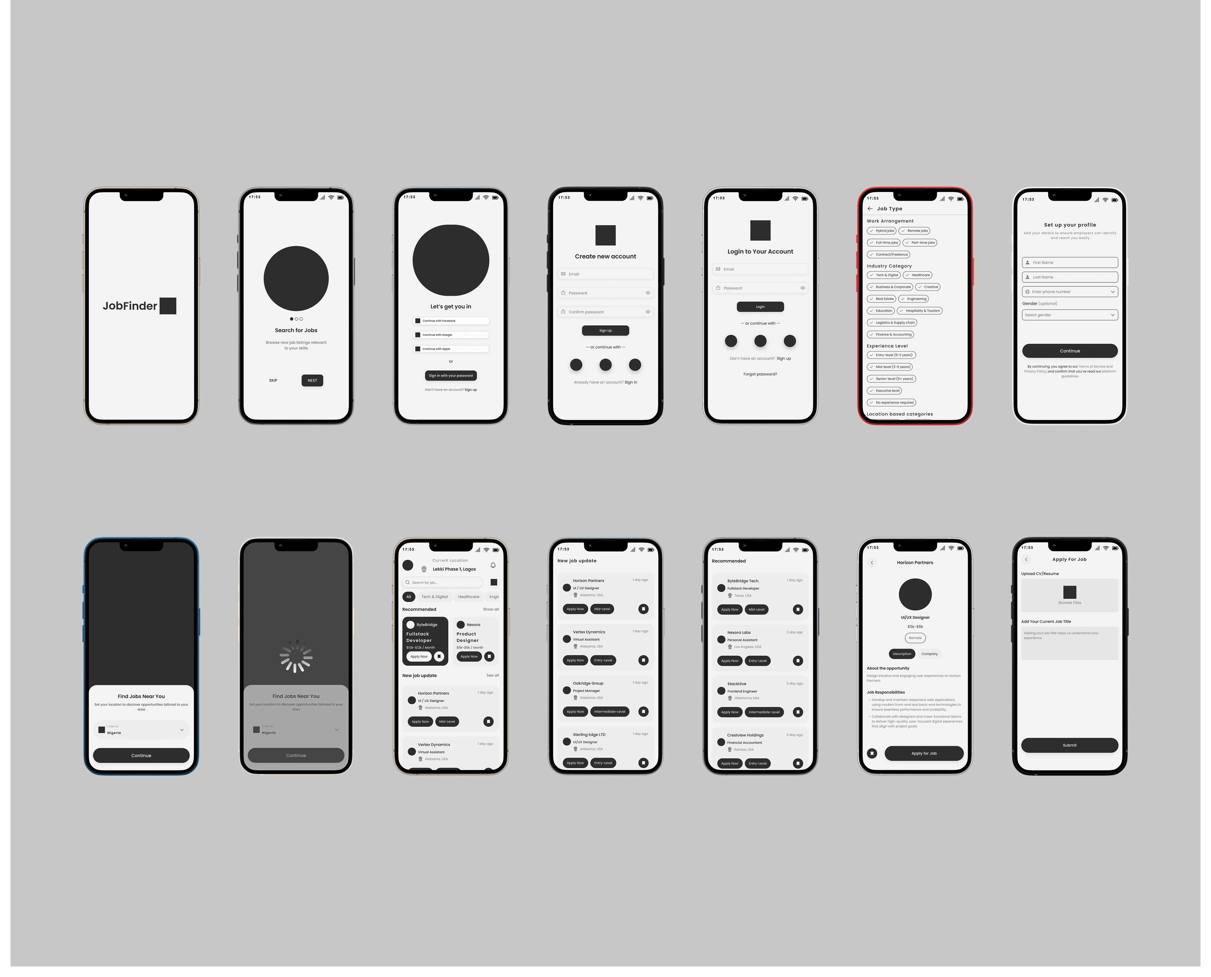
Low-fidelity wireframes let me explore layout possibilities quickly without getting distracted by colour or polish. I ran two rounds of wireframe reviews with peer designers and incorporated feedback before moving to high fidelity.
Design System & Visual Design
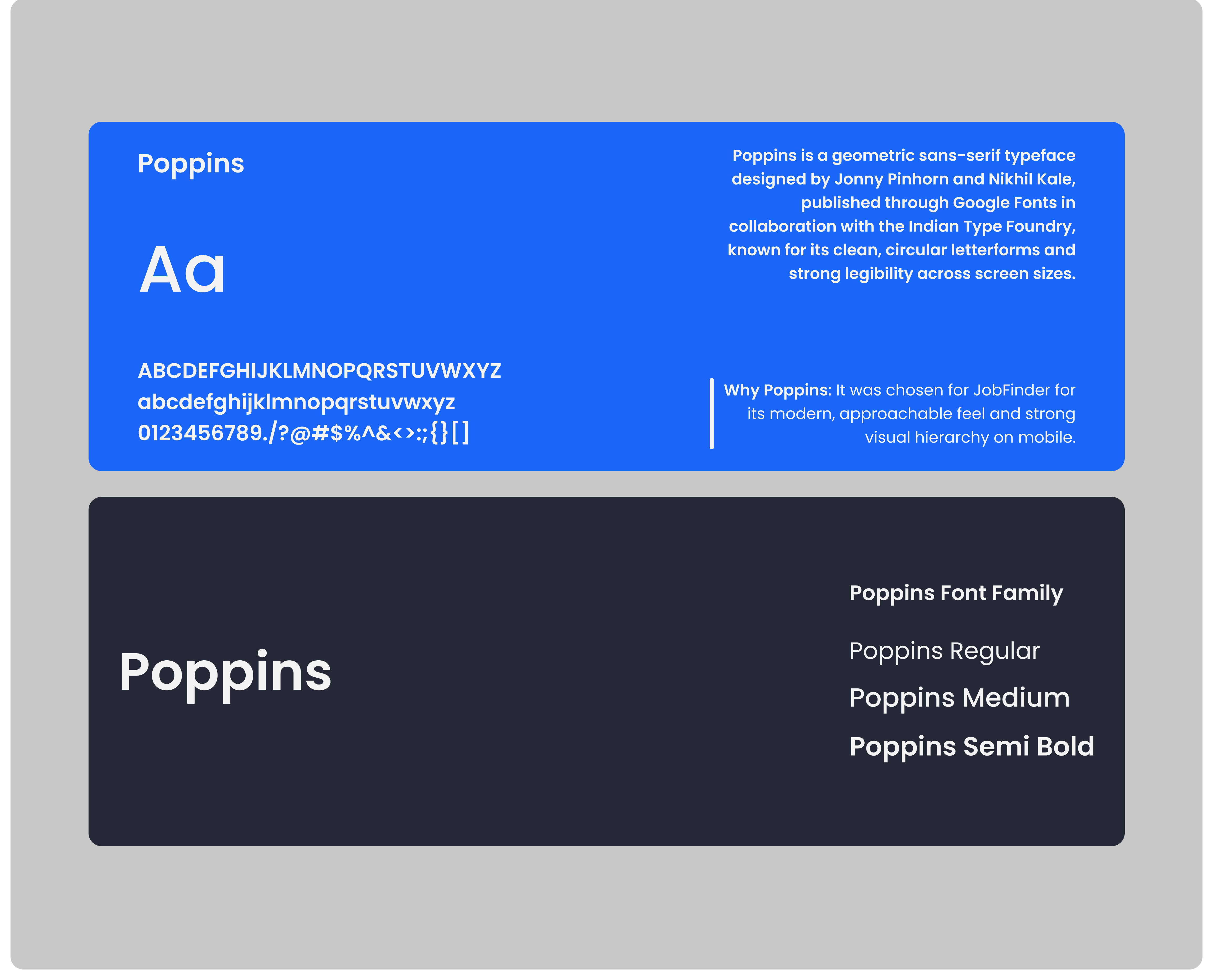
I built a focused design system covering colour, typography, components, and spacing, that kept the UI consistent and made handoff clean. Then I moved into high-fidelity, screen by screen.
Prototype & Iteration
An interactive prototype was shared with 5 users for usability testing. Key findings shaped the final adjustments, including simplifying the filter screen and adding visual weight to the Apply Now CTA on the job detail page.
USER-PERSONA :

Meet Amaka Osei
Amaka is a 24-year-old Computer Science graduate in Lagos who represents JobFinder’s target user.
She is frustrated by irrelevant listings, repetitive applications, and slow feedback from existing job platforms. Since she mainly applies on mobile, she values speed, relevance, and a frictionless experience.
Her needs shaped key decisions around personalization, usability, and simplified job applications.
EMPATHY MAP:
Understanding Amaka
Research showed that users like Amaka felt overwhelmed by irrelevant listings, repetitive applications, and little feedback from existing job platforms.
This shaped JobFinder into a more personalized and intuitive experience focused on clarity, confidence, and ease of use throughout the job search journey.

USER-FLOW DIAGRAM :
Before designing high-fidelity screens, I mapped out key user journeys to identify friction, simplify interactions, and ensure every screen served a clear purpose.
Different flows were designed for different user needs, allowing JobFinder to support both first-time job seekers and experienced professionals more effectively.

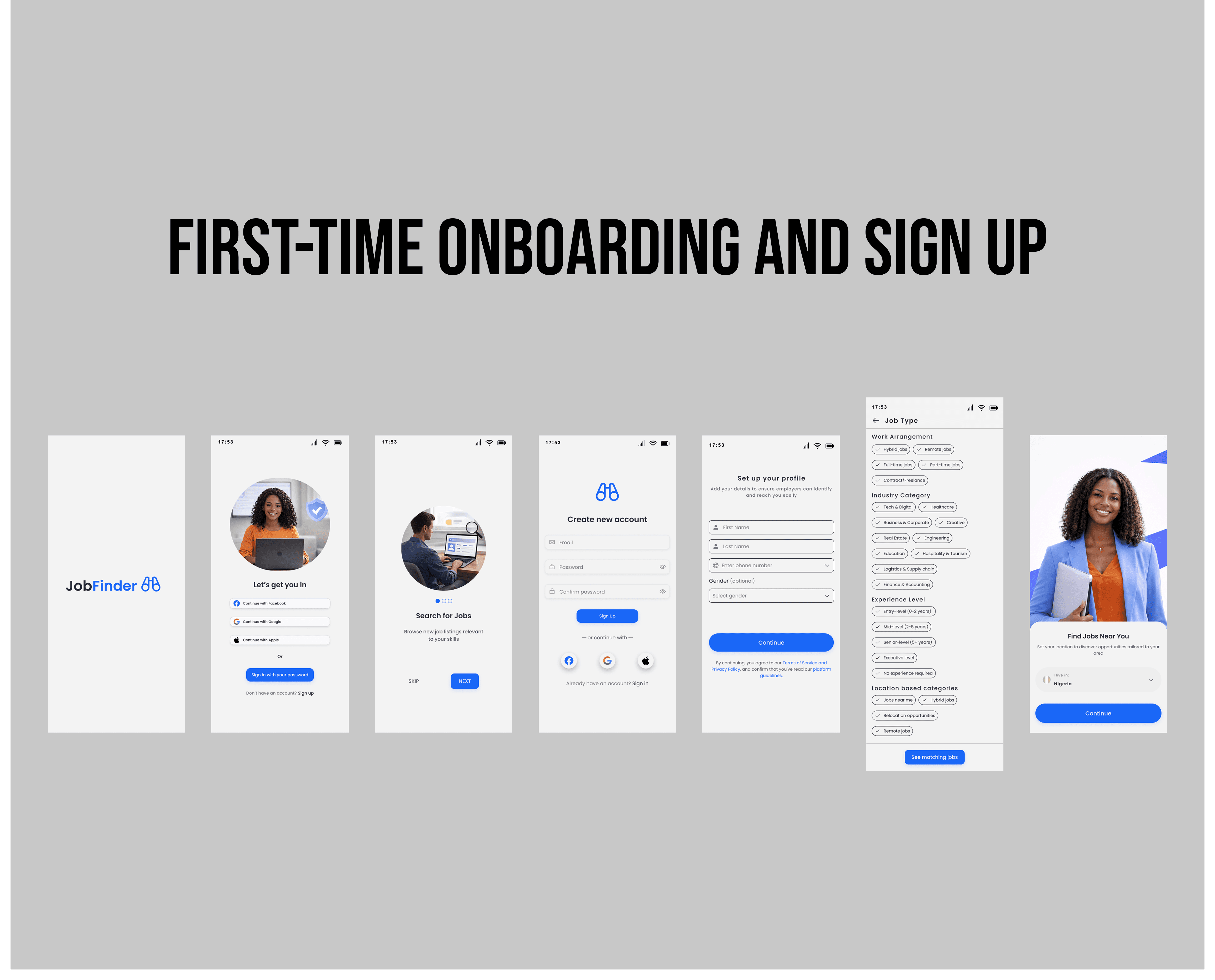
First-Time Onboarding & Sign Up
New users are introduced to JobFinder through a short onboarding flow highlighting the app’s core benefits. They can quickly create an account using email or social login, then complete a simple profile and location setup to receive more relevant job recommendations.
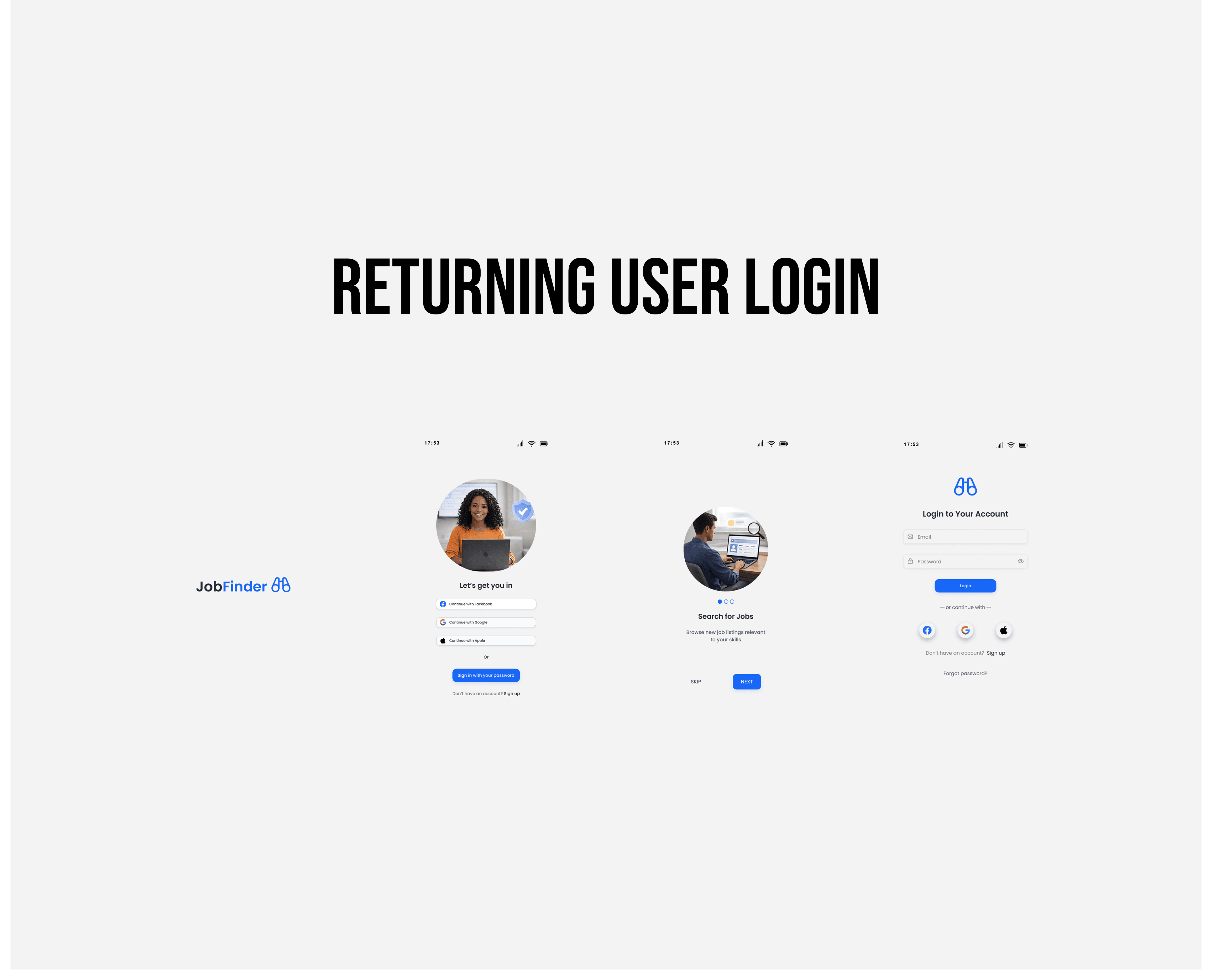
Returning User Login
Returning users bypass onboarding and move directly into a fast login flow using email, password, or social login. Once authenticated, they are taken straight to a personalized home feed tailored to their profile and activity.
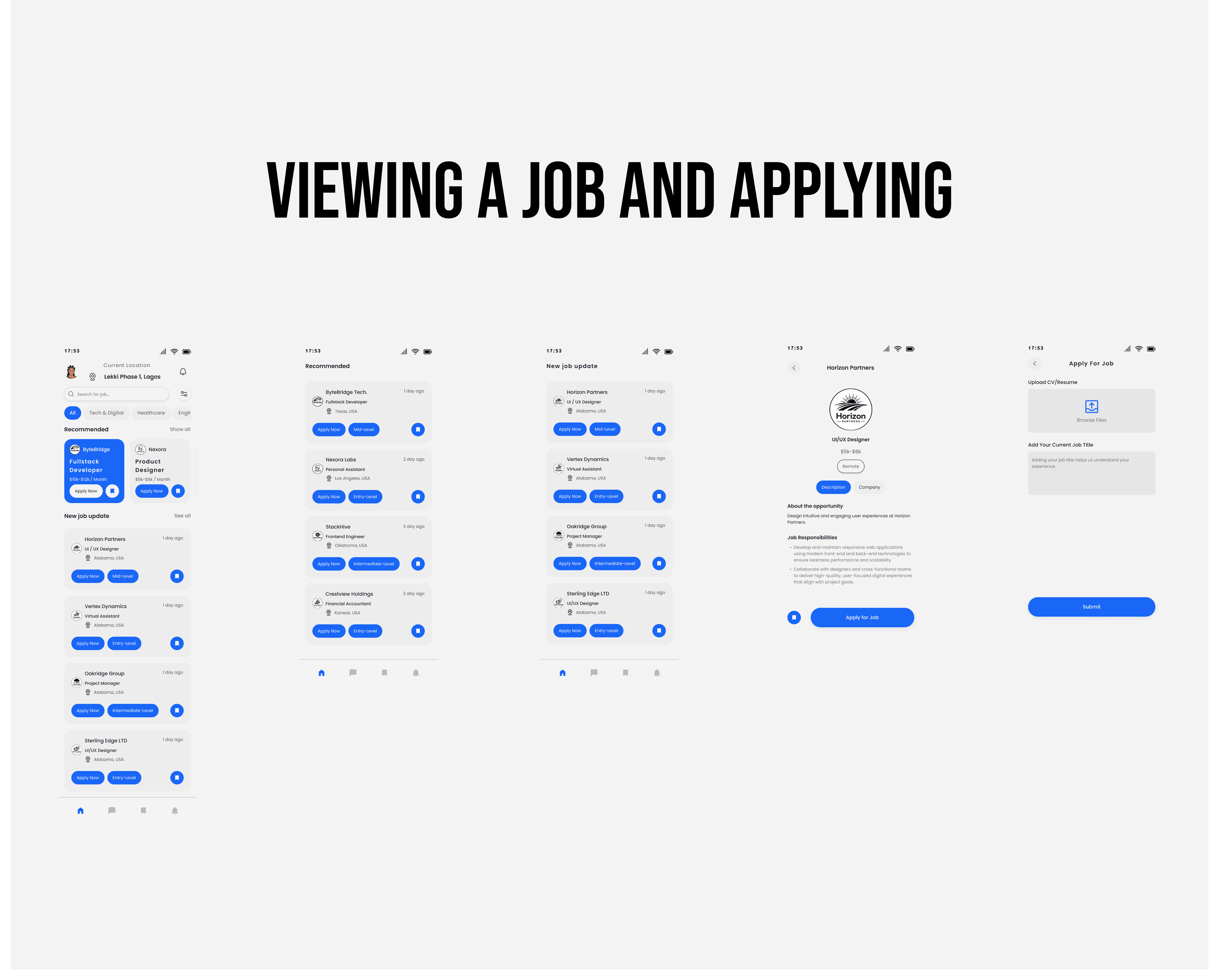
Viewing & Applying for Jobs
Users can view detailed job information, including salary, work arrangement, and responsibilities.
From there, they can either save the job for later or apply through a simplified application flow with CV upload and basic details, supported by clear validation feedback when needed.
MID-FIDELITY WIREFRAMES
DESIGN SYSTEM
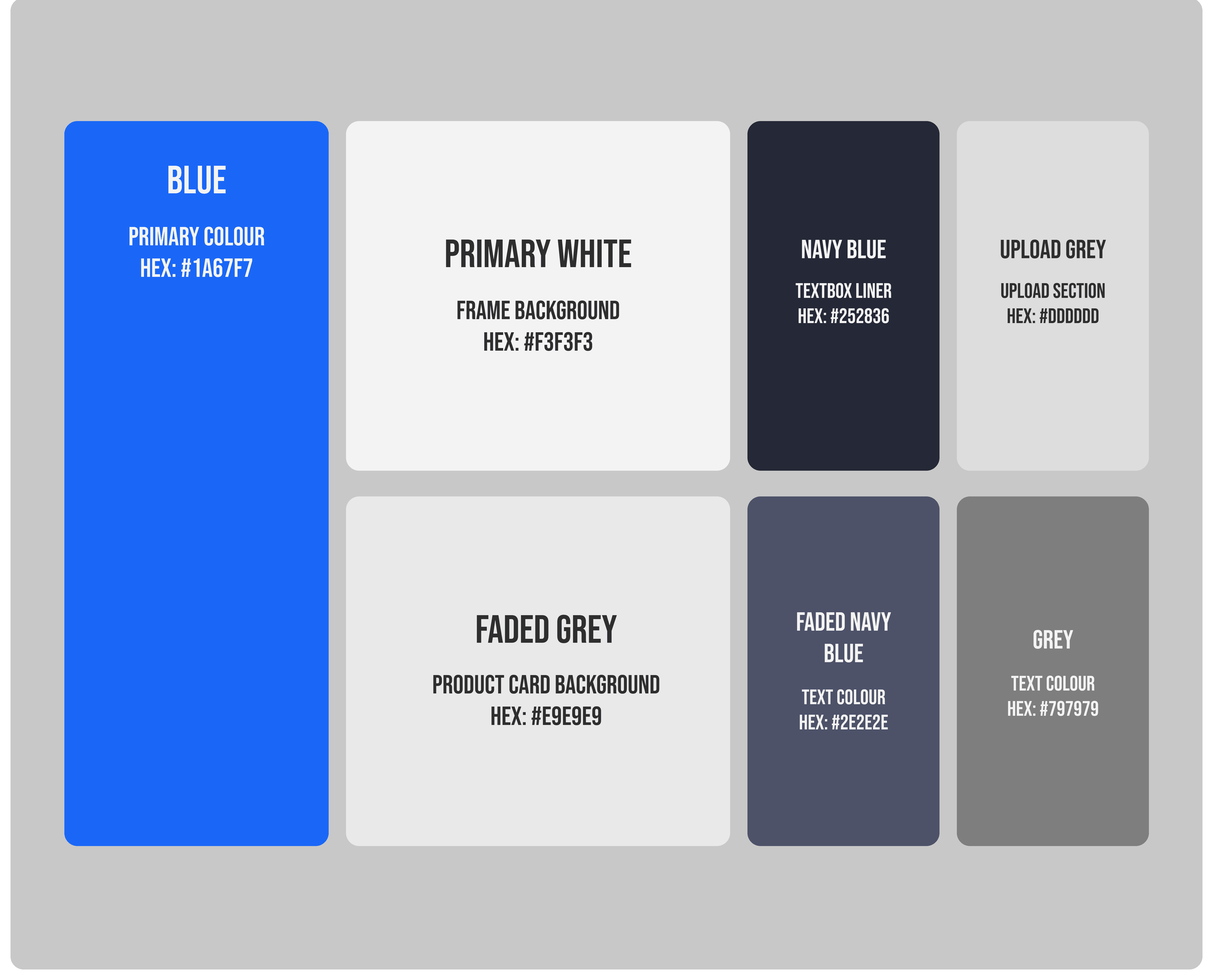
Color Strategy
JobFinder’s color system was built around blue to communicate trust, professionalism, and confidence.
The primary blue highlights interactive elements and active states, while dark navy adds contrast to featured content. Neutral greys and soft whites keep the interface clean and focused on job listings.
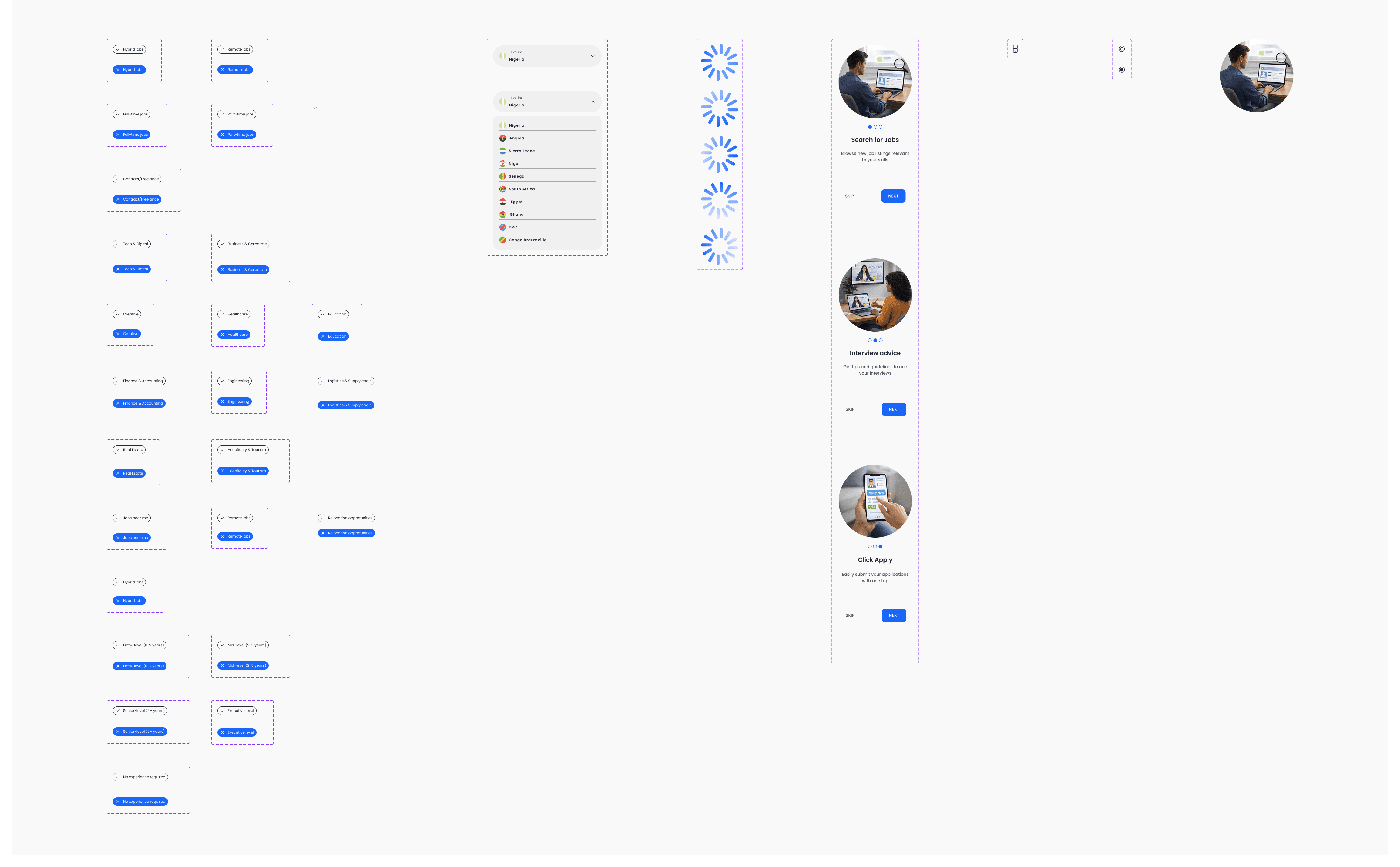
Component Thinking
JobFinder was built using reusable components such as job cards, filter chips, buttons, and input fields to maintain consistency across the product.
A clear button hierarchy helped distinguish primary, secondary, and low-priority actions, creating a more scalable and cohesive user experience.
TYPOGRAPHY
COMPONENT
SPACING LAYOUT
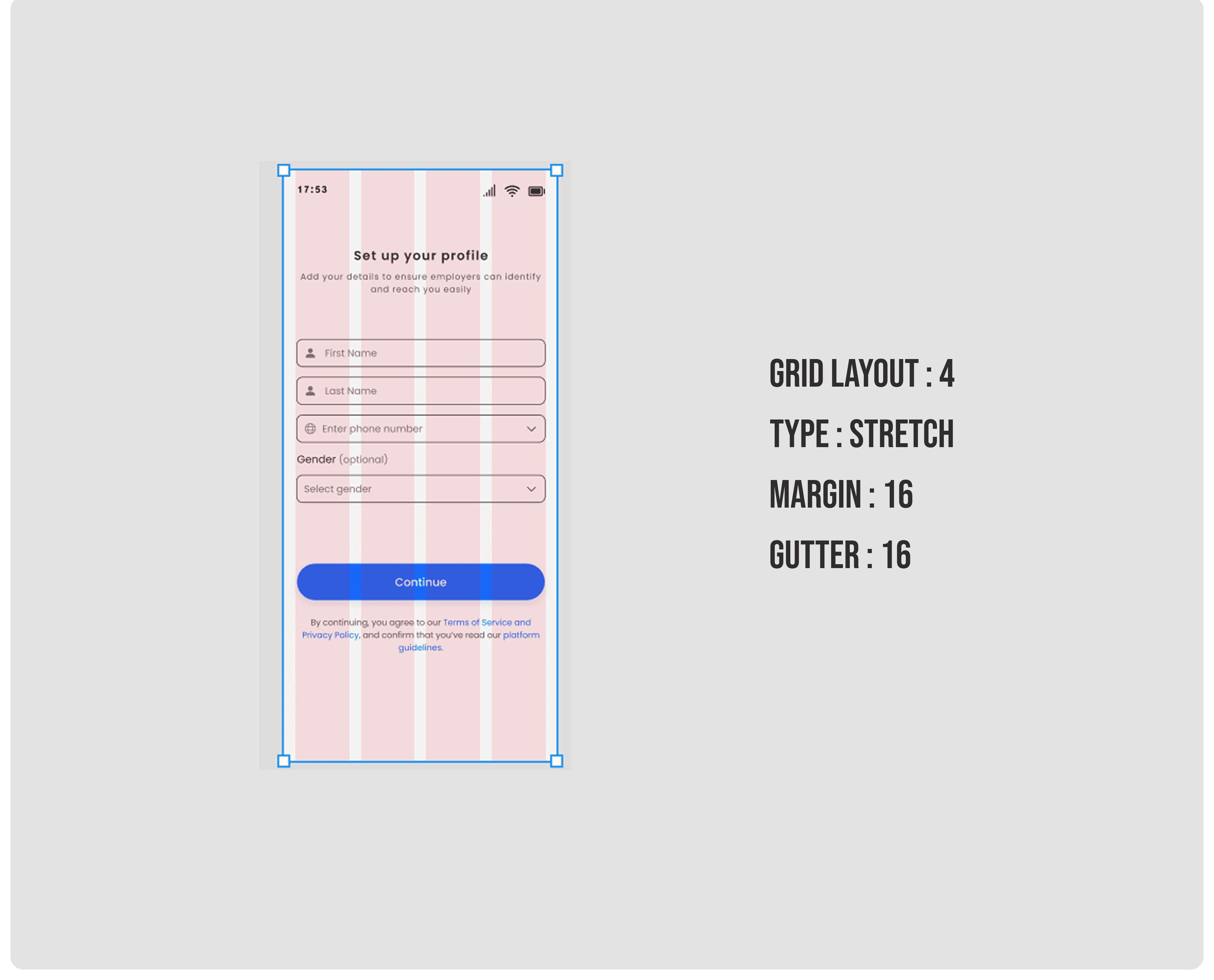
A consistent grid and spacing system was used to create a clean, balanced, and easy-to-scan interface.
Predictable spacing between elements improved readability, reduced visual clutter, and helped users navigate the app more effortlessly.
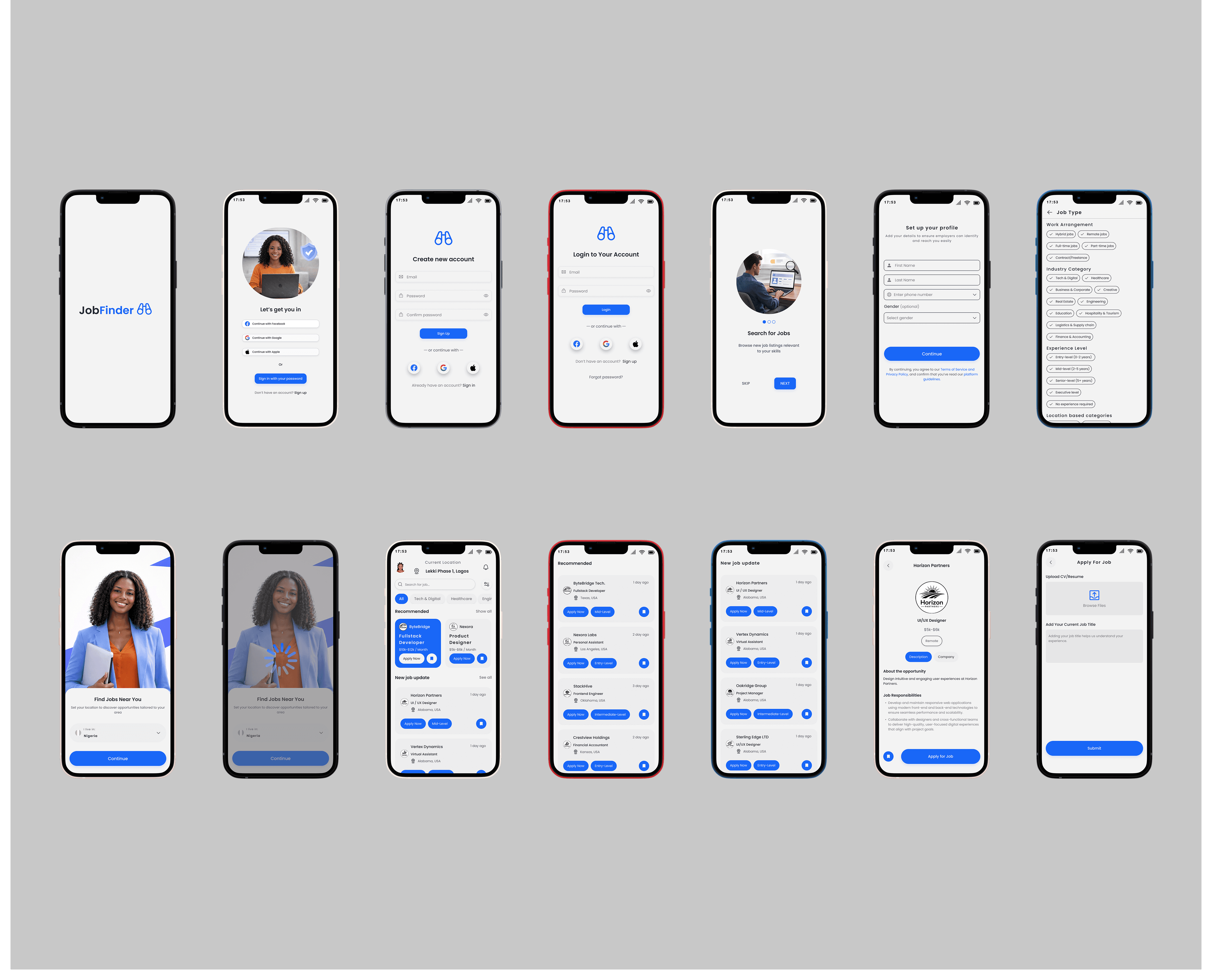
High Fidelity Mockups
With the structure validated and the design system locked in, I moved into high-fidelity. Every screen was designed with real content. No lorem ipsum. No placeholder icons. The goal was to make the mockups feel like a live product, not a design exercise.
Result & Impact
User testing showed that participants could complete the full journey from sign-up to job application in under three minutes without assistance.
Users responded positively to the personalized job feed and simplified application flow, describing the experience as intuitive and tailored to their needs.
Key product improvements included:
A faster one-screen application process
Location-based job recommendations
More relevant filtering options
Reduced friction across the mobile experience
Key Learnings
Simpler experiences often come from removing unnecessary steps rather than adding more features.
Early user research helped challenge assumptions and improve design decisions before high-fidelity execution.
Designing for mobile-first users required a stronger focus on clarity, speed, and usability.
More Projects


New release
Preview
Job Hunting
JOB FINDER
JobFinder is a mobile job search app that helps users discover relevant opportunities faster through personalized recommendations, location-based listings, and smart filters. This case study explores the redesign process focused on creating a simpler and more intuitive job search experience.
Year :
2026
Industry :
Tech
Client :
Job finder
Project Duration :
2 months
Problem & Solution:
Research revealed that many job platforms overwhelm users with endless listings and little personalization, turning job searching into a frustrating experience.
This project explored how a more personalized and guided approach could help users discover relevant opportunities faster and with less friction.
The Problem
Job apps feel generic and impersonal
Users waste time filtering through irrelevant listings
Onboarding is either skipped or so long it's abandoned
Applying for jobs feels tedious and repetitive
No sense of location-based relevance on mobile
Poor visual hierarchy makes scanning difficult
The Solution
Personalised onboarding that sets context early
Location-aware job feed from session one
Smart category filters to narrow down by field
Clean card-based layout for fast scanning
Simple one-screen application with CV upload
Saved jobs and notification system built in
Design Process :
I followed a structured but flexible process that kept the user at the centre of every decision. Each phase informed the next: research shaped the persona, the persona shaped the flows, and the flows shaped every pixel in the final design.
Discovery & Research
I conducted informal interviews with 12 job seekers aged 22–35 across Lagos, Abuja, and Port Harcourt. I wanted to understand how people actually search for jobs, not how they say they do. Themes around frustration, wasted time, and lack of confidence came up repeatedly.
User Persona Development
From the research I synthesised a primary persona, a realistic representation of the core user group. This persona sat on my screen throughout the entire design process and acted as a sanity check every time I had to make a design decision.
User Flow Mapping
I mapped the critical paths a user would take from downloading the app to successfully applying for a job. This revealed several unnecessary friction points that I was able to eliminate before a single screen was designed.
Wireframing
Low-fidelity wireframes let me explore layout possibilities quickly without getting distracted by colour or polish. I ran two rounds of wireframe reviews with peer designers and incorporated feedback before moving to high fidelity.
Design System & Visual Design
I built a focused design system covering colour, typography, components, and spacing, that kept the UI consistent and made handoff clean. Then I moved into high-fidelity, screen by screen.
Prototype & Iteration
An interactive prototype was shared with 5 users for usability testing. Key findings shaped the final adjustments, including simplifying the filter screen and adding visual weight to the Apply Now CTA on the job detail page.
USER-PERSONA :
Meet Amaka Osei
Amaka is a 24-year-old Computer Science graduate in Lagos who represents JobFinder’s target user.
She is frustrated by irrelevant listings, repetitive applications, and slow feedback from existing job platforms. Since she mainly applies on mobile, she values speed, relevance, and a frictionless experience.
Her needs shaped key decisions around personalization, usability, and simplified job applications.
EMPATHY MAP:
Understanding Amaka
Research showed that users like Amaka felt overwhelmed by irrelevant listings, repetitive applications, and little feedback from existing job platforms.
This shaped JobFinder into a more personalized and intuitive experience focused on clarity, confidence, and ease of use throughout the job search journey.
USER-FLOW DIAGRAM :
Before designing high-fidelity screens, I mapped out key user journeys to identify friction, simplify interactions, and ensure every screen served a clear purpose.
Different flows were designed for different user needs, allowing JobFinder to support both first-time job seekers and experienced professionals more effectively.
First-Time Onboarding & Sign Up
New users are introduced to JobFinder through a short onboarding flow highlighting the app’s core benefits. They can quickly create an account using email or social login, then complete a simple profile and location setup to receive more relevant job recommendations.
Returning User Login
Returning users bypass onboarding and move directly into a fast login flow using email, password, or social login. Once authenticated, they are taken straight to a personalized home feed tailored to their profile and activity.
Viewing & Applying for Jobs
Users can view detailed job information, including salary, work arrangement, and responsibilities.
From there, they can either save the job for later or apply through a simplified application flow with CV upload and basic details, supported by clear validation feedback when needed.
MID-FIDELITY WIREFRAMES
DESIGN SYSTEM
Color Strategy
JobFinder’s color system was built around blue to communicate trust, professionalism, and confidence.
The primary blue highlights interactive elements and active states, while dark navy adds contrast to featured content. Neutral greys and soft whites keep the interface clean and focused on job listings.
Component Thinking
JobFinder was built using reusable components such as job cards, filter chips, buttons, and input fields to maintain consistency across the product.
A clear button hierarchy helped distinguish primary, secondary, and low-priority actions, creating a more scalable and cohesive user experience.
TYPOGRAPHY
COMPONENT
SPACING LAYOUT
A consistent grid and spacing system was used to create a clean, balanced, and easy-to-scan interface.
Predictable spacing between elements improved readability, reduced visual clutter, and helped users navigate the app more effortlessly.
High Fidelity Mockups
With the structure validated and the design system locked in, I moved into high-fidelity. Every screen was designed with real content. No lorem ipsum. No placeholder icons. The goal was to make the mockups feel like a live product, not a design exercise.
Result & Impact
User testing showed that participants could complete the full journey from sign-up to job application in under three minutes without assistance.
Users responded positively to the personalized job feed and simplified application flow, describing the experience as intuitive and tailored to their needs.
Key product improvements included:
A faster one-screen application process
Location-based job recommendations
More relevant filtering options
Reduced friction across the mobile experience
Key Learnings
Simpler experiences often come from removing unnecessary steps rather than adding more features.
Early user research helped challenge assumptions and improve design decisions before high-fidelity execution.
Designing for mobile-first users required a stronger focus on clarity, speed, and usability.
More Projects
New release
Preview
Job Hunting
JOB FINDER
JobFinder is a mobile job search app that helps users discover relevant opportunities faster through personalized recommendations, location-based listings, and smart filters. This case study explores the redesign process focused on creating a simpler and more intuitive job search experience.
Year :
2026
Industry :
Tech
Client :
Job finder
Project Duration :
2 months
Problem & Solution:
Research revealed that many job platforms overwhelm users with endless listings and little personalization, turning job searching into a frustrating experience.
This project explored how a more personalized and guided approach could help users discover relevant opportunities faster and with less friction.
The Problem
Job apps feel generic and impersonal
Users waste time filtering through irrelevant listings
Onboarding is either skipped or so long it's abandoned
Applying for jobs feels tedious and repetitive
No sense of location-based relevance on mobile
Poor visual hierarchy makes scanning difficult
The Solution
Personalised onboarding that sets context early
Location-aware job feed from session one
Smart category filters to narrow down by field
Clean card-based layout for fast scanning
Simple one-screen application with CV upload
Saved jobs and notification system built in
Design Process :
I followed a structured but flexible process that kept the user at the centre of every decision. Each phase informed the next: research shaped the persona, the persona shaped the flows, and the flows shaped every pixel in the final design.
Discovery & Research
I conducted informal interviews with 12 job seekers aged 22–35 across Lagos, Abuja, and Port Harcourt. I wanted to understand how people actually search for jobs, not how they say they do. Themes around frustration, wasted time, and lack of confidence came up repeatedly.
User Persona Development
From the research I synthesised a primary persona, a realistic representation of the core user group. This persona sat on my screen throughout the entire design process and acted as a sanity check every time I had to make a design decision.
User Flow Mapping
I mapped the critical paths a user would take from downloading the app to successfully applying for a job. This revealed several unnecessary friction points that I was able to eliminate before a single screen was designed.
Wireframing
Low-fidelity wireframes let me explore layout possibilities quickly without getting distracted by colour or polish. I ran two rounds of wireframe reviews with peer designers and incorporated feedback before moving to high fidelity.
Design System & Visual Design
I built a focused design system covering colour, typography, components, and spacing, that kept the UI consistent and made handoff clean. Then I moved into high-fidelity, screen by screen.
Prototype & Iteration
An interactive prototype was shared with 5 users for usability testing. Key findings shaped the final adjustments, including simplifying the filter screen and adding visual weight to the Apply Now CTA on the job detail page.
USER-PERSONA :
Meet Amaka Osei
Amaka is a 24-year-old Computer Science graduate in Lagos who represents JobFinder’s target user.
She is frustrated by irrelevant listings, repetitive applications, and slow feedback from existing job platforms. Since she mainly applies on mobile, she values speed, relevance, and a frictionless experience.
Her needs shaped key decisions around personalization, usability, and simplified job applications.
EMPATHY MAP:
Understanding Amaka
Research showed that users like Amaka felt overwhelmed by irrelevant listings, repetitive applications, and little feedback from existing job platforms.
This shaped JobFinder into a more personalized and intuitive experience focused on clarity, confidence, and ease of use throughout the job search journey.
USER-FLOW DIAGRAM :
Before designing high-fidelity screens, I mapped out key user journeys to identify friction, simplify interactions, and ensure every screen served a clear purpose.
Different flows were designed for different user needs, allowing JobFinder to support both first-time job seekers and experienced professionals more effectively.
First-Time Onboarding & Sign Up
New users are introduced to JobFinder through a short onboarding flow highlighting the app’s core benefits. They can quickly create an account using email or social login, then complete a simple profile and location setup to receive more relevant job recommendations.
Returning User Login
Returning users bypass onboarding and move directly into a fast login flow using email, password, or social login. Once authenticated, they are taken straight to a personalized home feed tailored to their profile and activity.
Viewing & Applying for Jobs
Users can view detailed job information, including salary, work arrangement, and responsibilities.
From there, they can either save the job for later or apply through a simplified application flow with CV upload and basic details, supported by clear validation feedback when needed.
MID-FIDELITY WIREFRAMES
DESIGN SYSTEM
Color Strategy
JobFinder’s color system was built around blue to communicate trust, professionalism, and confidence.
The primary blue highlights interactive elements and active states, while dark navy adds contrast to featured content. Neutral greys and soft whites keep the interface clean and focused on job listings.
Component Thinking
JobFinder was built using reusable components such as job cards, filter chips, buttons, and input fields to maintain consistency across the product.
A clear button hierarchy helped distinguish primary, secondary, and low-priority actions, creating a more scalable and cohesive user experience.
TYPOGRAPHY
COMPONENT
SPACING LAYOUT
A consistent grid and spacing system was used to create a clean, balanced, and easy-to-scan interface.
Predictable spacing between elements improved readability, reduced visual clutter, and helped users navigate the app more effortlessly.
High Fidelity Mockups
With the structure validated and the design system locked in, I moved into high-fidelity. Every screen was designed with real content. No lorem ipsum. No placeholder icons. The goal was to make the mockups feel like a live product, not a design exercise.
Result & Impact
User testing showed that participants could complete the full journey from sign-up to job application in under three minutes without assistance.
Users responded positively to the personalized job feed and simplified application flow, describing the experience as intuitive and tailored to their needs.
Key product improvements included:
A faster one-screen application process
Location-based job recommendations
More relevant filtering options
Reduced friction across the mobile experience
Key Learnings
Simpler experiences often come from removing unnecessary steps rather than adding more features.
Early user research helped challenge assumptions and improve design decisions before high-fidelity execution.
Designing for mobile-first users required a stronger focus on clarity, speed, and usability.
More Projects
New release
Preview